Archive for Typography
March 6, 2018 @ 12:51 am· Filed by Neal Goldfarb under blegs, Nerdview, Philosophy of Language, Typography, Usage advice, Writing systems, WTF
In MS Word, buried deep in File|Options|Advanced|Compatibility Options|Layout is the option to check 'Do full justification the way WordPerfect 6.x for Windows does'". If you use full justification, your document will look ugly unless you check that box.
Does that qualify as a form of nerdview?
Permalink
October 9, 2017 @ 8:08 am· Filed by Mark Liberman under Morphology, Typography
In English, singular personal pronouns are almost the only residue of morphological gender. But in many languages this is a much bigger problem, with gender agreement in adjectives, gendered forms of most nouns, and so on. A few years ago, French proponents of "écriture inclusive" ("inclusive writing") proposed a novel use of an otherwise little-used character, the "middle dot", to set off optional letter sequences and create gender-ambiguous written forms. Thus
| Masculine |
Feminine |
Inclusive |
| intellectuel |
intellectuelle |
intellectuel·le |
| musicien |
musicienne |
musicien·ne |
| représentés |
représentées |
représenté·e·s |
Thus, as Le Figaro put it,
Pour que les femmes comme les hommes «soient inclus·e.s, se sentent représenté·e·s et s'identifient», le Haut Conseil à l'égalité entre les femmes et les hommes recommandait en 2015, dans un guide pratique, d'utiliser l'écriture inclusive.
Read the rest of this entry »
Permalink
May 2, 2017 @ 5:54 pm· Filed by Victor Mair under Typography, Writing systems
Chen Cheng-wei and staff writer Elizabeth Hsu, "Taiwan's last lead-character mold maker works to preserve the past" (Focus Taiwan, 5/1/17):
Rixing Type Foundry is home to the last remaining collection of traditional Chinese movable type character molds in the world. It possesses 120,000 molds of different characters in a wide range of sizes and three different typefaces — kaiti (楷體) or regular script, songti (宋體) and heiti (黒體) or sans-serif black — and has more than 10 million lead character pieces for printing or sale.
Read the rest of this entry »
Permalink
March 13, 2017 @ 3:43 am· Filed by Geoffrey K. Pullum under Orthography, Spelling, Typography
A truly startling (and surely unintended) hyphenation in the print edition of The Economist (March 11th) suggests that some updating of word-breaking algorithms is in order in the light of the fairly recent practice of inventing product and brand names that have word-internal upper-case letters. An article about juvenile delinquency, reporting that kids are less involved in crime in part because they're indoors playing video games, ends with this paragraph (I reproduce the line breaks and hyphens of the UK print edition exactly, though not the microspacing that justifies the right-hand margin; the only thing I'm interested in is the end of the penultimate line):
The decline in crime among the young
bodes well for the future. A Home Office
study in 2013 found that those who com-
mitted their first crime aged between ten
and 17 were nearly four times more likely to
become chronic offenders than those who
were aged 18-24, and 11 times more likely
than those who were over 25. More PlayS-
tation, less police station.
Read the rest of this entry »
Permalink
December 10, 2016 @ 3:07 pm· Filed by Victor Mair under Language and computers, Typography
Somebody asked Mark Swofford to help her devise a speedy, easy way to locate all the Chinese characters in a book-length manuscript that she was working on. Mark set to work on the problem, and this is what he came up with:
"How to find Chinese characters in an MS Word document" (12/10/16)
Read the rest of this entry »
Permalink
December 30, 2015 @ 12:52 pm· Filed by Victor Mair under Language and computers, Typography, Writing systems
On the otoro blog, there is another amazing article about sinograms:
"Recurrent Net Dreams Up Fake Chinese Characters in Vector Format with TensorFlow" (12/28/15)
I say "another amazing article" because, just a week ago, in "Character building is costly and time consuming" (12/22/15), we looked at a fascinating report on the vast amount of labor necessary to build fonts made up of real Chinese characters. Basically, the latter report examined the history of Chinese characters and then explained how typographers create new fonts comprising all the characters necessary for printing books, newspapers, magazines, advertising copy, and so forth.
Read the rest of this entry »
Permalink
December 22, 2015 @ 6:56 am· Filed by Victor Mair under Typography, Writing systems
I would like to call the attention of Language Log readers to an extraordinary article by Nikhil Sonnad:
"The long, incredibly tortuous, and fascinating process of creating a Chinese font " (Quartz, 12/18/15)
I knew that Nikhil was writing this article, because I helped him with the part about the historical development of the script over a month ago. After that I didn't hear anything from him until yesterday when he sent me notice that the article had just been published. Now that I've had a chance to read Nikhil's article, I must say that it a unique and amazing accomplishment.
Read the rest of this entry »
Permalink
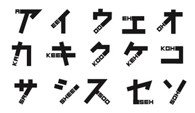
October 22, 2015 @ 7:15 am· Filed by Victor Mair under Transcription, Typography, Writing systems
On the DramaFever website, Brendan Fitzgibbons has an interesting article that shows how "New font lets anyone learn Japanese" (10/17/14):

Read the rest of this entry »
Permalink
August 15, 2015 @ 10:37 am· Filed by Victor Mair under Alphabets, Errors, Transcription, Typography
Eric Pelzl sent in this photograph of a bag from a lunch delivery that contains an interesting printing error:

Read the rest of this entry »
Permalink
August 4, 2015 @ 8:48 am· Filed by Victor Mair under Language and politics, Language and the media, Typography, Writing systems
If you don't know who Lei Feng is, you should. He's China's equivalent of the Good Samaritan and Alfred E. Neuman ("What, me worry?") all wrapped up in one (for those of you who are not familiar with Alfred E. Neuman, one of my high school heroes, here's the real McCoy).

Read the rest of this entry »
Permalink
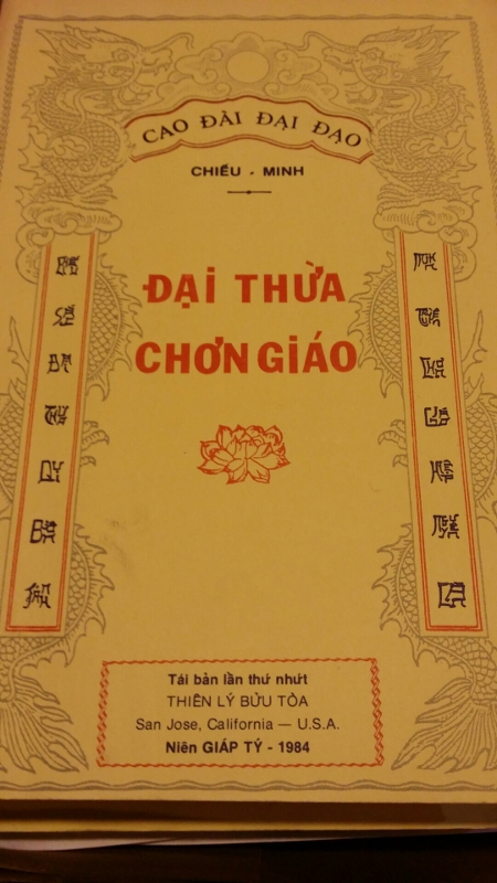
April 16, 2014 @ 11:34 am· Filed by Victor Mair under Language and religion, Typography, Writing systems
Jason Cox sent in the following photograph of the cover of a Vietnamese religious text and asked what was going on with the "characters" along the left and right sides.

Read the rest of this entry »
Permalink
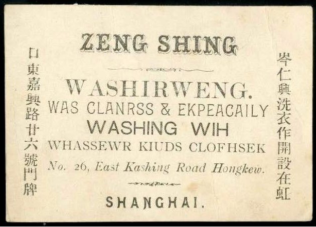
March 26, 2014 @ 9:20 pm· Filed by Victor Mair under Lost in translation, Typography
John Considine found this circa 1880 advertisement in the Hong Kong 2013 catalog of Bernard Quaritch (with the note that "We have not been able to locate any other example of this kind of trade card"):

Read the rest of this entry »
Permalink
September 27, 2013 @ 4:26 am· Filed by Geoffrey K. Pullum under Errors, Esthetics, Humor, Ideography, Language and art, Language exotification, Language play, Languages, Lost in translation, Names, Pragmatics, Psychology of language, Punctuation, Reading, Silliness, Slogans, Typography, Writing systems, WTF
I've been reading way too much Victor Mair. In the restaurant of my hotel in London I just saw an English girl wearing a T-shirt on which it said this:
And I immediately thought, who is Ho Pe?
Read the rest of this entry »
Permalink
