Lei Feng: model soldier-citizen
« previous post | next post »
If you don't know who Lei Feng is, you should. He's China's equivalent of the Good Samaritan and Alfred E. Neuman ("What, me worry?") all wrapped up in one (for those of you who are not familiar with Alfred E. Neuman, one of my high school heroes, here's the real McCoy).
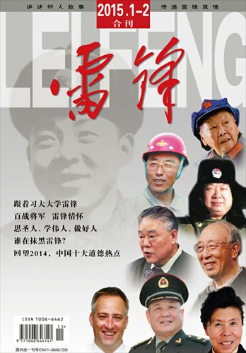
That's the cover of a new magazine devoted to promoting Lei Feng as the spiritual hero for the age, as introduced in an article by Yuen Yeuk-laam from Global Times:
"Magazine seeks to renew spirit of Lei Feng amid increasing decline in moral values" (8/2/15)
Since this article appeared in Global Times, a newspaper published by the People's Daily which is often used to disseminate Chinese Communist Party (CCP) policy positions, we can be sure that the government is taking this new venture very seriously.
Lei Feng, a soldier of the People's Liberation Army born in 1940 and died at the age of 21, has been highly praised by the Party leaders for his selfless acts and has been portrayed as a role model after his death. The country even launched an annual nationwide "Learn From Comrade Lei Feng" campaign to encourage people to do good deeds since 1960s.
With the passage of time, Lei's spirit has faded in the society increasingly driven by materialist gains. A group of cultural experts and Lei's supporters therefore decided to launch a monthly magazine that instills positive energy into the society and enhance moral values.
This being Language Log, I do not want to get into the pros and cons of the ideological content and political intent of the new magazine. I simply want to focus on one striking aspect of the cover that caught my attention. Namely, together with the benign, smiling visage of the eponymous hero, looming very large in the background is his name in gigantic Roman letters.
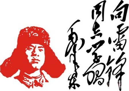
In standard script, that "grassy" (cursive) calligraphy would be 雷锋 (pinyin with tones: Léi Fēng). These two characters are from Mao's "famous" inscription written in memory of Lei Feng:
Xiàng Léi Fēng tóngzhì xuéxí
Máo Zédōng
向雷鋒同志学習
毛澤東
Learn from Comrade Lei Feng
Mao Zedong
Comment from a colleague who is a historian and connoisseur of Chinese calligraphy: "Mao's calligraphic style is supposed to be the cursive, though strictly speaking, it's somewhat nondescript and nonscholarly."
What are the designers trying to convey with this arrangement? Why make the pinyin overshadow everything else on the cover, including Lei Feng's face (the clearly visible white letters overlie Lei's gray, fuzzed photograph)? I can understand putting the pinyin somewhere on the cover, especially since a lot of people might have trouble recognizing both of the characters (particularly the second one), but why make it so large? The pinyin occupies more than one quarter of the height of the cover.
[Hat tip to Geoff Wade]


Dick Margulis said,
August 4, 2015 @ 9:04 am
"What are the designers trying to convey with this arrangement? "
The designers are, or more likely the graphic designer is, trying to convey that he or she thinks the arrangement of elements on the cover is aesthetically pleasing.
For my entire professional life, I have been plagued by graphic designers who view blocks of text as gray elements to be arranged pleasingly on a page but who have no inkling that those blocks contain information.
A week ago, in a discussion of dyslexia on copyediting-l, Karen Loftstrom wrote, "Studies have shown that there are a quite a few dyslexics working in art, architecture, and design. Perhaps because their deficits aren't as much of a handicap in those fields, and their strengths count." [She didn't cite any studies in that informal discussion, and I didn't request citations.]
Suddenly it all became clear. My decades of troubles with some graphic designers was due to their dyslexia, not their perverse personalities.
I don't know whether the same phenomenon obtains in China, but if it does, it would be the likely answer to your question.
Tom Parmenter said,
August 4, 2015 @ 11:00 am
"Everybody wants to be an art director," song about Betsey Ross in Stan Freberg's History of the United States, Part 1.
Hiroshi said,
August 4, 2015 @ 11:11 am
I don't find anything special with the huge blocks of Pinyin. To me the look (huge block-ish text on top) is standard among magazines. (I just searched "magazine" and "杂志" in Google image to confirm my impression.) It seems very common for Chinese magazines to use both Chinese characters and English for the title. (And one may argue that "Lei Feng" in this case is, actually, English…) In this particular case, I think it probably means the designer thinks this looks good.
As for the comment about Mao's calligraphic style being "nondescript and nonscholarly"… Well, I am far from a fan of Mao in any sense and don't feel like defending him in any case… but I'm really not sure about the "nonscholarly" comment. If the “cursive” refers to 草書 or 行草 as I assumed, then I would say Mao’s work is scholarly enough in the sense that his stroke orders and abbreviations are fairly standard/formal (with the exception of “学”), which indicates some training. From the artistic point of view, one would probably find his stroke control to be poor (or basically nonexistent), but my standards for being “scholarly” isn’t that high—I would call anything that’s basically proper cursive “scholarly”.
Possibly relevant info: There are websites on which you can search for a single character and see how it’s written in various Chinese calligraphic styles by people through the years, http://www.shufazidian.com/ for example.
cameron said,
August 4, 2015 @ 2:31 pm
I know that in some parts of Europe the pseudoscience of graphology is still given some credence. Has there ever been a tradition of analyzing handwriting for evidence of personality traits in China or Japan?
K Chang said,
August 4, 2015 @ 3:15 pm
What I find interesting were the subtitles / topics on the cover.
The last two were:
who is slandering Lei Feng?
Looking back at 2014, the top ten topics on ethics in China.
Cosmia said,
August 4, 2015 @ 10:45 pm
@cameron
There is a common saying in Chine, 字如其人, meaning "the character is like the person". That's the excuse my mother used when she pushed me to practice my calligraphy, because presumably a bad handwriting makes others think less of you. It seems to be still somewhat popular, as shown in this blog entry, though it is definitely on the decline as electronic input system replaces handwriting.
Tracing a bit back, this sentiment seems expressed by 揚雄 Yang Xiong, a Han dynasty scholar, poet, in《法言·问神卷第五》:“言,心声也;书,心画也。声画形,君子小人见矣。” which translates to "Speech is the sound of heart; writing is the drawing of heart. From the shape of sound and drawing, the good and the petty are distinguished."
Matt said,
August 5, 2015 @ 1:22 am
To be honest, I wouldn't say that the "LEI FENG" "overshadows everything else" on the cover — it's clearly in the background, and the red hanzi are right up front. Even Lei Feng's face, although technically behind his name, is easier to see because nothing is blocking it.
But I do agree that it's interesting to find it there at all (assuming that most Chinese magazine covers don't have romanized versions of their titles in the same area). Maybe the goal is just brand-building — even if you can't read Mao's calligraphy or the magazine itself, you'll probably still deduce that the smiling guy there is named LEI FENG and is important enough to have a whole magazine named after him.
juliel wei said,
August 5, 2015 @ 1:54 pm
As to why the graphic designer would use the romanization LEI FENG on the cover even though the magazine is only meant for a Chinese audience, there may be several reasons:
–the white-on-grey produces an airy-and-light effect vs. an all-grey background;
–this is enhanced by the simple, bold, typeface LEI FENG,
—which is moreover _appropriate_, since it is the subject’s name,
–and is understandable by every Chinese grade-school student, since Pinyin romanization is taught in Chinese grade school;
–furthermore, Pinyin bespeaks something _modern_ for the Chinese, and even _avant-garde_
So the LEI FENG design element would be airy-but-strong, appropriate, and modern. I imagine the designer wants a cover that is strong and modern.
julie lee said,
August 5, 2015 @ 2:14 pm
I would call Mao Zedong's handwriting _uncultivated_. It does not show long hours and long years of practising Chinese callilgraphy, which was an essential part of the gentleman's education in the old days. He was, after all, not a gentleman.
Jeff W said,
August 5, 2015 @ 6:38 pm
I agree with what Matt and juliel wei said.
It wouldn't have occurred to me that the letters of the pinyin “overlie” Feng’s face unless you’re somehow construing the image as entirely 2D. Clearly, Lei Feng's image is intended to be perceived in the background and the pinyin lettering more in the foreground. The position of the image of Lei Feng gave me the impression that his “spirit” or influence was present but in the background.
I thought that, in a design sense, the flat, blocky, very slightly transparent pinyin was intended as contrast to the flowing, colorful, fully opaque, “raised” (as conveyed by the drop shadow) calligraphy in the foreground.
I'm no designer but I was more struck by the jumble of heads on the right than by anything having to do with the pinyin per se. And the outer bottom edge of the bowl of the G in “LEI FENG” follows the contour of the blue cap a bit too closely so, although it’s obviously intended that that person is “in front of” the lettering, there’s a little ambiguity at that point. I would have shifted everyone a few pixels to the left to avoid that.