What does this graph mean?
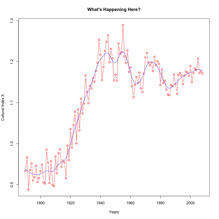
It's a time series, from 1890 to 2008, of a certain socio-cultural index. The points in red are the year-by-year values; the blue line is a smoothed ("spline") version of the sequence.
If you had to summarize this plot to someone over the phone or in text-only form, how would you do it? I might say something like
It starts at about 0.95 through the 1890s and 1900s. Then around 1915 it starts rising, and keeps on going up to a peak of about 1.25, around 1950. Then it comes down a bit, and wobbles around until the present, in the range of 1.15 to 1.2.
Read the rest of this entry »


