Pop Japonesque nonsense?
« previous post | next post »
[This is a guest post by Nathan Hopson]
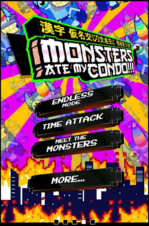
Amazon's App Store for Android features a free daily app. The selection of a few days ago caught my eye not for the content of the app itself, but for the nonsensical (and incorrect) use of Japanese.
The game title appears to be a slight misnomer; from what I can tell it's more like, "I fed my condo to the monsters." But in any case, it's the giant monsters causing urban destruction à la Godzilla, inter alia, that surely accounts for the Japonesque motif.
I took special note of the "A" in "Ate" that was designed to resemble 太. It suggests a level of literacy that the nonsense at the top playfully rejects.
This is more than just a kanji tattoo gone wrong.
This is, whether intentionally or not, the inversion of the kinds of cultural flow that gave us so many years of Engrish giggles. Has "Cool Japan" finally made it?

Plane said,
August 8, 2015 @ 4:10 pm
The Japanese consists of the phrase 漢字仮名交じり文 (kanji-kana majiri bun 'mixed kanji-kana writing') repeated three times with some mangling. The first time, they inserted a space that wouldn't normally be there. The second and third times, they removed characters from the phrase.
My bet is they don't know any Japanese. The 太 is probably part of a font they didn't design, so I don't think it's really an indication that they're aware of what they were doing.
Ethan said,
August 8, 2015 @ 6:00 pm
I'm waiting for the regionalized European edition, retitled "Lorem Ipsum Dolor".
chris said,
August 8, 2015 @ 6:12 pm
Even someone who knows no Japanese at all could look at a sample of it and think "hey, that character there looks kind of like an A, wouldn't it be cool to use it instead of an A?". Perhaps while in the process of assembling a gibberish string of Japanese characters.
As for "cool Japan", it seems like this game may be mocking certain parts of Japanese culture (particularly monster movies and garish graphic design) more so than sincerely admiring them.
John said,
August 8, 2015 @ 9:33 pm
I recognise that sequence of characters – I don't know where/who it originated from, but it seems to be one commonly used for testing character encodings:
https://wso2.org/jira/si/jira.issueviews:issue-html/REGISTRY-880/REGISTRY-880.html
http://www.tutorialarena.com/mysql/mysql-string-length.php
http://stackoverflow.com/questions/17263161/java-japanese-charcters-string-size-in-bytes
http://stackoverflow.com/questions/26652820/how-to-skip-other-languages-when-decoding-html-entities
Michael Watts said,
August 9, 2015 @ 4:28 am
I never thought 太 particularly resembled A. My money is on 闩.
Becki said,
August 9, 2015 @ 6:19 am
If you play the game you'll find that the monsters themselves are also labelled with non-sensical Japanese. あぶない、あぶない、あぶない、たれびん. Dangerous ,dangerous, dangerous, small bottle for soy sauce. This has become a bit of a catchphrase for my J/E bilingual son and I.
Jean-Michel said,
August 11, 2015 @ 6:10 pm
The new season of Aqua Teen Hunger Force has a mock-Japanese closing credit sequence with a similar (but distinctly different) kanaesque font, which is arguably more "authentic" but also harder to read (here's an example). It seems to have involved someone with at least basic knowledge of Japanese, judging from the Japanese rendering of "Aqua Teen Forever" (アクアティーン永遠に Akua Tīn eien ni), though I think there should be a topic marker は before 永遠に ("forever").
jamie said,
August 12, 2015 @ 5:55 pm
Re. I agree with Plane, the font choice doesn't really show any awareness (arguably, quite the reverse). It looks like "Gang of Three"; horribly cliched and one of the first search results for "oriental font": http://www.dafont.com/gang-of-three.font