Concocted compound characters
« previous post | next post »

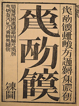
People who don't know any Chinese characters will think the four glyphs pictured above are just typical Chinese characters, but won't be able to make any sense of them at all.
People who are minimally / partially literate in Chinese characters will recognize components of the four glyphs, but not one of the glyphs as a whole.
People who are moderately literate in Chinese characters will "sort of" recognize parts of the four glyphs, but will not be able to extract meaning from the sentence as a whole.
Native speakers who are highly literate in Chinese characters will not be able to pronounce a single one of the four glyphs, but in many cases will be able to instantly read off the sentence thus:
bùxiǎng shàngbān, nà jiù bié shàng
不想上班,那就别上
"If you don't want to go to work, then don't go"
Xinyi Ye says, "This seems to be a new design trend in China nowadays, especially for auspicious or cute things like 'chūnlián 春联' ("spring festival couplets)."
These are traditionally called "hétǐzi 合体字" ("compound character"), and we've written about them before on Language Log (see "Selected readings" below).
Because of their invented nature, they remind me of Xu Bing's Book from the Sky (Tiānshū 天書):
Title page of Book from the Sky (Tiānshū 天書), in pseudo-Chinese characters.
The characters “天書” do not appear anywhere in the book. Note that the three large title characters in the center of the cover are repeated in a smaller font at the top right. This is Xu Bing's tricking the reader into believing that they are real character that can be repeated with a consistent meaning / usage.Xu Bing's made-up graphs are constructed in an entirely different manner. The "hétǐz 合体字" ("compound characters") above are made of components that are mostly actually characters themselves or are real elements in actual characters. Xu Bing, however, even makes up most of his components, e.g., the component on the left side of the third of the three big characters on the cover is reminiscent of Kangxi radical 184 (shí 食 ["eat; food"]), but it's not the same.
The four glyphs pictured at the beginning of this post also take liberties with their strokes, but they still can serve as elements of actual components of real characters, even though they are distorted.
Selected readings
- "Polysyllabic characters revisited" (6/18/15) — see esp. what I say about túshūguǎn 圕 ("library"), with embedded references to other posts about this type of character
- "'Double Happiness': symbol of Confucianism as a religion" (6/8/15)
- "'Book from the Ground'" (12/5/12)
- "The unpredictability of Chinese character formation and pronunciation" (2/6/12) — Xu Bing's "Book from the Sky"
[Thanks to Jing Hu]
John J Chew said,
September 27, 2025 @ 9:17 am
There's an annual Japanese contest to create new kanji; past winners can be seen here.
https://sousaku-kanji.com/archive.html
My favourite recent one was the 2020 winner for a character meaning "socially distanced seating".
Chris Button said,
September 27, 2025 @ 10:59 am
Very cool.
Incidentally, this compounding can be found all the way back in the oracle-bone inscriptions. For example Pan Geng 盤庚 may be found written with as a compound 凡庚 graph.
Chas Belov said,
September 27, 2025 @ 8:19 pm
@Victor Mair: I was fortunate to attend Xu Bing's Book of the Sky exhibition when it showed at San Francisco's Asian Art Museum. Even with the little written Chinese I know, it was mind-blowing.
@John J Chu: ¡I love that character for socially-distanced seating! (I can't read Japanese, but I presume it's the character found at https://sousaku-kanji.com/archive/images/img_11th_01-1.gif) Now we just need to get it into Unicode.
Michael Watts said,
September 27, 2025 @ 9:01 pm
Interesting.
wrt the reading, I was able to read 上班 from the second character. I thought of 想 for the first one, but rejected it on the grounds that the component in the top right is 月 rather than 目. The official reading doesn't seem to justify this. (I'm also curious about the stroke crossing the pie-stroke in 班.)
The last two didn't really suggest anything to me. With the benefit of the official reading, they also don't seem to have any flourishes or omissions that differ from the characters that they derive from.
Also very cool.
sam said,
September 28, 2025 @ 3:21 am
The Unicode consortium is going to have a fit if these enter anything near regular use.
Ryan Chang-Hill said,
September 28, 2025 @ 3:20 pm
The third character kind of looks like 肬 (not exactly).
If used with the right calligraphic style, this kind of writing may have potential for wordplays and double entendres. I imagine there are already examples.
Jonathan Smith said,
September 29, 2025 @ 8:25 am
Fun, I saw this somewhere (?)… searching now it seems to be everywhere. I would guess it was built from compressed 上班, which is legible and conceivably comes from an honest mistake. Whereas e.g. #3 is not going to be understandable sans context. Yes the compressed 不想 is pretty convincing when the 目 is written correctly… re: unicode ah contrair they love such things; document these puppies and send them in…