Better colormaps?
« previous post | next post »
In the comments on "Painbows" (11/6/2021), bks advanced the opinion that "Grayscale is superior to color in almost all situations."
And ~flow noted that "There are in fact proposals to leave painbows behind and rather use bichromatic scales like Cividis", citing this github repository.
There were other suggestions as well, and of course there are many named colormaps, old and new, as well as the facility for generating innumerable others. (OK, technically numerable given quantized floating-point numbers mapped to quantized RGB values, but …)
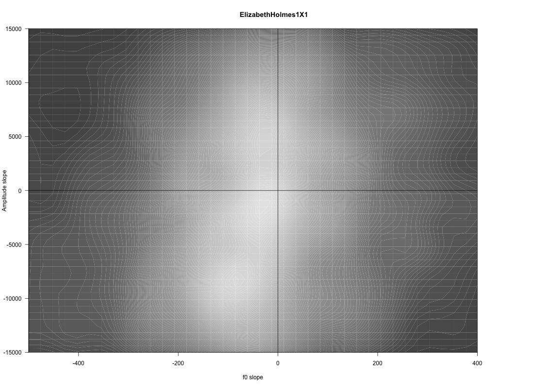
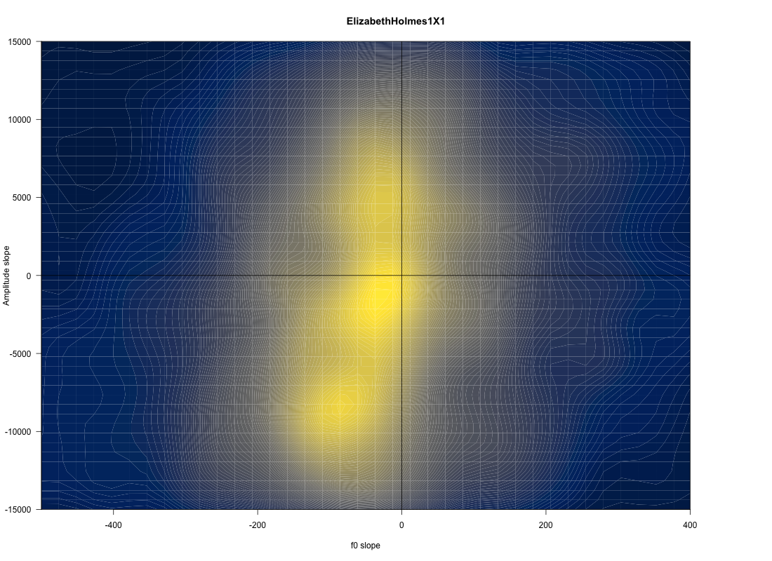
So I thought I'd follow up with a modest sample of alternative ways of coloring the same type of 2-D density plots of rates of F0 change and amplitude change that I used in the Painbows post.
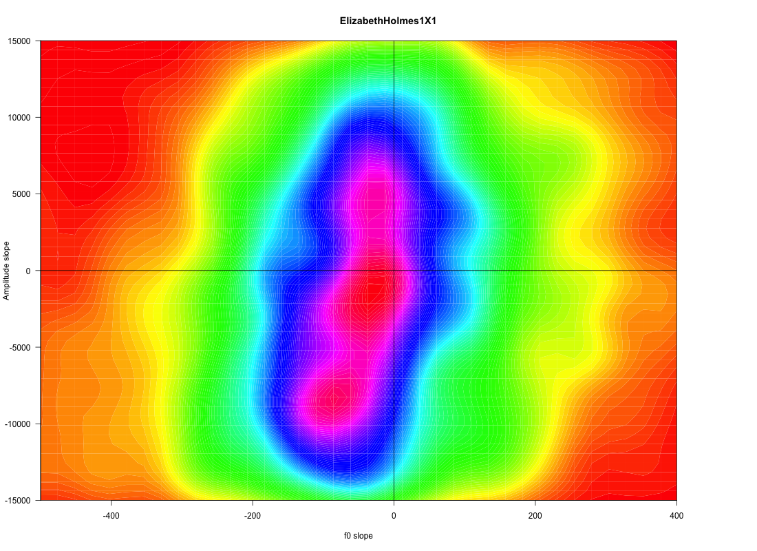
The starting point is a 67-second sample from Elizabeth Holmes in 2019, used previously in "Policing women's voices", 3/23/2019. Here's the "rainbow" version of the Delta F0 by Delta Amplitude plot:
I'm a fan of grayscale for many things, especially spectrograms. But this one is not impressive, though maybe some changes to the default mapping would make it better.
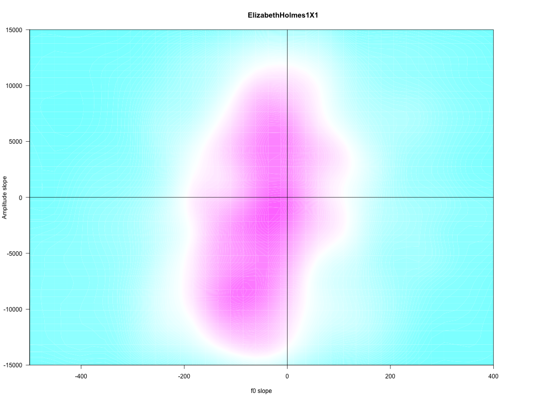
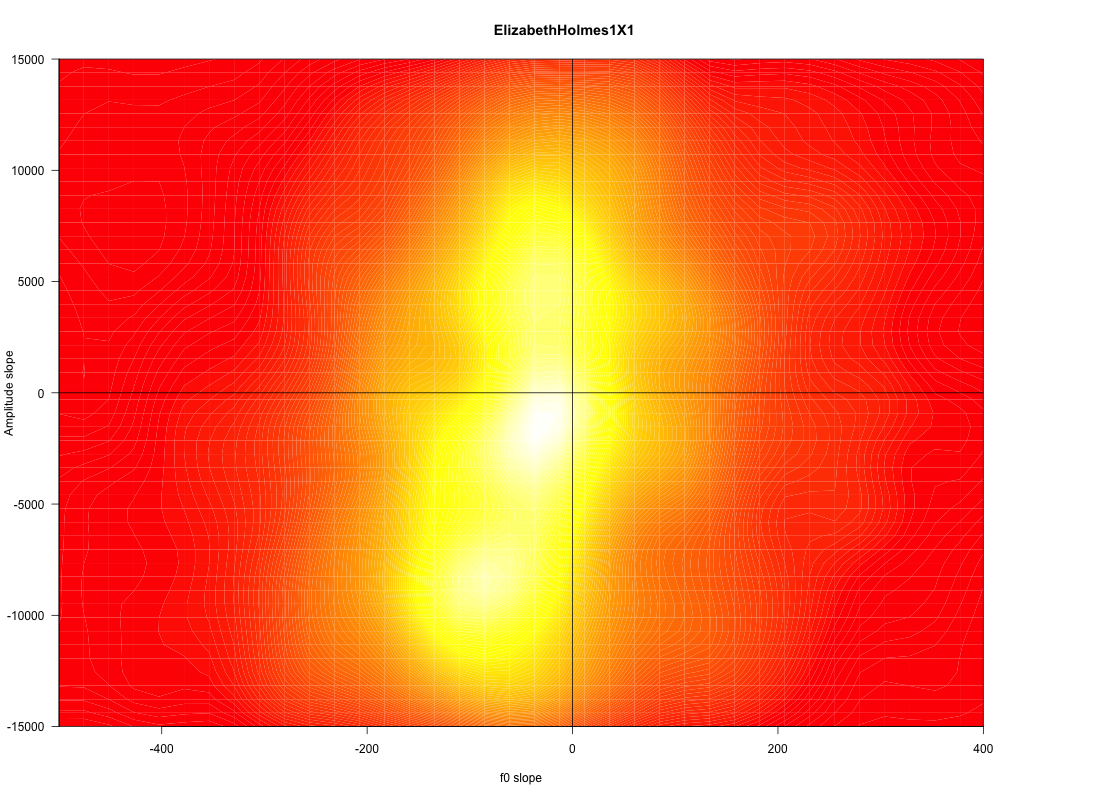
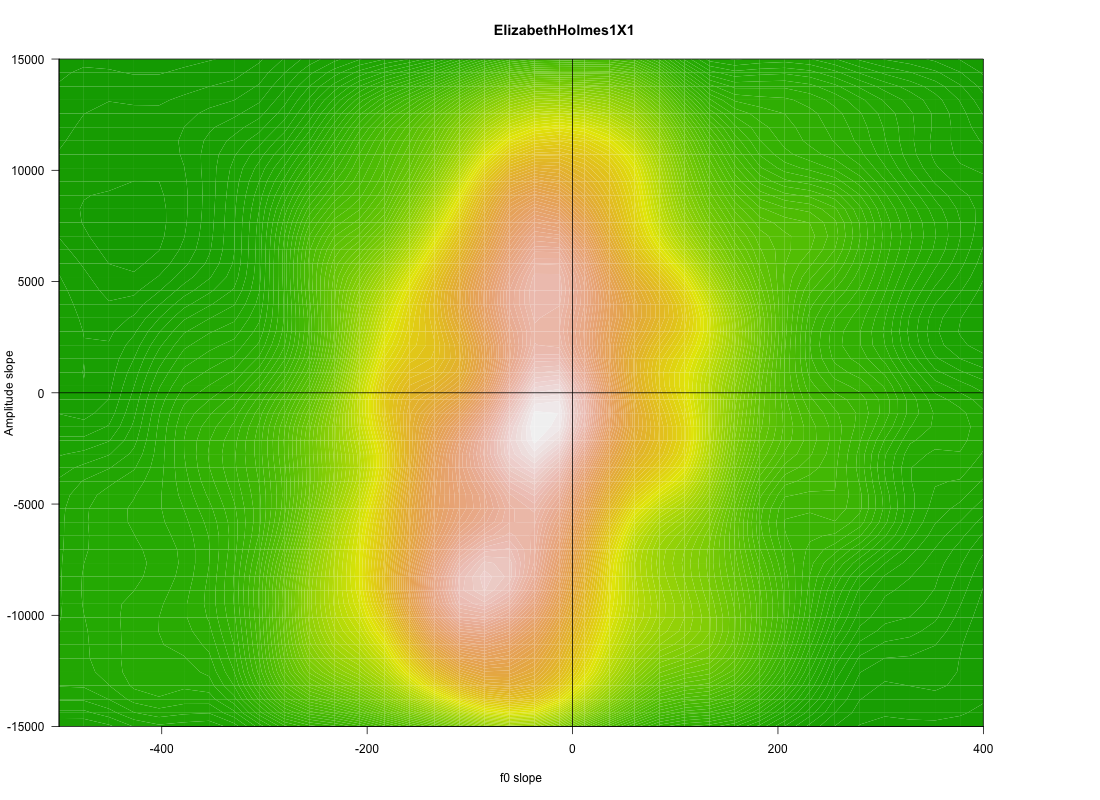
Some other standard R colormaps:
| cm.colors: | heat map: |
 |
 |
| terrain: | topo(graphic): |
 |
 |
…which is (said to be) an improved version of viridis:
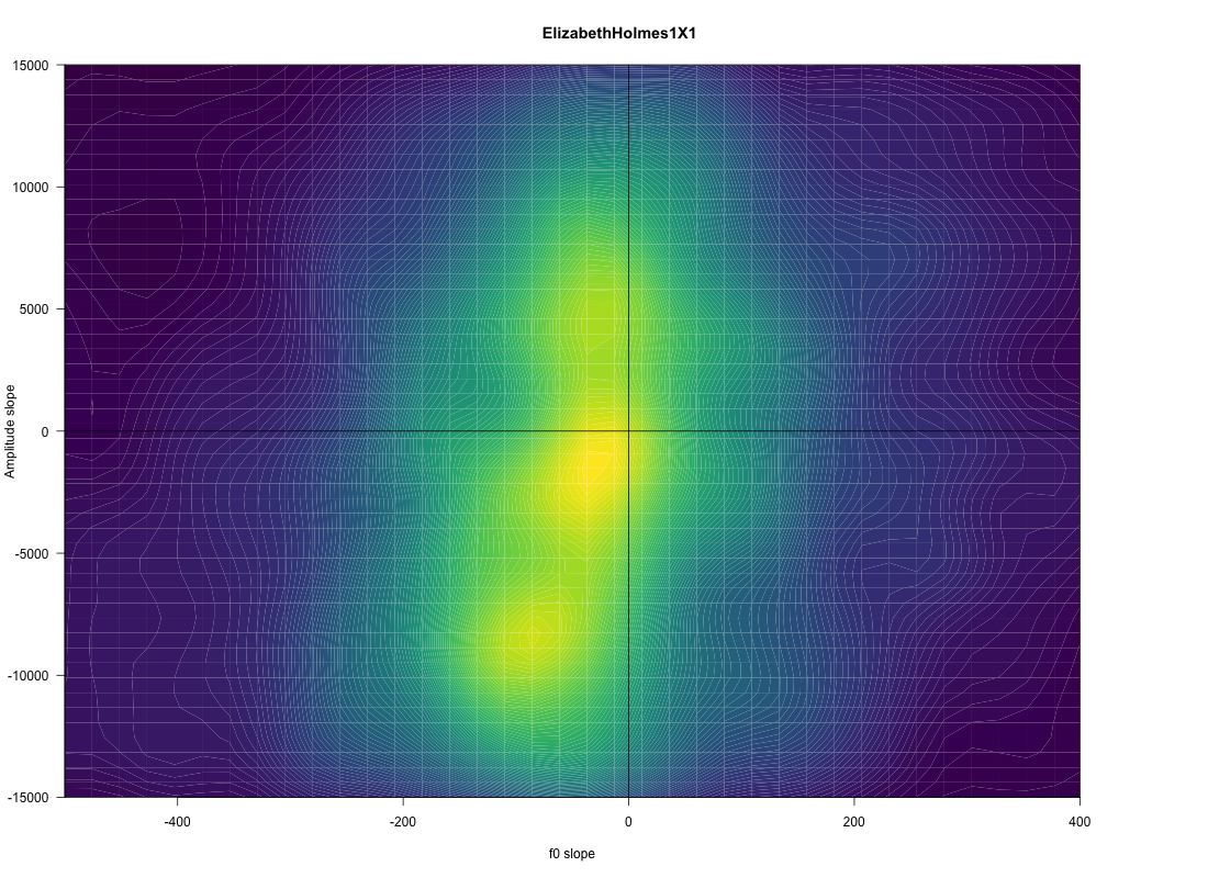
And some more from the R viridis package:
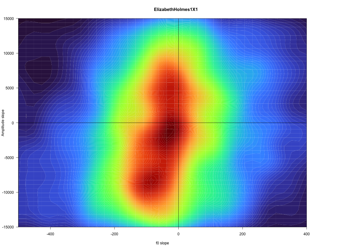
| turbo: | mako: |
 |
 |
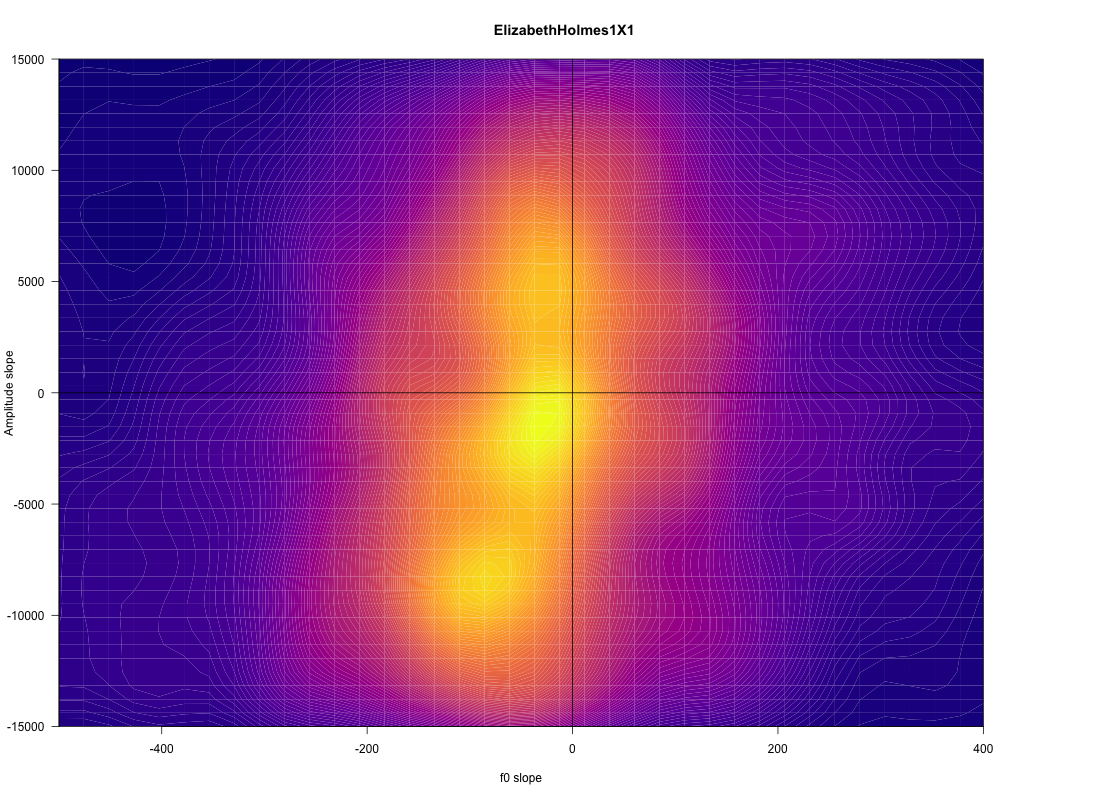
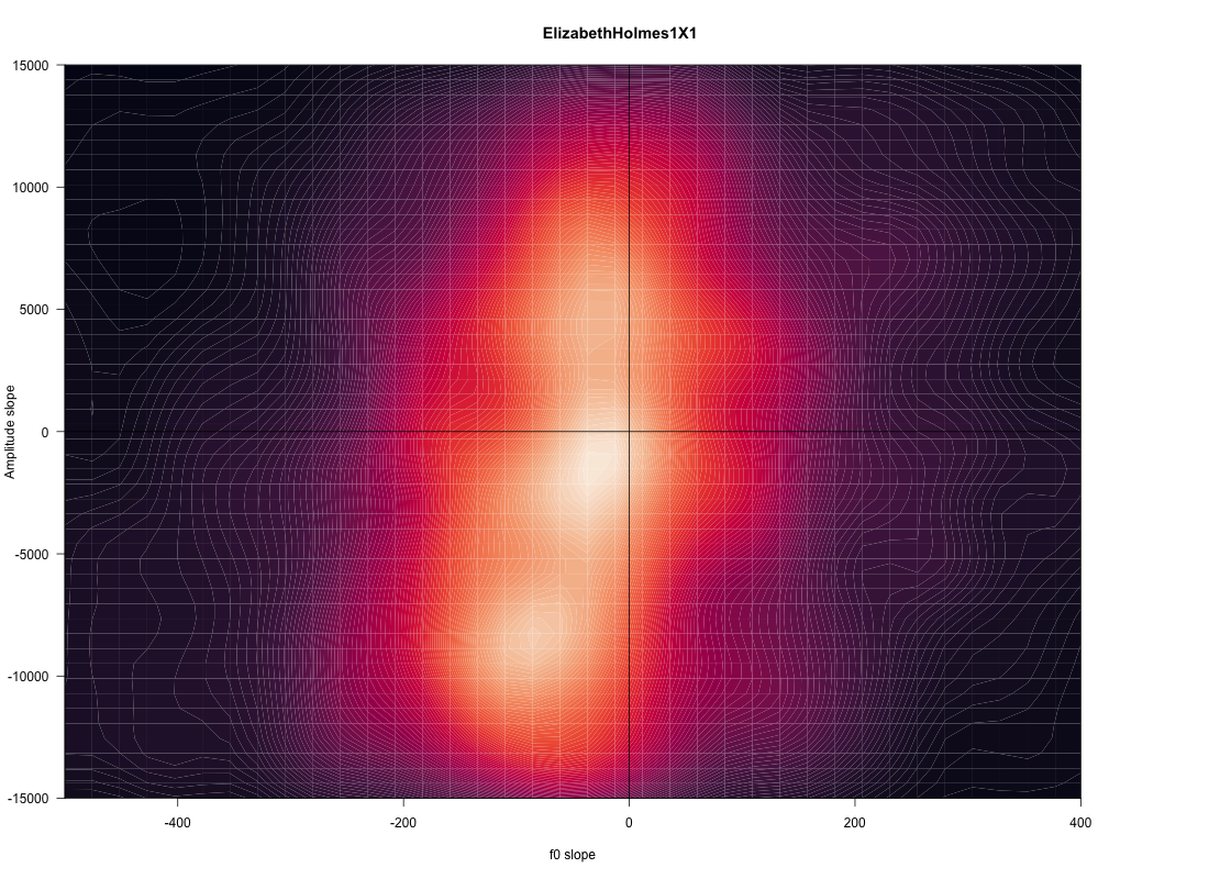
| plasma: | rocket: |
 |
 |
For this particular plot, I kind of like "turbo", though it's not clear to me whether it works for colorblind people:
Phillip Helbig said,
November 9, 2021 @ 9:38 am
I use greyscale plots. I also draw some contour curves at standard values. In astronomy, it has become common to have the worst of both worlds: in essence just the 1-. 2-, and 3-sigma contours, but with the areas in between in different colours, but the same colour for the whole region. So, no more information than just the contours. For the reasons mentioned, greyscale is almost always better, and of course one should indicate the value of each pixel, not have it constant between contours.
At least it gives me a chance to mock the new fashion and say that I prefer fifty shades of grey. :-)
Jerry Friedman said,
November 9, 2021 @ 12:07 pm
Maybe since I'm color-blind (Motto: "Deuteranomaly is not a book of the Bible"), most of them give me the false impression that something interesting is going on in a yellow, white, etc., oblong border around the center. The exceptions are grayscale, heatmap, cividis, viridis, and plasma. The grayscale doesn't show the three lumps inside those "borders", which might be important. Some contour, but fewer than the ones given and black instead of white, would help.
The worst one is "rainbow", which goes dark-light-dark-light-dark-light-dark from the outside i (or vice-versa). The colors are pretty, only which one is red and which one is green, and why don't the extremes look red and violet to me?
A1987dM said,
November 9, 2021 @ 12:08 pm
I like colored maps which still make sense when printed in black and white — my favorite ones are cubehelix and plasma, but cividis, viridis, rocket and mako are also good enough.
Jerry Friedman said,
November 9, 2021 @ 12:10 pm
*Some contour lines (last sentence of my first paragraph)
Jerry Friedman said,
November 9, 2021 @ 12:11 pm
Oh, mako's OK for me too, maybe better than plasma.
Joe said,
November 9, 2021 @ 12:32 pm
Yes, okay, (some versions of) a colorful plot are esthetically pleasing. But it may be form over function.
Look carefully. In "terrain" and "topo" you can see a distinct halo, a contour that looks like a discrete ring of some important signal around the main lump of data. But in each panel that halo is in a slightly different place. That's because it's an artifact of the lumpy color scale. If you used the same color gradient but mapped it to a slightly different numerical range, you would get a different discrete pattern that jumps right out at you – a false pattern. "Turbo" is the worst of these options because it creates several discrete artifacts: I see a red region, a yellow region, a cyan region, a blue region, and a violet region, all of which are arbitrary consequences of the perceptually uneven rainbow vomit scheme instead of the data. And as readers of a linguistics blog may know, even our discrete color definitions may vary from one language/culture to another. This graph would lead you to wrong conclusions for no other reason than the color scale.
General rules: 1) try not to use color mappings for quantitative data in the first place, because human vision is much better at perceiving e.g. bar length (but unfortunately these graphs aren't amenable to that); 2) if you must use a color mapping, map your quantitative variable onto lightness or intensity, rather than hue, whose perception is less accurate and more random from one person to another (even among those without diagnosed colorblindness), not to mention more random from one printer or screen to another; 3) use at most two different hues for a low-to-high scale or three if there is also a legitimately meaningful neutral point between them like zero ("sequential" vs. "diverging" on the excellent ColorBrewer); 4) take care that your hues are equally visible to humans in a perceptual colorspace like HSL, not just equidistant to computers in RGB or CMYK space, preferably without using a lot of red-green contrast since that's the most common form of colorblindness.
David Marjanović said,
November 10, 2021 @ 6:42 am
Because they aren't. They're both red. In the center, instead of violet, there's a bright magenta rim around three connected red blotches.
I think the scale is miscalibrated. Like, it's meant to be 1–10 red–magenta, but the values go up to 11.
~flow said,
November 10, 2021 @ 1:39 pm
thx for the citation!1! I must agree with what Joe said, and want to expand it a bit: I think we (producers and consumers of data) have a penchant to use more colors because when we try out the diverse color schemes, more hues show more details, don't they. The question we must then ask is, do these details have any correlate in reality or in our vocabulary or theory? If none of those, the only thing that separates any value from any other is the single dimension of signal strength. A graphical representation of the data then should likewise not introduce any additional dimensions, and it turns out that hue is a rather salient 'dimensionalizer'. Think of color maps as an analogue to terrestrial maps where we use colors to distinguish sea from land and country from country. Basically, what you get with painbows and even such pleasant schemes as Turbo when applied to continuous scales is 'fake countries' or 'pseudo-provinces' of data.
In map-making one classical habit of the trade is using a scale from greenish to brownish to indicate altitude of land masses. I remember very well that our teacher made it very clear that those colors must not be misunderstood as representing verdant vs barren land or anything of the sort. We're mostly somewhat trained in interpreting the prevalent color schemes on maps, but when your audience is not quite experienced in looking at the data presented and the details of the color schema used, chances are they will interpret the color bands as meaningful data (which they are not as established by a comparison of Terrain and Topo, both of which would appear to highlight 'coastal areas' around an 'island of data', an island whose shape reminds me of Taiwan, which I'm not prone to pareidoli-size into Cividis or Viridis).
I'm always doubtful what to think of the color schemes employed by windy.com (see e.g. https://www.windy.com/-Wind-gusts-gust?gust,53.462,7.910,3,i:pressure). One should think that because wind speed is a continuous variable with no natural barrier between, say, 40kmh and 50kmh, only up to two colors should be used. OTOH people do distinguish between 'calm', 'windy' and 'stormy' (and 'hurrican') so maybe there's something said to be in favor of the multihue scale here. Observe that the purple areas are often over the sea and extend right to the coastline; this is a consistent pattern except in stormy conditions.
Since RGB and CYMK got mentioned earlier in this thread let me add that neither of these are particular good candidates to build a good color scale on; both are rather technology oriented (RGB for three-color monitors, CYMK for the four-color printing process). Their numbers are meant to indicate how much of each component should go into the composite to obtain a defined effect and do not care for the intricacies of human color perception. There are better alternatives, for which see these two links:
https://news.ycombinator.com/item?id=28500014
https://lea.verou.me/2020/04/lch-colors-in-css-what-why-and-how/
[(myl) RGB and CYMK are indeed technological rather than psychological. But human color vision is indeed a (surprisingly linear) three-dimensional subspace of the (effectively) infinite-dimensional spectrum of visible light — see these lecture notes for details. And so there's a linear mapping from those technological vectors to the corresponding psychological ones, at least for whole-field color perception.
Jerry Friedman said,
November 10, 2021 @ 6:17 pm
David Marjanović: Thanks. I was wondering whether something like that was happening.
~flow said,
November 11, 2021 @ 3:54 am
Professor, I searched for "these lecture notes" but couldn't find any link—did you accidentally not include it? As for the linearity of human perceptible color space, isn't it true that many color models make it difficult or are misleading when it comes to mapping such a dimension like 'lightness' to hue as Lea Verou demonstrates? It's not like one cannot correct for that in RGB or CMYK, it's more that a color picker or a naive color scale that are built just by mapping out the numerical values of the components of these schemes with constant deltas between adjacent values tend not to do what their names seem to promise. In HSL, for example, buth a fairly dark shade of blue and a rather light shade of yellow happen to both have 50% L(ightness), yet the blue is considerably darker than the yellow. Meaning that when you use these values that look fine on paper to build your color ramps now your readers have an additional dimension to contend with, perceived lightness, although HSL 'Lightness' was held constant.
Philip Taylor said,
November 11, 2021 @ 4:43 am
"These lecture notes" — https://www.ling.upenn.edu/courses/ling525/EarlyColorVision.html. There is an embedded hyperlink, but it is invisible to the naked eye unless one hovers over the phrase in question.
Peter Erwin said,
November 11, 2021 @ 6:12 am
I kind of like "turbo", though it's not clear to me whether it works for colorblind people
From the original Google AI Blog post that introduced the "turbo" colormap in 2019:
(That post does a nice job of showing how much more (real) detail turbo shows than colormaps like viridis, and how good the latter are at hiding details.)
~flow said,
November 11, 2021 @ 6:36 am
Philip Taylor—alright, there they are! Link marked as red in red text… another hue problem I guess…
Peter Erwin said,
November 11, 2021 @ 3:01 pm
I'm with Mark Liberman on this: the turbo colormap is probably the best, not just for vague aesthetic reasons, but because it shows more detail about the data. (The grayscale colormap is pretty much useless, since it reduces the data to an almost formless blur.)
I spend time just about every day looking at images of galaxies (and of various 2D data sets of galaxies, including things like stellar population maps and velocity fields), and I've experimented a lot with different colormaps. The best for my purposes are rainbow-like maps, because they seem to be best for showing as much detail as possible. Grayscale maps are almost always completely useless (there are specialized cases where they are useful, but these are rare). (Granted, it helps that I use software where I can easily adjust the boundaries and settings of the colormaps
I generally find arguments like Joe's baffling if not downright perverse, since they seem to be founded on the desire to suppress and hide information as much as possible, based on a fear that people might actually learn things from their datasets.
Imagine you were preparing a topographic map for a moderately complex land, and you were told to use no more than two contour levels, no matter how complex and varied the actual landscape was. (Are there particularly high mountains, particularly deep canyons, or a plain with an altitude that changes slowly on large scale? Don't worry, you won't be able to see any of that.) That's what Joe's advice sounds like to me.
Jerry Friedman said,
November 12, 2021 @ 1:32 pm
Peter Erwin: My objection to turbo, and Joe's if I understand him correctly, has nothing to do with detail. It's that the colors are misleading. With my deuteranomaly, the first thing I see when I look at the small version is three regions: blue, yellow, and black. The yellow stands out the most. When I click on it, I can see some green, and the "black" region in the middle looks mostly red, but the overall impression is still the same: three regions, and the yellow one is probably the important or the most different one.
I can guess that it's supposed to mean a gradual increase from violet to red, but to use your word, the method of representing that seems perverse. Yellow is simply not something that's visually between blue and red.
Philip Taylor said,
November 13, 2021 @ 6:42 am
"Yellow is simply not something that's visually between blue and red". There I respectfully disagree. For me, both yellow and green lie between blue and red on the visible light spectrum. See, for example, https://www.thoughtco.com/thmb/h-vN9gnvgNBs7NhWDgFM4fPBHQk=/768×0/filters:no_upscale%28%29:max_bytes%28150000%29:strip_icc%28%29/the-visible-light-spectrum-2699036_FINAL2-c0b0ee6f82764efdb62a1af9b9525050.png
Peter Erwin said,
November 13, 2021 @ 2:24 pm
@ Jerry Friedman,
"the yellow one is probably the important or the most different one."
I have no idea why you think yellow is more "important", or why you think the colors are supposed to encode value judgements about the data. (Which parts of the data are more "important" depends on the data itself and the questions you are asking about it; the purpose of the color map is to allow you to distinguish different features in the data, not sort them by some absolute standard of meaning.)
" Yellow is simply not something that's visually between blue and red."
I should probably point out that I'm an astronomer, and almost all of the plots I prepare are for other astronomers. Since we are all, to coin a phrase, electromagnetically literate, statements like yours are kind of bizarre, like someone asserting that "Mexico is simply not something that is geographically in between the United States and Central America".
Of course, it's useful for me to reminded that many — probably most — people out there are ignorant about the basic physics of light and color, and so a rainbow color scheme is not necessarily an intuitive one for the general public. But not all scientific data displays are meant for the widest possible audience.
Jerry Friedman said,
November 13, 2021 @ 3:39 pm
Peter Irwin and Philip Taylor:
It occurred to me after I wrote "Yellow is simply not something that's visually between blue and red" that I should have made "visually" more obvious. Maybe something like "visually (rather than physically)" or "in human vision". Of course I learned the colors of the spectrum as a child. But in human vision, yellow is a separate color, one of the subtractive primaries. It is not between red and blue, and therefore, yellow in a false-color data visualization doesn't intuitively convey "between red and blue". Of course, if one has seen many visualizations where it's used that way, especially where the red and violet are related to the physics underlying the data as with Doppler shifts, one can develop such an intuition.
To follow Peter Irwin's analogy, "Yellow isn't visually between red and blue" is quite different from "Mexico isn't geographically between the United States and Central America." It's like "Mexico isn't linguistically between the United States and Central America," or better, "Korea isn't linguistically between Japan and China."
Peter Irwin: I have no idea why you think yellow is more "important", or why you think the colors are supposed to encode value judgements about the data.
I get the impression that yellow represents the most important feature because it's a bright, "advancing" color that's lighter than red and blue, in human vision. Therefore the yellow looks like the foreground and the red and the blue look like the background. And if I know what the data represent, I get the impression that the colors encode some kind of judgement about the data because of the gratuitous use of the full spectrum. Why would someone choose to make roughly continuous slopes look like three qualitatively different regions? I trust they have a reason.
That's much like what A1987dM, Joe, and ~flow said above.
(Which parts of the data are more "important" depends on the data itself and the questions you are asking about it; the purpose of the color map is to allow you to distinguish different features in the data, not sort them by some absolute standard of meaning.)
Turbo strikes me as a poor way of conveying that because it appears to emphasize some features of the data. (However, if I saw it in a different context, I'd guess it reflected the designer's standard of meaning rather than some absolute standard.)
Of course, it's useful for me to reminded that many — probably most — people out there are ignorant about the basic physics of light and color, and so a rainbow color scheme is not necessarily an intuitive one for the general public. But not all scientific data displays are meant for the widest possible audience.
I hope it's also useful for you to be reminded that a rainbow color scheme may not be ideal even for people who aren't ignorant about those things. Turbo worked well for some people here, but not others.
Philip Taylor said,
November 14, 2021 @ 7:46 am
OK, perhaps I am overly familiar with the "natural" spectrum and am having difficulty imagining another. Are you (Jerry) able to produce a red–blue continuum which has a colour other than yellow or green between the two ? If so, I would be most interested to see it.
Jerry Friedman said,
November 14, 2021 @ 10:45 am
Philip Taylor: Of course, blue-purple-red. You can see a poorly constructed version in the "rainbow" plot, and I'm sure better versions are available.
If you want to do the whole spectrum, then in principle, you could avoid the luminance problem I see in turbo by going through shades of brown instead of orange and yellow. I doubt that would work well.
The first question, though, is whether blue and red are good choices for the extremes of your data, if you're interested in clarity of presentation. I can see that such a method (or red and violet) would be good for Doppler-shift data presented to astronomers, but I'm not convinced of it for the linguistic data here.
By the way, as a physics teacher I'm familiar with the visual spectrum and some of the elementary physics behind it.
Philip Taylor said,
November 14, 2021 @ 11:48 am
Well, when I look at the "rainbow" plot, I don't see a continuum. Not just because it consists of a discrete set of closed curves, but because the blue does not appear (to my eyes) to "dissolve" into the purple. When you look at the blue—cyan boundary, there is a clear continuum; at the blue—purple boundary, I see two colours each fading out, but nothing in between.
Jerry Friedman said,
November 14, 2021 @ 12:22 pm
That's why I said it's poorly constructed. Here's a better one. (Note that clicking the red-purple- blue image shows you a different version.) If you don't like that, you might be to find something even better by using terms such "blend" and "gradient".
I don't understand the technical terms on that page, and I have only a vague general idea of how this is done, but I know what it looks like to me.
Thomas Shaw said,
November 16, 2021 @ 12:44 pm
To quote from the conclusion of the google AI blog post that Peter Erwin linked above, "Turbo is a slot-in replacement for Jet, and is intended for day-to-day tasks where perceptual uniformity is not critical, but one still wants a high contrast, smooth visualization of the underlying data." Turbo does not claim to be the best colormap for every purpose, but in my (non-colorblind) experience it is a useful one for being able to distinguish detail without overemphasizing particular features.
That blog post also has a detailed description of what the colormap is, how it was designed, and what features it optimizes. One that is relevant to some points that have been made above: "Turbo mimics the lightness profile of Jet, going from low to high back down to low, without banding. As such, its lightness slope is generally double that of Viridis, allowing subtle changes to be more easily seen. This is a valuable feature, since it greatly enhances detail when color can be used to disambiguate the low and high ends." Maybe this is the source of Jerry Friedman's "The yellow stands out the most," since it is the lightest part? This is again a chosen tradeoff, favoring local and global distinguishability of the colors over e.g. semantic mapping of lightness to a numerical scale.
I would also note that it is common to supply a colorbar beside a plot that uses a colormap like this, and having many easily distinguishable colors is very helpful for mapping a color from the plot onto the colorbar, when the reader wants to pick out a number or compare two numbers. In other words, a colormapped plot is just a part of a larger context, and should never be depended upon to make the whole point — it's one way of showing complicated data all at once, that should be supported by detailed analysis.
Finally, just to add to the resources here, I have found the "scientific colormaps" of Fabio Crameri to be useful. Website: https://www.fabiocrameri.ch/colourmaps/ Paper: https://www.nature.com/articles/s41467-020-19160-7 (I think that is open access). One thing I learned from this is the presentation trick of showing a color given by x + y*sin(x), so that you can see how distinguishable nearby colors are at different parts of the range by looking at the contrast in the wiggles.