Painbows
« previous post | next post »
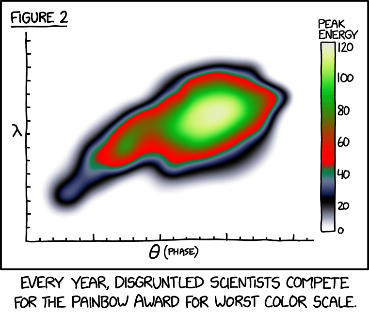
A recent xkcd:
Mouseover title: "This year, our team took home the dark blue ribbon, better than the midnight blue we got last year but still short of the winning navy blue."
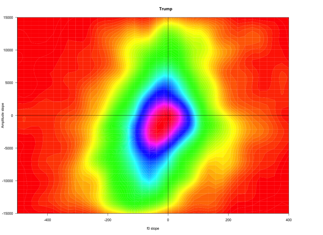
One of my own entries in the painbow competition, from "Macronic and Trumpish prosody", 8/31/2019:
See also:
"Some visualizations of prosody", 10/23/2016
"Tunes, political and geographical", 2/2/2017
"My poster for the 'Prosody Visualization Challenge'", 6/14/2018


Jeremy said,
November 6, 2021 @ 11:11 am
Mark, your painbow entry is certainly non-intuitive. Did you choose to make it that way, or was the color scheme imposed by your graphing software? I can grok the Roy. G. Biv model — others generally lead to my consternation.
[(myl) Appropriately, it's R's "rainbow" color palette. Next time I should create a "painbow" palette, obv…]
MattF said,
November 6, 2021 @ 1:35 pm
I’ve made plots like that— I regard it as a way of doing of quick-and-dirty contour plotting. The unfortunate red-green scale should be avoided because colorblind readers can’t see the contrast.
bks said,
November 6, 2021 @ 5:07 pm
Grayscale is superior to color in almost all situations. Speaking for the color-challenged.
unekdoud said,
November 6, 2021 @ 6:08 pm
Cubehelix (which is over a decade old!) converts to an increasing ramp in grayscale, while Turbo claims to be a colorblind-friendly version of Jet.
Jon said,
November 7, 2021 @ 12:35 am
I experimented with various schemes 25 years ago, looking for the greatest clarity. In situations where there may be abrupt transitions from one level to another in adjacent pixels, omitting intermediate shades, grading schemes should always approximate a greyscale.
I found that a smooth scale from pale yellow to dark brown gave the clearest display, with white meaning no data.
I don't find the cubehelix scale gives an intuitive feel for magnitude, and would rather have a smooth greyscale than that.
Peter Erwin said,
November 7, 2021 @ 5:16 am
I feel a bit awkward pointing to this, since some of the authors are friends of mine, but the figures in this astronomy paper include some spectacularly awful color schemes. Figure 3 is particularly bad — worse than xkcd's example, I think — since it uses two different color schemes for the two different sets of velocity plots (middle row and bottom row), where it's the same (aesthetically unpleasant) set of colors, but ordered differently, just to maximize the confusion.
(For context, the nearly universal standard when plotting observed Doppler-shifted velocity fields in astronomy — as in the second row of that figure — is a rainbow scheme with highest velocities at the red end and lowest (or most negative) velocities at the blue end. This is a direct and obvious physical metaphor for what's going on: the highest velocities correspond to spectra "redshifted" to the longest wavelengths, while the lowest/most negative velocities correspond to spectra "blueshifted" to the shortest wavelengths. (Obvious to astronomers, at least, since we all know what the physical ordering of colors in the rainbow is.)
~flow said,
November 8, 2021 @ 6:09 am
There are in fact proposals to leave painbows behind and rather use bichromatic scales like Cividis:
https://www.scientificamerican.com/article/end-of-the-rainbow-new-map-scale-is-more-readable-by-people-who-are-color-blind/
https://github.com/marcosci/cividis