QWERTY again
« previous post | next post »
Various readers have pointed out to to me that the "QWERTY Effect" is back. (For coverage of the first QWERTY-Effect paper, see "The QWERTY Effect", 3/8/2012; "QWERTY: Failure to Replicate", 3/13/2012; "Casasanto and Jasmin on the QWERTY effect", 3/17/2012; and "Response to Jasmin and Casasanto's response to me", 3/17/2012.)
The new paper is Casasanto, D., Jasmin, K., Brookshire, G. & Gijssels, T. "The QWERTY Effect: How typing shapes word meanings and baby names". In P. Bello, M. Guarini, M. McShane, & B. Scassellati (Eds.), Proceedings of the 36th Annual Conference of the Cognitive Science Society. Austin, TX: Cognitive Science Society, 2014.
As before, the idea is that typing letters with the right hand makes us like them more; or in the words of their abstract,
Filtering words through our fingers as we type appears to be changing their meanings. On average, words typed with more letters from the right side of the QWERTY keyboard are more positive in meaning than words typed with more letters from the left: This is the QWERTY effect (Jasmin & Casasanto, 2012), which was shown previously across three languages. In five experiments, here we replicate the QWERTY effect in a large corpus of English words, extend it to two new languages (Portuguese and German), and show that the effect is mediated by space-valence associations encoded at the level of individual letters. Finally, we show that QWERTY appears to be influencing the names American parents give their children. Together, these experiments demonstrate the generality of the QWERTY effect, and inform our theories of how people’s bodily interactions with a cultural artifact can change the way they use language.
The most interesting new result is the baby-names experiment, in my opinion; and since I'm stuck in Heathrow Airport for a while, I thought I'd take a quick look at it.
Their dataset comes from from the U.S. Social Security Administration's listing of "Popular Baby Names", and specifically from the "National Data", which the SSA describes as follows:
For each year of birth YYYY after 1879, we created a comma-delimited file called yobYYYY.txt. Each record in the individual annual files has the format "name,sex,number," where name is 2 to 15 characters, sex is M (male) or F (female) and "number" is the number of occurrences of the name. Each file is sorted first on sex and then on number of occurrences in descending order. When there is a tie on the number of occurrences, names are listed in alphabetical order. This sorting makes it easy to determine a name's rank. The first record for each sex has rank 1, the second record for each sex has rank 2, and so forth.
To safeguard privacy, we restrict our list of names to those with at least 5 occurrences.
Casasanto et al. describe their first baby-name experiment this way:
We first analyzed the mean RSA of all names from 1960–2012 that had been given to at least 100 children every year (n = 788 distinct names).
Their definition of RSA:
Following J&C, we calculated the Right Side Advantage for each word by taking the difference of the number of letters on the right side of the keyboard (y, u, i, o, p, h, j, k, l, m n) and subtracting the number from the left side (q, w, e, r, t, a, s, d, f, g, z, x, c, v, b );[RSA=(# right-side letters) – (# left-side letters)]).
Their tabulation of mean-baby-name-RSA presents a convincing picture:
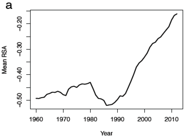
There's certainly a trend since the late 1980s. They associate this with the "QWERTY era":
It is difficult to pinpoint the moment in history at which QWERTY became ubiquitous in Americans’ homes, and a part of people’s daily lives across a wide variety of demographics. Apple Macintosh and Windows home computers became available, though not yet widely used, in 1984 and 1985, respectively. America Online made the Internet widely available in people’s homes starting in 1991. We chose the year 1990 as the beginning of the “QWERTY era” based on a survey of technological landmarks like those listed above, and on the inflection point observed in figure 5a, rounded to the nearest decade.
In trying to replicate and extend their results, I encountered some difficulty in determining exactly what their recipe for calculating the values in Fig. 5a was. The SSA's list separates names by sex, e.g. in 1960 we have:
Alva,F,59
Alva,M,60
Therefore in 1960, neither Alva-for-males nor Alva-for-females makes the threshold of 100, but Alva is certainly one of the "names … that had been given to at least 100 children" in that year.
If I interpret their recipe literally, and add the counts for male and females in each year, I get 802 names with a count of 100 or more children in every year from 1960 to 2012. If instead I threshold male and female names separately, and accept only those where one or the other had a count over 100, I get 791 distinct names.
Since neither 802 nor 791 is equal to 788, either my two interpretations of their recipe are both wrong, or there's a bug in my code, or there's a bug in their code. Anyhow, I'll go with the second list, since 791 is closer to 788 than 802 is.
But there's a further uncertainty in the recipe for calculating the "mean RSA" of baby names in a given year.
The name "Adrian" has two right-side letters (i+n) and four left-side letters (a+d+r+a), for an RSA of -2. The name "Sandy" has two right-side letters (n+y) and three left-side letters (s+a+d), for an RSA of -1.
In 1960, the SSA gives the following counts for these two names:
Adrian,F,107
Adrian,M,558
Sandy,F,3649
Sandy,M,175
And both of them make both ">= 100" lists, not only for 1960 but also for all subsequent years. But what's the "mean RSA" here? Is it the per-word-token mean RSA:
(-2*107 + -2*558 + -1*3649 + -1*175)/(107+558+3649+175) = -1.148
Or is it the per-letter-token mean RSA:
(-2*107 + -2*558 + -1*3649 + -1*175)/(107*6+558*6+3649*5+175*5) = -0.223
The scale on their Fig. 5a suggests that it's the latter.
But this leaves one more uncertainty. Consider the name "Alex" in 1961:
Alex,F,21
Alex,M,1219
It's on both ">=100" lists, because of the reliably large number of male Alexes. But the number of female Alexes doesn't surpass 100 until 1986. So in pre-1986 years, do we count the female Alexes or not? Given that "Alex" has 1 right-side letter (l) and three left-side letters (a+e+x), for a difference of -2, does "Alex" contribute -2*4*1219 to the RSA numerator, and 1219*4 to the RSA denominator? Or does it contribute -2*(21+1219) to the numerator, and (21+1219)*4 to the denominator?
I'll assume the former, and go forward. On that basis, I get this graph as an attempted replication of their Fig. 5a:

The shape is similar to their Fig. 5a, though it's different enough that it's clear my recipe is not quite the same as theirs. Still, I'll take this as replication of their result, and evidence that "Mean RSA" (under my interpretation as well as theirs, whatever exactly it is) has increased (by about 70%) since 1990.
But two obvious questions arise. Why limit consideration to names that occur more than 100 times in every year? And why look only at the evidence since 1960, given that the SSA data goes from 1880 forwards?
Limiting consideration to the commonest names will emphasize the effect of popularity changes in particular names, given the power-law (or more likely, log-normal) distribution of name frequencies. But I don't see any obvious reason to think that letter-preference effects should apply only to names with some minimum count across the 1960-2012 period.
If instead we do the same calculation for all the names in the SSA list (those with a count of greater than 5), we get this picture for the period from 1960 to 2012:

There's certainly still an upwards inflection shortly after 1990, though now the post-1990 change is only about 39%, and there's almost as much of a rise (31%) from 1960 through 1979.
If we do the same calculation from 1880 to 2012, we get this graph:

And this picture, in my opinion, makes it somewhat less plausible that whatever has happened since 1990 is due to the increase in typing caused by the rise of AOL and so forth.
What explains the steep drop from 1945 to 1955? Or the big rise (of 42%) from 1955 to 1979, now larger and longer than the 39% rise from 1990 to 2011?
I would guess that the down/up/down oscillations from 1945 to 1955 to 1979 to 1990 were caused by swings in the popularity of a few names, name-morphemes, or name fragments.
In the pre-personal-computer era, these causes seem more plausible than oscillations in the amount of typing that Americans do, or any other activities that might be imagined to give them changing valence-associations for different letters. And it's not at all obvious that what's happened since 1990 is different.
In addition to changes in the popularity of particular names, there are large changes in name spelling that may have quite a bit of leverage on "mean RSA" measures. Thus the popularity of names with final "i" has changed recently, in ways that parallel the "mean RSA" changes:

This might be because "i" is a right-side letter — or it might be because Naomi is one of the biblical names that have become popular recently, and because Charli and Laci seem somehow cuter than Charlie or Lacie, and …
Craig said,
May 14, 2014 @ 9:11 am
If there were a relationship between typing and the popularity of baby names, you'd expect to see very little correlation until typing became a common skill. Even then, you'd have to take into account that typing was far more common among women than men, and consider how often babies' names are chosen solely by the mother. I don't have any figures to support this, but I suspect typing only became a common skill for men in the 1970s or '80s; up until then, in most business environments, typing was done by secretaries (usually female) or a pool of typists (usually female).
I'm sure there are a number of different factors involved in what names people choose to give their children, but I would be astonished if the position of letters on the QWERTY keyboard were one of the more significant ones. More often, I think people choose names based on their sounds and associations.
Overall, this seems like a good example of "correlation is not causation" even to the extent that there is any correlation at all here.
un malpaso said,
May 14, 2014 @ 9:43 am
Another thing to remember is that, as the prevalence of texting on mobile devices and pads is increasing, more and more often people are not even typing with both hands. Some use both thumbs, some swipe or stab with one finger…
George said,
May 14, 2014 @ 9:53 am
@un malpaso
Not to mention the fact that texting on a 'classic' mobile phone doesn't involve a QWERTY layout at all.
Also, I've just been observing myself typing and while I never appear to type letters on the right side of the keyboard with my left hand, I often type letters on the left side of the keyboard with my right hand. Of course, I never received any actual training in typing… but in this day and age what proportion of us has?
Steve Kass said,
May 14, 2014 @ 10:14 am
Good guess. If my quick calculation is correct, between 1945 and 1955, Debra and Deborah are responsible for about three-quarters of the drop.
KevinR said,
May 14, 2014 @ 10:28 am
Looking at the vertical scale, I'd guess the authors used per-word-token averages (to get a 1980 peak of -.43ish) while you used per-letter-token averages (to get a 1980 peak of -.10). 4-5 letters seems a little short for average word length, though.
On the rise of terminal 'i' — is this replacing terminal 'ie' or 'y'? If y, then there is no change in left-right.
On the post-war trend — is there perhaps an ethnic component to this? Do Hispanic and Asian names have a notably different left-right balance than the pre-war names (mainly European)?
Maybe there is a pattern of using dimunitive names as full names?
pj said,
May 14, 2014 @ 11:00 am
There's got to be some kind of numerology-style fortune-telling scam pile to be made from convincing people of the significance of their name's RSA, right? RSA 6: you will be blessed with great good fortune, but are sensitive. Avoid meeting an old friend on Thursday.
J. W. Brewer said,
May 14, 2014 @ 11:20 am
One datapoint contrary to the alleged trend is the given name "John" which is a right-hand only string (don't know how common those are in this context*), which thus seems like it ought to have a RSA of infinity or something rather than merely 4. It was the #1 boys' name in the U.S. from when the SSA data begins (1880 births) through 1922; then continuously in the top 5 until 1972; then continuously in the top 10 until 1986; then further decline since then (#27 last year).
Jonathan Mayhew said,
May 14, 2014 @ 11:45 am
If this effect is really robust then it should be obvious that Julia and John are more positive names than Sara and Serena, that Rose is not as nice a flower for a flower as a tulip, or swan is an uglier name for a bird than jay, but I don't feel that intuition, as a left hander. Nor, indeed to a I feel an opposite inclination toward the left of the keyboard. As I understand it, they are arguing for a kind of "poetic function" in naming, akin to other preferences related to the sound of words. The rlrl pattern of Jane is pleasant to type, but is that going to be a strong factor in naming?
Geoff Brookshire said,
May 14, 2014 @ 12:11 pm
Thanks for you interest in our new study. The analyses you posted, Mark, did not accurately reproduce our analyses, and they are not clearly interpretable.
For clarification, please see this brief reply: http://casasanto.com/papers/LL-response-2014-05-14.pdf
J. W. Brewer said,
May 14, 2014 @ 1:30 pm
Is there really no pre-existing scholarship on the timing of the "QWERTY era," such that picking 1990 as the line is methodologically defensible? There are two somewhat separate issues with perhaps different timelines: a) what percentage of the relevant population could touch-type and thus had internalized letter-finger associations at a subconscious level; and b) what percentage of the able-to-type population used that skill as their default mode of drafting/composing texts (rather than e.g. writing out first drafts long-hand and only typing up the results later on once the word choices had already been made, which might plausibly might make the RSA less psychologically salient)? But I find it difficult to believe that there is no data on either of those things out there. Certainly as to a), what percentage of high school graduates or incoming college freshmen could type at a certain level of proficiency seems like exactly the sort of question that there's a longitudinal study of in some dusty volume in your local research library.
(My own a & b datapoints are that I learned to touch-type reasonably well in high school c. 1980 and learned to compose effectively on a QWERTY typewriter as a college freshman in '83 in the context of learning how to dash off papers the night before they were due such that the first draft better be good enough to turn in because no time was left to edit. OTOH I did not communicate via email until '94 or '95.)
Theodore said,
May 14, 2014 @ 2:43 pm
Even in light of the authors' response posted above, I still wonder about a couple things:
The calculation of RSA as a difference gives greater weight to longer names, which could cause a few extremely popular long names to dominate the calculation. (Why not calculate as a ratio of RH letters to LH letters?)
The QWERTY layout is not random; it was based at least loosely on some phonological and orthographic realities of English in the late 19th century U.S. Couldn't some other correlated language or demographic change be behind the apparent trend? E.g., have we developed some phonetic aversions? Is there an increasingly prominent subset of the population for whom the (left-side) letters Q, X and F are not native?
the other Mark P said,
May 14, 2014 @ 3:17 pm
I don't have any figures to support this, but I suspect typing only became a common skill for men in the 1970s or '80s
It still isn't. I once had a woman says to me – "You type like a girl", meaning that I could actually type properly, without looking.
Most people operate with a very right handed tendency, as George does, not true left/right split at all.
I wouldn't be surprised if less people can "touch" type now than 30 years ago. When I started work we had a typing pool, a dedicated group who could really type. Now everyone does their own typing, mostly quite badly.
J. W. Brewer said,
May 14, 2014 @ 3:29 pm
To give a practical illustration of one of Theodore's point, ELIZABETH and RACHEL have the same ratio (2:1 left-hand over right-hand) but different differences (-3 versus -2).
Steve Kass said,
May 14, 2014 @ 3:31 pm
There are some very interesting other trends in this data. I repeated* the authors' "more comprehensive" and "conservative" analysis for the "LHA" (last half of the alphabet advantage, defined as the number of n-z letters minus the number of a-m letters). The resulting graph is here: http://i.imgur.com/tABuTVW.gif
The mean LHA increases steadily and significantly from -1.6 to -1.1 between 1880 and 1931. Then it drops, almost monotonically, to just under -1.3 in 1953, rises for ten years, but then begins a nearly-uninterrupted 50-year fall to about -1.75. The trends are striking, and no doubt the p-values for them are vanishingly small.
What could the reason be? What historical or technological milestone in 1931, 1953, and/or 1963 influenced Americans' feelings about the alphabet?
*Almost repeated. I used a database I'd created a while back, so my data only goes through 2010, not 2012. In addition, I considered otherwise-identical male and female names to be different, so compared to the authors, I may have left out some names, if there were any that only reached the N=100 threshold in some year(s) when male and female were combined. Since the average is weighted, this probably doesn't have much impact, but I'll redo the analysis when I get a chance. I'll also repeat it with 1960 as a starting date, since the SSA data for birth years before 1940 is very biased. It's only more recently that most Americans could be assumed to have filed an application for a Social Security card. The N=100 bar is also much higher for the early years, by the way, when there were only a few hundred thousand names recorded per birth year as opposed to a few million. A percentage threshold might be more appropriate, given that the total number of people in the database per year increases over time by a factor of more than ten.
J. W. Brewer said,
May 14, 2014 @ 3:57 pm
Steve Kass: it's a fair point as to the earlier-years data being seriously incomplete, but is there any reason to think it's biased? I.e., I assume that the data for, say, 1886 excludes the quite high percentage of Americans in that birth-year cohort who died before Social Security came along, but is there any particular reason to think that the distribution of names among the longer-lived subset differed systematically from the distribution among the shorter-lived subset? (A separate question is to what extent the data distinguishes between U.S.-born holders of names and immigrants who came to the U.S. and got into the SSA's database later in life – perhaps sometimes with an Americanized version of their original birth name and other times not.)
A separate issue is that the SSA database tracks only "official" names. There are plenty of Americans named, say CHRIS or PEGGY who have been universally known by those names since birth and have never been CHRISTOPHER or MARGARET other than on official paperwork. To the extent the name-in-use has a different numerological value than the name-in-the-paperwork (sometimes the RSA contrast can be dramatic as e.g. MOLLY v. MARY), which should control? It seems implausible to think that parents could uniformly have been subconsciously influenced by the QWERTY valence of the official version to the exclusion of that of the in-use version. Of course we don't necessarily have a good longitudinal dataset for the names-in-use (at least not one generated by the SSA or any other government agency of which I'm aware), especially when you consider that many historically popular names are associated with multiple names-in-use and there's no reason to think that e.g. the percentage allocation of MARGARETs among MAGGIEs, PEGGYs, and other options has been constant over time. But using what is likely not the right dataset for the hypothesis you are testing because you don't have anything better is a path rife with hazards.
D.O. said,
May 14, 2014 @ 4:55 pm
The whole QWERTY effect concept seems like an April Fools joke, but I cannot help myself. Not being able to understand why whatever alphabetical advantage is claimed should be calculated only for popular enough names (people who give their kids unusual names are so messed up that keyboard layout is of no significance to them?) and believing that Peregrine should count 3 for 'e' and 2 for 'r', I simply added all letters in all names in the database for a given year and took averages. The differences in percentages (out of all letters) from 1990 to 2010 look like this
A +4.0%
Z +1.7%
E +1.1%
J +0.8%
—
L -1.2%
D -1.5%
T -1.9%
C -2.6%
S -2.6%
So the main story is that the left side of the keyboard (a, s, c, t, z, d) is changing fast in frequencies, while the right side is more stable. RSA difference of 0.3% is a small ripple on that. New theory: while choosing baby names, parents are trying to maintain left-right balance. Should I send it to the Annual Conference of the Cognitive Science Society or to The Onion?
AntC said,
May 14, 2014 @ 5:08 pm
@KevinR On the rise of terminal 'i' — is this replacing terminal 'ie' or 'y'? If y, then there is no change in left-right.
Surely we should be considering not only left-right, but how far displaced left-right!(?) Then 'i' is further right than 'y', but 'ie' is roughly the same.
Daniel Barkalow said,
May 14, 2014 @ 5:10 pm
Based on the authors clarification of their method, it looks like their results would be entirely unaffected if 90% of the parents in 2010 had chosen to name their child "Dwarf", so long as this didn't change the distribution of the other 10%. And, in fact, it didn't matter to the outcome at all that the 4th most popular name for a girl in 2013 is typed entirely with the left hand, because that name wasn't popular enough in 1976.
Jonathan Mayhew said,
May 14, 2014 @ 5:23 pm
I'm wondering if research has been done on neuropsychology of activities like touch typing, drumming, and running that require balanced, symmetrical, or coordinated use of left and right. The best names from a typist's point of view might plausibly be ones that lead with the right and then alternate strokes between the hands, like Jane. You could also look at paradiddle names like Jenn. The paradox is that the better typist you are, the more ambidextrous you probably are, so any bilateral preference would probably be greatly attenuated. Also, the less conscious you are of what letters are on the left and which are on the right. I honestly don't know in my conscious mind though I can type without looking at the keyboard. Of course I can tell you by typing the word and seeing what finger moves.
AntC said,
May 14, 2014 @ 5:29 pm
@Craig … typing was far more common among women than men
I believe that when first invented, typewriters were considered so high-tech only men could operate them. The competition for typing speed between QWERTY layout and others was amongst male typists.
So the long decline in RSA from 1880 to 1950s must be due to the rise of the (female) typing pool.
The bounce-back thereafter is the influence of (mostly male) commercial programmers, who were coding stuff with very different keyboard patterns to English, and paired with the social revolution, took more of an interest in naming children.
More recently, as others have noted, the rise of txting has put a spanner in the works.
Hey, can I get a grant for this kind of nonsense?
Keith M Ellis said,
May 14, 2014 @ 6:38 pm
This is cargo cult science. None of these researchers have a background in statistics, they are all psychologists and/or linguists (Cassanto, Jasmin, Brookshire, Gijssels). That first sentence of the abstract: "Filtering words through our fingers as we type appears to be changing their meanings" is remarkably strong for a statistical analysis that is flawed in several respects and where there is a "and a miracle occurred" standing in for the inferred causal mechanism.
This is pretty clearly an intuitive "handedness has cognitive implications" → "which means there are linguistic implications" → "handedness is involved in touch-typing of course so is language" → "and so the relative prevalence of touch-typing should influence language evolution". Let's trawl data for evidence of this!
Which would be fine if the causal mechanism were far better established or the statistical analysis were airtight. But neither of those things are true.
Rubrick said,
May 14, 2014 @ 7:07 pm
It seems like an extremely simple way to check the validity of this theory would be to repeat the analysis, but with the letters grouped into two random subsets, rather than right-left subsets. In fact, I'd think the original authors should have done this as a control. If this new grouping yields a graph with any meaningful-looking trends whatsoever (or if multiple repeats of the analysis with different random subsets yield such trends a significant percentage of the time), it would pretty soundly deflate the idea that the original trends are the result of "right-hand favoritism".
Kivi Shapiro said,
May 14, 2014 @ 8:04 pm
With all due respect to the researchers, this link feels appropriate: http://www.tylervigen.com/
Rubrick said,
May 14, 2014 @ 8:45 pm
Kivi, that site is absolutely stupendous. Thanks!
Steve Kass said,
May 14, 2014 @ 9:18 pm
Rubrick said,
Indeed, it's very simple to do this, and thanks for the suggestion. Here are five examples: http://i.imgur.com/O9Oq2E6.png
As you can see, this is really interesting. The graphs don't all look the same, but they all look interesting, and several of them practically beckon the storyteller. There's something interesting about this general kind of data and "advantage function" analysis worth discovering, I think.
About the graphs: The letters at the top of each chart are the ones that were assigned a value of +1 in the "advantage" function. Following the authors' comment here, I averaged the advantage on a per-baby-name basis, not a per-letter basis. These five examples were the first five generated by a sequence of formulas in Excel that appended each letter from A to Z to an originally empty string with probability 0.5, using Excel's RAND() function.
In order to make the graphs more comparable, I used the same range on each vertical axis (0.6 units, chosen to accommodate the result with the most variation).
I hope someone will try to reproduce these as a check of my work. (Like Mark, I was unable to reproducing the authors' charts, although the differences I saw were mostly simple vertical translations of the graphs, which would have had no impact on the authors' analysis.) I also found 802, not 788, names meeting the continuous-popularity criterion. My results for the yearly mean RSA matched Mark's (when I averaged on a per-letter basis) but my results differed, mostly by a constant shift, from the authors' (when I averaged on a per-name basis).
I used Microsoft SQL Server 2012 for the analysis.
Pete said,
May 15, 2014 @ 4:38 am
For whatever reason (by historical accident or by design) the left-hand side of the keyboard includes all three of English's rarest letters: Z, Q and X. So an increase in RSA could be seen as a growing avoidance of these letters in children's names.
It would be interesting to know exactly which letters have become less popular, and which if any have become more popular. Presumably the three commonest letters, E, T and A, have not been the primary beneficiaries, because they're also left-hand letters.
GeorgeW said,
May 15, 2014 @ 5:47 am
Pete: This is what I suspect as well. It could be related to the relative popularity of names like Zachary, Quentin and Alex.
Darkwhite said,
May 15, 2014 @ 6:34 am
While reading the article and the first half of the comments, I felt as if I had stepped into the world of The Emperor's New Clothes.
Thanks to D.O., Rubrick and Steve Kass for making the minimal effort to check the validity of the results – which the authors clearly neglected.
GeorgeW said,
May 15, 2014 @ 7:53 am
To what extent would the results influenced by the greater number of RH letters (15 to 11)?
BlueLoom said,
May 15, 2014 @ 8:11 am
The way I had always heard it (perhaps urban legend) was that the QWERTY keyboard was designed specifically to *slow down* typists. Early, speedy keyboard workers on non-QWERTY keyboards had serious problems with the (mechanical) keys getting tangled. Thus, letters frequently used in English words were put in what was thought to be weak places (e.g., the letter "a" for the left-hand little finger) in order to slow down the typing.
Darkwhite said,
May 15, 2014 @ 8:31 am
BlueLoom:
It is indeed urban legend. The QWERTY-layout was mostly the result of an effort to prevent collisions and jams inside of the typewriter. It is a excellent and beautiful piece of mechanical engineering.
Adrian said,
May 15, 2014 @ 9:20 am
One thing I noticed was the inclusion of B in the left-hand letters. How many two-finger typers type B with the left hand?
Darkwhite said,
May 15, 2014 @ 9:35 am
I type some sort of eight finger touch with all of Y, H and B in the left hand. I guess my children will have odd names.
GeorgeW said,
May 15, 2014 @ 9:46 am
I type with both hands (imperfectly) and was trained by the U.S. Army many years ago.
For some reason, in typing the alphabet, I alternate with left/right sequences starting with larger groups declining to one.
abcdefg (left hand) hijklmnop (right) qrst (left) uvw (right) x (left) y (right) z (left)
Nathan said,
May 15, 2014 @ 10:48 am
GeorgeW: Do you really type "w" with your right hand?
J. W. Brewer said,
May 15, 2014 @ 11:20 am
I had never thought of it in this light before, but it is true that the given name of my own first child (about to turn 13) has an RSA of -2 per this methodology whereas the given name of my second child (three years younger) has an RSA of +4. That's a pretty dramatic left-to-right trendline. (My kids' respective middle names are much closer to each other on this metric, but the study doesn't take middle names into account, perhaps because of the lack of a readily-available dataset.)
J. W. Brewer said,
May 15, 2014 @ 11:26 am
And our surname, of course, stubbornly retains its RSA of -6, with the right hand having no role to play in its typing. It is true that EDWARD (which has the same left-hand-only pattern with the same dramatic -6 RSA) has been in long-term secular decline, down to #137 in popularity last year compared to #27 a half-century earlier.
J. W. Brewer said,
May 15, 2014 @ 12:54 pm
OK, here's a striking pattern that's not inconsistent with the QWERTY effect thesis. Consider what one might call the traditional "royal" names, meaning the historically common Anglo-American boys' names that do not come from the Bible but have been borne by post-1066 kings of England. It's a set of six, of which the two with positive RSA (WILLIAM and HENRY) have increased in popularity over the last quarter-century (2013 SSA rankings compared to 1988) while the four with negative RSA (the above-mentioned EDWARD plus RICHARD, GEORGE, and CHARLES) have all dropped over the same timeframe. Coincidence?
MaryKaye said,
May 15, 2014 @ 2:16 pm
I never knew that I type some of the central letters, especially B, with either hand as best fits the flow of the typing–until I borrowed a "split" keyboard with a gap between the right and left letters, and found myself tapping on the blank plastic space between them. Generally speaking B is right-hand for me, but not always. (And boy, does trying to watch myself type foul me up!)
I learned to type in high school and have been typing frenetically ever since–I was an early adopter of email–so about 35 years. The process is so automated that adapting to something novel, like the split keyboard, is very hard. In Belgium I was afflicted with a variant keyboard layout that put Q where I expected M, and I signed dozens of emails Qary as a result.
I think there is signal in these data but I very much doubt it is QWERTY-related. I also think that the discrepancies between the different analyses remain frustratingly unexplained.
GeorgeW said,
May 15, 2014 @ 3:19 pm
Nathan: "Do you really type "w" with your right hand?"
Oops. Corrected sequence:
abcdefg (left hand), hijklmnop (right), qrst (left), u (right), vwx (left), y (right) z (left).
Steve Kass said,
May 15, 2014 @ 4:58 pm
J. W. Brewer said,
If you define popularity as the authors did, only HENRY has become more popular. The name WILLIAM was less frequent, not more, in 2013 than in 1988, although it did go up in rank.
From the SSA files, here are the counts (male and female combined):
Charles 12187 6969 (down)
Edward 5835 2679 (down)
George 4331 2522 (down)
Henry 2093 8811 (up)
Richard 14245 2770 (down)
William 24273 16508 (down)
Also worth noting, of all names given to at least 100 babies in each of 1988 and 2013, the majority declined in popularity ()
Jonathan Mayhew said,
May 15, 2014 @ 5:04 pm
I think analysis of particular names is largely beside the point here. Not even the authors of the study are arguing on the basis of emblematic names, but of general tendencies in naming.
Rubrick said,
May 15, 2014 @ 6:35 pm
Thanks for doing that work, @Steve K! That alone should be enough to silence anyone who thinks there's anything "real" going on the original study. But it won't. :-)
Speaking of implied causality, I just noticed this comment by @Keith Ellis: "This is cargo cult science. None of these researchers have a background in statistics, they are all psychologists and/or linguists". I'd be willing to put MYL's statistical chops up against most, and I'm pretty sure he's a linguist.
Doug said,
May 15, 2014 @ 6:36 pm
@GeorgeW
"To what extent would the results influenced by the greater number of RH letters (15 to 11)?"
Either I learned to type funny, or you meant to say "greater number of LH letters."
I don't think it should matter given that the authors track the change in RSA overtime.
Easterly said,
May 15, 2014 @ 11:55 pm
The authors say that they've extended their work to Germany. I'm too busy/lazy to track down their new work, but last I heard the German keyboard was QWERTZ, not QWERTY. One would think that this would have an effect on their results.
Re the value of early Social Security records, there's a lot of noise on the Net that the Social Security system only passed Congress because it was set up to exclude many occupations with large numbers of black workers (e.g., domestics, agricultural labor and the like). I don't have a cite for this, but if true it would bias the set of names contained in the system's records.
Breffni said,
May 16, 2014 @ 4:23 am
Steve Kass, Rubrick, Kivi Shapiro: I share the general scepticism about this work, and Steve's figures are indeed a salutory reminder about spurious correlations. But in fairness to these researchers, they didn't go from pictures to story. They put this QWERTY effect theory on record in previous publications, and adduced evidence in support of it (whatever you think of that evidence); the theory leads to a clear-cut hypothesis regarding trends in baby names; and the hypothesis is indeed supported (whatever you think of the strength of that support) by their analysis (whatever you think of the analysis). So while there's room for criticism at various points, I wouldn't write it off as a correlation-hunting expedition.
J. W. Brewer said,
May 16, 2014 @ 12:01 pm
Rubrick – I think myl may be a bit of an outlier in linguistics scholars of his generation in his statistical chops. I happened to be reading the other week an old speech (circa late 1980's?) by Wm. Labov who was quite proud of the fact that the department at Penn had assembled a core group of two or three faculty who thought that doing math (plus doing empirical data collection) was actually relevant to the discipline, with the strong implication that this made Penn's department something of an outlier at the time. It may be No Coincidence that myl joined the Penn department at around that time. Certainly I was as best as I recall never ever called upon to use any math skills whatsoever in my undergraduate career (graduated '87) as a linguistics major, and the only specific recollection I have of being exposed to the notion that simple statitical analysis might be relevant to the discipline was reading an account of one of Labov's early fieldwork projects in my sociolinguistics class. (I'm not ruling out the possibility that there were electives I could have taken which would have yielded credit toward the linguistics major and also involved doing some math stuff, but if so I didn't stumble across them and certainly wasn't steered toward them.)
J. W. Brewer said,
May 16, 2014 @ 12:05 pm
Steve Kass: thanks for digging deeper into my example when I could be bothered to – the increased dispersion of names such that a given name can go up in rank number but down in absolute terms is an important phenomenon of recent decades that's easy to overlook. It is true that the positive-RSA William had a less steep decline (in percentage terms) than any of the four negative-RSA names . . .
Steve Kass said,
May 16, 2014 @ 8:47 pm
@Breffni: I don’t accuse the authors of correlation-hunting. But to begin with, I don’t agree with you that the authors’ hypotheses are clear-cut. Straightforward statements, yes, and natural things to propose after their earlier work, but not clear-cut in how they should be evaluated statistically, not at all.
The authors' describe the baby-name experiment:
This is not a clear-cut hypothesis, at least not clear-cut in the sense that you could state it and there would be little doubt what mathematical proposition about data it hypothesized. Granted, the statement of a hypothesis need not reveal every detail, but "The first names that Americans give their children have changed over time (with respect to the QWERTY left/right letters)" is not a statement with a clear meaning.
[Aside: What the authors do here is not the same sort of experiment as the previous ones. The data is complete. There's no sample, no hypothesis testing, no statistical test of significance. They measured; they didn't test. (I've never understood what it means to quote a p-value for a full-population data analysis, as these and other authors sometimes do.)]
Clear(er)-cut hypothesis are like these: “Mean systolic blood pressure measurements of American high school students has been rising since 1975.” or “Successful new American magazines have simpler language, by the following measure: Among American weekly or monthly magazines with average annual circulation in 2013 of over 100,000, the more recently the magazine was founded, the lower the average sentence length in words in their three longest articles per issue.” The first could be studied with experimental data, and any finding could be measured with a p-value. The second could be evaluated in full by looking at every issue of every magazine meeting the criteria. A correlation coefficient (and a glance at the scatterplot) could assess any relationship. A p-value would be meaningless, since the data isn't a sample.
Lack of clear-cutness in the hypothesis, there is no doubt a robust and long-term trend in the mean RSA over the last couple of decades. However, my earlier test of the baby names data against five randomly-generated preference functions suggests that one must investigate a metahypothesis like this:
Let M be any measurement on words that is computed as a sum over the letters of the word of a function on the letters A to Z that has value between -1 and 1. Then the mean value of M on the 802 baby names in significant use since 1960 has probably been trending in the same direction for at least 15 years.
Why does this matter? It matters, because if this sort of metahypothesis is true, then the expected answer to "Are baby names changing (i.e., the correlation coefficient between year and mean X is not near zero)?" is "Yes, my goodness, they are!"
Here's another example, not a random one: The average length of baby names each year was steadily increasing from 1960 to 1990, turned around and began decreasing then. (http://i.imgur.com/Wg1pgIu.png) This fact is undeniable and the correlation is strong (if my calculation was correct). All kinds of statistics could be wielded to support the obvious fact that something real is going on here.
Does it mean anything? If I think some "X effect" I studied in another context explains it, how could I test such a thing?
And more relevant to the research in front of us, would it be reasonable for me – only after generating this graph – to "choose the year 1990 as the beginning of the X era, based on a survey [with unspecified design and no scientific basis] and on the inflection point [sic] observed in the graph, rounded to the nearest decade." (The feature is a relative minimum, not an inflection point.)
As is obvious from my comments here, a lot about this research both dumbfounds and exasperates me. The authors are clearly passionate about their theories, and some of what they find in data (especially in this baby name data) is fascinating and real.
Unfortunately, finding interesting things in interesting data isn't much of a career-builder, unless there's a catchy hook. As a mathematician with more than average interest in statistics, I get very lost with statements like this, and I don't think it's because I need to learn more about social science methodology and its mathematical foundations.
Brett said,
May 16, 2014 @ 9:55 pm
@Steve Kass: I don't understand your statements about p values. Being frequentist quantities, the p values tell you the probability that something like the data would be produced by random selections from an unbiased distribution. Whether your data set is complete or not has no bearing on that interpretation. (Of course, the fact that this is the correct interpretation of p makes it not really useful for drawing conclusions, but, again, whether you have a complete data set is not relevant to that question.)
Steve Kass said,
May 16, 2014 @ 11:13 pm
@Brett: As you say, the p-value does have a well-defined mathematical interpretation, even for data that is not a sample. But I find statements like this, from the paper, odd:
What does it mean to say "This correlation remained highly significant…"? The point is that the effect (which the correlation coefficient measures) remained strong when something different was measured. It's sloppy, at best, I think, to make that statement instead of stating that the effect size remained very large.
I'm a mathematician, not a statistician, but I've asked some statisticians about this question, and I've done some research. The small p-value doesn't seem to me to worth mentioning. The effect is strong, based on the r-value, which directly measures effect (not inferentially, as it would in a sample, and not approximately, as it would if measurement error were a plausible source of bias)
That said, this particular issue isn't something that causes me to question the authors' results. The relationship they found between mean RSA and year is huge, and there is no doubt it's real. That it has anything to do with a "QWERTY effect" that began to influence Americans in 1990 (date chosen in part because that's where this graph had a minimum!) is different question.
There are too many things in this paper for my taste where I find myself asking "Why is this considered evidence of something interesting?"
Examples:
If a decades-long trend is typically found for yearly averages of a random letter-based function, why get excited when such a trend is found for RSA?
It turns out that the large differences in RSA means the authors found when comparing newly-coined names vs. old (See their "Comparison of pre- versus post-QWERTY era names") are similar in size to the large differences I just computed using LHA (last half advantage) and VA (vowel advantage, using a,e,i,o,u, and y, which are the usual vowels in names). [I assume the authors did not weight names by their frequency in this analysis, because I could reproduce near-identical results only if I didn't. I don't understand that choice, but it didn't matter. Similar very large effect sizes obtain for RSA, LHA, VA, and one of the two random functions I tried whether one weights or not.]
A casual reader might incorrectly think that the vanishingly small p-value quoted in this section of the paper means "this is not a fluke". Well, it means this is not something you would find in random data, but it does not mean this is not something you would find for a different function. (I'll be passing through Atlantic City tomorrow, so if I'm wrong, I may be in for a lucky day.)
No doubt there is something very interesting about the baby name data set, and possibly something about it changes in 1990. Just what, I'm not sure. Whether there is something very interesting about the RSA function (as opposed to similar functions, random and not) and how it relates to words over time, I have no idea.
Tina said,
May 18, 2014 @ 8:17 pm
"What explains the steep drop from 1945 to 1955? Or the big rise (of 42%) from 1955 to 1979, now larger and longer than the 39% rise from 1990 to 2011?"
1945 to 1955 correlates almost exactly with the post WWII Baby Boom ( see chart :http://en.wikipedia.org/wiki/File:US_Birth_Rates.svg ), a time when the exhilaration following wartime may have driven more "touchstones" in naming: naming after brothers in arms, special friends, family members etc. Also this time period was not marked by indoor pursuits – young families socialized heavily, travelled etc., thus were not spending time with their typewriters.
The steady rise from 1955 through 1979 corresponds with improvements in typewriters – the IBM Selectric was introduced in 1961, along with the offering of typing classes in every high school, and return to the office workforce of women as their children entered school. Increasingly through this time, handwriting gave way to typewriting – by 1970, many high school teachers required papers be typewritten.
The year 1990 is a little early for the PC keyboard to have the effect but there was something else that exploded in use by teens and young adults about then: Beepers, or telephone pagers. Teens would try to find a word acronym for their pager number to make it memorable "564 BLUE" or something. Per About.com. "By 1990, wide-area paging had been invented and over 22 million pagers were in use. By 1994, there were over 61 million pagers in use and pagers became popular for personal use."
Interesting article, and much to think about…
Dave Harmon said,
May 22, 2014 @ 5:01 pm
While I'm hardly an expert in any of the relevant fields, I do see at least one more spoiler here that hasn't been mentioned yet:
It's my understanding that there is a fairly strong three-generation cycle for popular names, where the popular names for the generations of a child's parents and grandparents are deprecated as "sounding wrong". Obviously that doesn't apply to perennial favorites such as the common Biblical names, but even so — how much of these graphs can be explained by that cycle?
There's also the question of how much name popularity should actually count, or if it's actually another spoiler. If you're looking at an apparent bias effect, can you really assume it's independent of (or dominating) the well-known "flocking" of baby names? Then too, it seems to me that newly coined names should show any such effect even more strongly.
Also, just to pick up a thread from J.W. Brewer (May 14, 2014 @ 3:57 pm), the most obvious bias for the early Social Security data, would be different rates of "early adoption" according to social class, race, immigration status, and so on.