Concept of turning pinyin into a syllabary
« previous post | next post »
From Agni Gopireddy (the title is as they gave it):
If one likes the idea, one may be able to use it for pinyin advocacy. The reason for this idea is mainly to make pinyin take up less space, which would mitigate one of the disadvantages it has relative to Chinese characters. Here are some mockups of how such an idea would look:
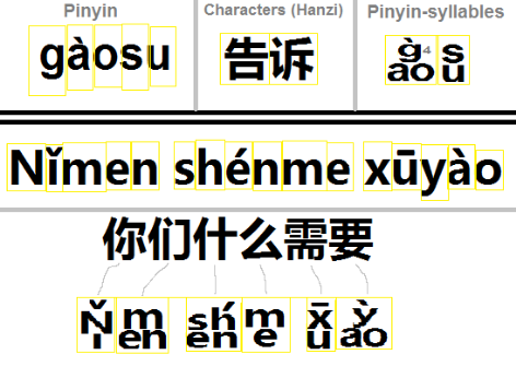
An additional note: I think, for the sake of shortening the syllables, it would be possible to remove some letters from certain syllables without necessarily compromising readability. So "xiang" could become "xiag" or even maybe "xag", since every syllable that ends with "g" ends with "ng" (as far as I know).
Agni's proposal, which is akin to the square arrangement of letters in Hangul, is different from syllabication / syllabification / hyphenation.
So as not to prejudice the debate, I refrain from voicing my own opinion on Agni's proposal.
Suggested readings
- "Polysyllabic characters in Chinese writing" (8/2/11)
- "Word, syllable, morpheme, phoneme" (10/6/18)
- "The concept of word in Sinitic" (10/3/18)
- "Words in Vietnamese" (10/2/18)
- "Diacriticless Vietnamese on a sign in San Francisco" (9/30/18)
- "Words in Mandarin: twin kle twin kle lit tle star" (8/14/12)
DBMG said,
January 6, 2022 @ 11:41 am
It seems to take even more space than the original: "yao" spans a 2×2 square of letters instead of a 1×3 line…
V said,
January 6, 2022 @ 12:22 pm
That seems similar in concept to Taiwanese Hangul?
J.W. Brewer said,
January 6, 2022 @ 12:41 pm
It seems to me like the only advantages of a Latin-scripted writing system for Mandarin as compared to e.g. a customized approach like bopomofo, are that it a) is easier to learn for those already literate in another Latin-scripted language; and b) it makes it easier for Sinophones to then learn to read other Latin-scripted languages; and I guess c) it's easy to use software/databases/etc originally designed for another Latin-scripted language. Using the existing glyphs of the Latin alphabet in a totally different way than any other Latin-scripted language does would seriously diminish if not destroy those advantages, so you might as well just write in bopomofo. Or an adaptation of hangul, or katakana, or tengwar, or whatever.
The "12 point font" comparison seems artificial, because you can read Latin-scripted texts at a smaller size (because there are so many fewer glyphs to disambiguate) than the characters. Just eyeballing some photos of bilingual signage from Tokyo train stations I found online suggests to my admittedly non-expert eye that the romaji is typically in a smaller "point size" than the kanji, and I assume there was some trial and error figuring out which size for which script resulted in the same desired degree of legibility at such-and-such a distance.
J.W. Brewer said,
January 6, 2022 @ 12:43 pm
I suppose "biscriptal signage" would have been a better word than "bilingual" although I do think the history of the signage conventions does have something to do with accommodating gaijins.
David Marjanović said,
January 6, 2022 @ 12:52 pm
That would make handwriting a lot harder – in cursive, gàosu has a grand total of two strokes, but if you stack it à la coréenne, you need five.
Scott P. said,
January 6, 2022 @ 1:10 pm
Does anyone write in cursive anymore?
J.W. Brewer said,
January 6, 2022 @ 1:48 pm
Note that the longest (in character count) example they give, shown as configured into a box, is the four-character "shen," but AFAIK all romanization systems out there have a few six-character syllables (for hanyu pinyin it's chuang, shuang, and zhuang, and there are a lot more five-character ones), so it would be good to see a mock-up of one of those to see how busy-to-illegible it becomes. Note again the comparative efficiency of bopomofo, which requires from 1 to 3 glyphs to represent any phototactically permissible Mandarin syllable, compared to the 2-to-6 typical of the various romanization systems.
The suggestion to respell "xiang" as "xiag" or "xag" to mitigate this issue would more closely approximate the glyph-count-efficiency approach of bopomofo (ㄒㄧㄤ), but again at the expense of making the use of the Latin-alphabet glyphs deviate more from how they are typically used in Latin-scripted languages.
cliff arroyo said,
January 6, 2022 @ 4:10 pm
"That seems similar in concept to Taiwanese Hangul?"
I always thought that that system could be syllabified (maybe with tone marks).
On the topic at hand, I'm not clear what the advantage of the pinyin syllable blocks is supposed to be… not typographical as it would require hundreds (or thousands?) if new unicode characters or a new way of inputting pinyin.
And I've never noticed that chinese characters take up less space than pinyin… if anything limits on how much they can be reduced and remain legible would point to them needing more space than would a pinyin system…
Why pinyin users can't devise something similar to the Vietnamese telex system is beyond me but I think anti-Viet prejudice probably plays a role….
Philip Taylor said,
January 6, 2022 @ 5:10 pm
Does "anti-Viet prejudice" exist, Cliff ? And if so, amongst whom ?
John Rohsenow said,
January 6, 2022 @ 5:15 pm
*Taiwanese Hangul is an orthography system for Taiwanese Hokkien. Developed and promoted by Taiwanese linguist Hsu Tsao-te in 1987, it uses a modified Hangul alphabets to represent spoken Taiwanese, and was later supported by Ang Ui-jin. Wikipedia
cliff arroyo said,
January 6, 2022 @ 5:27 pm
" "anti-Viet prejudice" exist, Cliff ?"
William Hannas mentions it in one of his books and I've seen it online as well (back when forums and blogs were things).
As a language spoken and written and read by tens of millions of people that once used characters and uses them no more… you'd think that those interested in Chinese romanization might pay attention to it, but IME that is really not the case.
cliff arroyo said,
January 6, 2022 @ 5:30 pm
"Taiwanese Hangul
Oops I thought that was an oblique reference of bopomofo… which I still think could be modified to be written in syllable blocks (doesn't mean it should be… just that it could)
Daniel Barkalow said,
January 6, 2022 @ 6:15 pm
I expect this could be implemented as a font with a lot of ligatures used with regular pinyin as the actual character sequence. I think this might make sense for text that's blocked out to support hanzi having a mixture. It seems like an answer to the question: "If you have a square region big enough to write 需 legibly, how can you fit shén in it legibly instead?" The part that confuses me a bit is that it includes spaces between words and the variable-width glyphs don't make up for it, leading to it still being bigger than hanzi in the example, and not grid-aligned.
David C. said,
January 6, 2022 @ 8:58 pm
I think you see a real difference between signs that were actually designed to be read by foreigners/gaijins and signs where the accompanying Latin script is, let's say, supplementary.
Often you see the English text constrained to the length of the Chinese text, which results in needing a much smaller font for the English.
I still think that given an equivalent amount of signage space, text is more visually distinctive and legible in Chinese characters than in Latin script.
Mark S. said,
January 6, 2022 @ 10:55 pm
Re. "anti-Viet prejudice," here's a good example:
Vietnamese culture appears shallow without Chinese characters, says Chinese writer.
Certainly those interested in romanization are mindful of the example of Vietnam. For example, John DeFrancis wrote an entire book on Vietnamese: Colonialism and Language Policy in Viet Nam (recently made re-available, at the sort of @#$! high price typical of many academic publishers). But because of the aforementioned prejudice, advising Chinese to look to the wisdom of Vietnam is something of a non-starter.
wanda said,
January 7, 2022 @ 12:00 pm
@Scott P.: "Does anyone write in cursive anymore?"
My TAs and I grade biology exams. I would say that in the past 3 years, out of something like a 1000 college students taking hand-written exams, 5 or so wrote in cursive. However, I would also say that I've had 1 or 2 undergraduates TAs (out of maybe 30 total) who couldn't even read cursive, so I had to decipher the writing for them. The undergrads at my institution are mostly traditionally aged (18-23ish). So my guess is that a typical educated "young person today" doesn't typically use cursive but knows enough to decipher it.
My take on the pinyin syllables is that it's wack. People who are used to reading Latin characters are used to having them line up left to right. Students who are learning Chinese as a second language will have a hard time reading the syllables. Students who are learning Chinese as a first language won't have a hard time, but it will be confusing for them to learn English as a second language. If you want to fit in "shen" in a block character space, write it diagonally from upper left to lower right.
David Marjanović said,
January 7, 2022 @ 3:36 pm
Hardly in the US, where what's called cursive is pretty much a calligraphic script with lots of extra loops on the letters and isn't even taught until the third grade.
In the rest of the Latin- (and Cyrillic-)writing world, everyday handwriting looks like this. I was never even taught to draw printed letters by hand.
Victor Mair said,
January 7, 2022 @ 6:57 pm
When I was in elementary, middle, and high school (late 40s through the 50s), we were not permitted to print when handwriting. It had to be simple cursive, though not ornate, with lots of ornamental curlicues, and each letter appearing to be joined to the next.
By the time my son went to primary, middle, and high school, and on into college (70s and later), I was amazed and dismayed that students were allowed to print their letters when handwriting. Now, nearly all of my students print their letters, and it looks terribly ungraceful to me, though I must admit it is usually more legible than most cursive.
The thing that puzzles me most is how young people can print very rapidly, almost as quickly as someone writing cursive.
The whole point of cursive is to keep the tip of your writing instrument on the surface of the paper, whereas when you print you have to keep lifting the tip of your pencil / pen off the surface of the paper. I'm always puzzled to see how fast people can print and remain legible.
TonyK said,
January 7, 2022 @ 8:17 pm
This idea is so bad, it makes my teeth hurt. It combines the gracelessness of pinyin with the impracticality of Chinese characters. Surely it was meant as a joke?
Jason said,
January 8, 2022 @ 3:23 am
Yeah, may as well just adapt Hangul, which has a well established input system and pre existing support in unicode. Unicode's combining character feature could be extended to allow for tone marks, at far less software cost than syllabic Roman letters.