Mongolian script on RMB bills
« previous post | next post »
"China to issue new RMB bills in August", CRI Online (4/29/19):

I already discussed all of the non-Han languages printed on the back of Chinese banknotes in this post:
"The languages on Chinese banknotes" (9/16/13)
In the present post, I wish to focus on the Mongolian script, which seems so excessively small as to be unreadable to the naked eye. I asked a number of Mongolian specialists what their opinion about the Mongolian script on the new Chinese banknotes is.
Timothy May:
Egads that is tiny. I cannot read it at all. Perhaps with a high-resolution image that can be blown up without losing image quality.
Christopher Atwood:
The answer to your question is, yes I think it is [extremely small], and it always has been. The same could be said for vertical script Mongolian generally and even in Unicode fonts. In my experience doing powerpoint presentations, Mongolian needs to be pushed up to 18 or 20 point to get the same level of distance readability you get from Chinese 11 point or English or Cyrillic 12 or 14 point. But that means it occupies much more space. To create an equal level of readability, the Mongolian script needs to occupy roughly double the space that English or Cyrillic would, and more than double what Chinese would. In reality, on formally bilingual signs in China, less space is usually given to the Mongolian than to the Chinese, which results in the Mongolian being essentially unreadable at any kind of distance. So it is in this case, where the minority languages (Mongolian, Tibetan, Uyghur, and obsolete Zhuang) are each allocated half the space of the Pinyin; the Mongolian in particular is hence effectively unreadable.
P.S. Curious about the preservation of what seems to be obsolete Zhuang. It reminds me of Mongolian texts produced by the Ming court which continued to use Yuan-era rules for transcribing Chinese and Middle Mongolian spelling rules, long after they had become obsolete.
Chris asked me to mention that all of his estimates of readability are just his seat of the pants measures, not anything confirmed by lab science or such.
Dotno Pount:
To be honest, I don’t think I perceive the differences [among the non-Han scripts] very clearly. They look very similar, and the Mongolian has always been quite small. I suppose the horizontalization forces the font size to be too small. I think the same effect on road and building signage is quite pernicious, especially the highway signs, because they're unreadable clutter that distracts people who don’t know Mongolian, and for those who only read Mongolian, they are just dangerous. As for the Russicism, I don’t think there is a Mongolian native word for bank that was ever invented. There’s a joke in IM on how saying "yinhang" (Mandarin for "bank") with a Mongolian accent sounds like “prostitute."
Juha Janhunen:
Yes, of course it is too small to be read without a magnifying glass. The same is true of the Tibetan version. They are clearly there only to fill a symbolic function. But I think they were about this size also on the previous banknotes. These texts are a kind of remainder of the five nations (五族) ideology, though Manchu has been replaced by the artificial standard of Zhuang. Some of my Inner Mongolian friends like to collect banknotes of the Mengjiang Yinhang (蒙疆銀行) from the time of Inner Mongolian independence (1939-1945, though some post-war historians working for the winners call it "Japanese occupation").
Jichang Lulu:
No comment on the new notes specifically, but I have always found that Mongolian displayed in bilingual items in the PRC (such as indeed banknotes) is too small. Perhaps this would be less of an impediment to those with stronger Mongolian skills, but to me they are often unreadable, as if they were there as an afterthought, not actually intended to communicate with Mongolian speakers in that language and script.
There are specific challenges to handling Mongolian or Manchu, Chinese, and Latin or Cyrillic scripts in the same text, and it wouldn't be fair to criticise the relative proportions chosen for a casual shop sign. On the other hand, it seems appropriate to expect a well-resourced state institution to give due consideration to the demands of each script used when designing multi-scriptal materials. In fact, a sign or banknote give the designer more freedom than running text, and indeed the opportunity to display Mongolian as one or two columns of running, larger text, rather than as tiny words floating mid-air (to force vertical Mongolian into a horizontal context).
Needless to say, China owes the Qing a long tradition of multi-lingual display including the Mongolian and Manchu scripts. It seems that in many cases they came up with better design solutions…
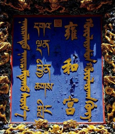
A typical example I have at hand—the Yonghe gong (aka ‘Lama Temple’).
And here's an alternative design for the 250 yuan bill:
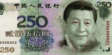
(Source)
Andreas Johansson said,
May 7, 2019 @ 12:59 am
So if I'm understanding Atwood correctly, Mongolian is a decidedly inefficient script in the sense of requiring a lot of real estate to convey a certain meaning? If so, why is that? As an alphabetic script, it shouldn't need to be more inefficient than Latin or Cyrillic, right?
Ian said,
May 7, 2019 @ 3:05 am
@Andreas,
There are a couple factors that make it exceedingly difficult to read, even when big enough. First and foremost is the prevalence and ambiguity of the "tooth" character to the left of the line. In some words you can end up with basically an initial distinguishable character and a final distinguishable character with a mess of eight or more "teeth", the meaning of which must be determined by counting them up and grouping them together in accordance with proper syllable structure. This difficulty remains even for native speakers in many cases.
Another issue is the fact that most of the real estate used by traditional and modern representations of Written Mongol (including Unicode) seems to be in the vertical direction, which is also the direction of writing. In scripts like Latin and Cyrillic there are a fair amount of strokes that deviate from the line of writing direction (the imaginary line underlining the script), which makes them more efficient in that you can convey many easily-distinguishable glyphs by using a small amount of horizontal space. On the other hand, with Written Mongol, very little space to both sides of the vertical line is used, and it relies instead on "long" (in the vertical sense) characters. It would be something like squashing written English to half the height and stretching it horizontally instead. This would take up considerably more space, and even if you bunch the lines closer together it's still hard to read.
So anyway, there's nothing really inherent about the script that requires this, other than tradition. One could, in principle, redefine Written Mongol such that the characters maximize horizontal space at the expense of vertical space, thus saving overall space, but it doesn't seem to be such a critical issue. In addition, this would require getting used to a whole new format and structure of characters for users of the script that are already used to the old way, as inefficient as it may be.
Andreas Johansson said,
May 7, 2019 @ 3:34 am
@Ian:
Thank you!