The pragmatics of market predicates
« previous post | next post »
Collaborative post by John Kingston and Chris Potts
Newspaper stories about the financial markets often contain quantitative information that is intepretable only by experts. The headline screams "Dow Up 200!", but what does that mean? In some contexts (say, apartment rentals), 200 is a lot. In others (e.g., houses prices), it is hardly anything at all. Similiarly, what is a 3% change like? Sometimes we're asked to shrug off 3% differences as irrelevant (think of polling data). For the markets, though, most of us have the sense that 3% is a big deal.
The headlines do contain some information that all of us have intuitions about: the verbs and other predicates that describe the change. We know that rise says that the change was upwards, and we can intuitively juxtapose it with soar, which suggests really dramatic upward change. Conversely, fall and plummet describe motion in the downward direction, with the second implying much worse news than the first.
So much for our linguistic intuitions. Do they square with the way newspaper headline writers use these predicates in describing financial markets? This is much less clear. As part of our Data Rich Humanities project, sponsored by UMass Amherst CHFA, we have been exploring this question using the collection of 23,327 NY Times financial headlines described in this earlier post.
As an initial experiment, we pulled all the headlines that match the pattern Dow PRED N (point(s)/percent/%), where PRED is a verb/predicate and N is a numerical value. Where the unit is not mentioned, points seems always to be understood. Headlines writers have a strong propensity for reporting changes in terms of points, which are interpretable only if one knows the size of the market at the time of reporting. However, percentage changes can involve small enough numbers that they might raise other issues. So we can assume that, whatever the numerical value, most readers look to the words in the headline to figure out what happened. This makes those words vitally important to accurate reporting.
We converted all point values to percentage values, using the opening price of the market on the day the headline was written (or as close as we could come, for days when we didn't have the data). This put all the data on a uniform scale, and it removed the time-dependence of point values. (200 points was a much bigger deal twenty years ago than it is today. Percentage changes have a more constant impact.)
The results are generally encouraging; it looks as though readers of the Times can basically trust their intuitions about the relevant predicates in forming an opinion about how serious the financial news is. Figure 1 provides histograms for four predicates: rise, fall, soar, and plunge.
| Figure 1 (click to enlarge) |
|---|
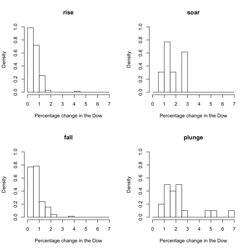 |
Intuitively, rise and fall are moderate change verbs. They are (generally) used when the market change was below 1%. After that, their superlative counterparts (usually) take over. In the terms of linguistic pragmatics, rise conversationally implicates not soar: soaring counts as rising, but it is misleading to use rise for dramatic changes. Some misleading instances aside, headline writers seem to be adhering to this pragmatics. The same can be said for the fall-plunge pair.
The histograms are suggestive, but we think they are not the ideal tool, especially since our data have some notable outliers and gaps that probably trace to data-sparseness. The boxplots in figure 2 seem superior:
| Figure 2 (click to enlarge) |
|---|
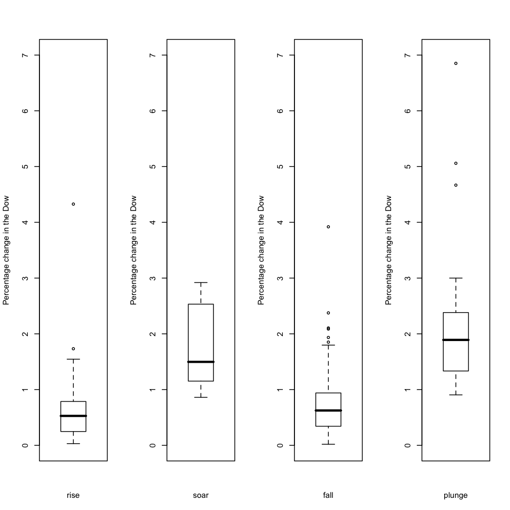 |
This is an information-rich visualization. It is worth pointing out various of its features, since they point uniformly to the idea that headline writers use these predicates reliably:
- The most important data-point is the dark horizontal line in each plot. This is the median value. The values for rise and fall are close: 0.53 for rise and 0.63 for fall. In contrast, the median values for soar and plunge are higher: 1.5 and 1.9, respectively.
- We can also compare the boxed areas. These delimit the values within the first and third quartiles — the core of the data. For each of the rise/soar and fall/plunge pairs, these areas do not overlap, a strong indication that their median values are genuinely different.
- The downward whisker of soar (whose length extends 1.5 times the 25-50% inter-quartile range or to the minimum) does not overlap with the upper quartile (75%) of rise. The downward whisker for plunge just barely overlaps with the upper quartile of fall.
All these distributional features point to the conclusion that headline writers, like the rest of us, generally use rise and fall for modest changes, reserving their more picturesque counterparts for extreme changes in the market.
Of course, we do not mean to say that the language is never misleading:
(Our thanks to Chris Davis for useful suggestions about how to present these numbers.)
Martyn Cornell said,
October 27, 2008 @ 10:07 am
Having copy-edited (in the UK) and written headlines for stock market stories in the past, I can confirm that headline writers do indeed, as anyone would expect, try to convey some idea of the scale of price movements with the verbs they use. But I'd have guessed that "plunge" and "soar" were much less common in headlines than "fall" and "rise", and a quick and very dirty search through market stories over the past eight years in The Times (of London) seems to confirm this, with shares rise 40 times more common than shares soar, and shares fall 17 times more common than shares plunge.
Of course, "rise" and "fall" will be made to look less common by adding in the numbers for other verbs, such as "climb or, "drop", and the prepositions "up" and "down". But there is going to be some distortion caused by the fact that, in most headline typefaces, "rise" is a "count" (number of character widths as measured against the width of the letter "n" in that typeface) of three and "fall" is a count of just two and a half, since r, i, f and l are generally only half-width characters, which will mean that for headline writers trying to get as as many words into a tight newspaper space as possible, "fall" is a better choice than, say, "plummet" (each "m" has a count of one and a half).
If you looked at the stories, incidentally, as opposed to the headlines, I would guess you would find "rise" and "fall" used much less often, since the financial reporters who write market reports seem incapable of using the simple words when a synonym can be found: last Friday's Times, for example, uses the following words in place of "fell" – "lost", "down" "off", "lower", "tumbled", "faded", "slumped" and (yes) "plunged"..
Craig said,
October 27, 2008 @ 1:40 pm
I've read enough of "soars," "plunges," and "slashes" in headlines to last me a lifetime. The headlines are screaming too much these days. Another word I don't care for is "blasts," which is often used in place of "criticizes." To me it smacks of yellow journalism.
Chris Potts said,
October 27, 2008 @ 2:35 pm
Martyn!
I think you're right about the counts: rise, fall, and other predicates at their level are significantly more frequent than their more colorful counterparts. This makes sense given that the predicates are being used in a responsible way; so far, the market conditions that justify soar and plunge are relatively rare.
Here's a ranking of the top fifteen most frequent predicates, in decreasing order:
up
off
fall
rise
gain
drop
climb
slip
down
lose
decline
advance
jump
surge
plunge
Faldone said,
October 27, 2008 @ 3:40 pm
I think you'll also find that the stock market rises or falls much more often than it soars or plummets just as an actual numerical phenomenon irrespective of the words used to describe it.
JP said,
October 27, 2008 @ 8:40 pm
It might also be interesting to account for placement and size. Does the headline speak "louder" on the front page or the front of the business section, and big? Above the fold? Do the more colorful predicates predominate in these locations?
Martyn Cornell said,
October 28, 2008 @ 2:11 pm
Chris, that's a fascinating list: the character counts on those headline words go, in order:
2, 2, 2.5, 3, 3.5, 3.5, 4.5, 3, 4.5, 3.5, 6, 6, 3.5, 5.5, 5.5
and, surprise, wordcounts increase (more or less) linearly as frequency declines. Scientific proof that headline writers tend to use shorter words more than longer ones! (Which is why, Craig, you'll see "blasts" – character count 5.5 – more often in a headline than "criticizes", character count 7.5)
Chris Potts said,
October 29, 2008 @ 7:18 am
Martyn!
Very cool! I somehow missed that, but it's evident even in the look of the list.
Nigel Greenwood said,
October 29, 2008 @ 7:36 am
As a statistician, & admirer of the work of John W. Tukey, I was delighted to see boxplots being used on this blog. I know that the term median is widely used these days; but wouldn't it be worth explaining exactly what it means & how it differs from the arithmetic mean? Just in case anyone reading is a bit hazy on the distinction, the median is the central value when the data are ordered by size. Eg raw data: 5, 2, 1, 3, 20; ordered data: 1, 2, 3, 5, 20; median 3; mean 31/5 = 6.2. If the box (interquartile range) represents the "core" of the data, as the writers succinctly put it, the median is the core of the core.
One advantage of the median is that it is less sensitive than the mean to extreme values or outliers (as in my contrived example, & even more in the headline examples in the blog).