Creative kanji
« previous post | next post »
[The following is a guest post by Nathan Hopson]
The results are in from the 11th Kanji Creation Contest (Sōsaku Kanji Kontesuto), sponsored by Sankei Shinbun newspaper and the Shirakawa Shizuka Institute of East Asian Characters and Culture at Ritsumeikan University. Out of a total of over 26,000 entries in the general, high school, and elementary and middle school divisions, the overall winner was a very 2020 take on the character 座 (za, “to sit”).
Example 1
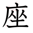
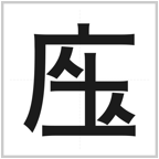
Fig. 1 Standard (left) and prizewinning creative kanji for “to sit.”
The character (in both its standard and creative forms) is made up of three elements:
- 广
- 土
- 人
Of these, it is the last that is subtly manipulated here. That element, also an independent kanji in its own right, means “person.” By moving the two “people” apart, the contest winner expressed the idea of “sitting apart,” or social distancing.
Other particularly ingenious entries that also reflect the zeitgeist of 2020 include a reimagining of meetings, an ode to home delivery in surviving the pandemic, and an acknowledgement of pandemic screen time.
Example 2
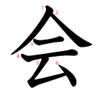
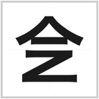
Fig. 2 Meetings go online with the addition of a Z for Zoom.
The bottom half of the character for “to meet” (kai) has been replaced with a Z. Instead of a meeting, then, a Zoom.
Example 3
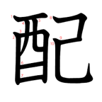
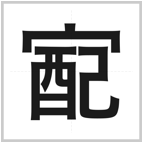
Fig. 3 Homing in on delivery.
The standard character 配 (hai), “to deliver,” is given a radical meaning house/home (宀) over the top.
Example 4
From the elementary and middle school division came this clever deformation of the character 画 (ga). By itself it means “image,” “brushstroke,” or “to draw,” for example, but here the reference is clearly to its usage in 映画 (eiga), as in “movie.” The meaning of this creative kanji is “laptop computer.”
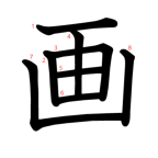
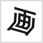
Fig. 4 Foldable kanji.
Example 5
Not all of the best entries had to do with covid-19. A high schooler submitted this kanji for “deforestation” and, by extension, environmental destruction:
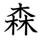
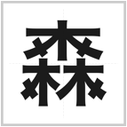
Fig. 5 Cutting down trees.
The character 森 (mori), which is a collection of trees 木 (ki) has been modified with the addition of strokes (cuts) through each tree.
Example 6
There were also examples of characters that reminiscent of sniglets, often humorous coinages for words that don’t exist but should. Perhaps the best of these was a kanji for dried fish, which simply combined fish (魚) and dry (干). One of the judges remarked that he was just taken off guard by this strange kanji blind spot―it really feels like this kanji should already exist.
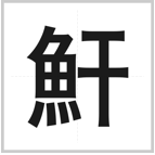
Fig. 6 魚 (fish) + 干 (dried) = dried fish.
Example 7
The theme of this year’s contest was “kanji that will still be around in a century.” Perhaps they should have gone for two centuries, since one of the winning kanji was for the number 200.
The character for 100 is 百 (hyaku). To this the entrant added an additional stroke on top. With this, the top two horizontal strokes are also the numeral 2 (二 ni).
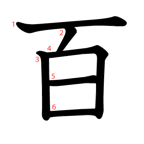
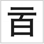
Fig. 7 100 → 200.
(百, when rotated 90 degrees widdershins, is also a passable natural ambigram.)
Whether any of these kanji are still around in 2021, let alone 2120, is doubtful. But it would be nice to have something positive come out of 2020, so I’m hopeful.
Philip Taylor said,
December 30, 2020 @ 1:49 pm
These new kanji are indeed very creative, but I am puzzled as to the reason for their uniformity in style — was it a requirement of the contest that all entries be in what we in the West would refer to as a sans serif style ? The beauty of the traditional kanji at the left stands in marked contrast to the Bauhaus blandness of those on the right.
David Marjanović said,
December 30, 2020 @ 3:30 pm
Another blog post about that contest, presenting a slightly different selection.
Stephen L said,
December 30, 2020 @ 5:52 pm
Ahaha, very funny :)
@Philip I'm guessing these renderings were done by the people running the prize for consistency of presentation, and do not represent how they were drawn in the entries. They're mirroring in style the font used on the rest of the announcement (with their lines having weird flared ends), which maybe gives the effect of making the characters seem more 'real'. I'm ok with it; the effect works. Having calligraphically drawn characters might stand out a bit weirdly on that webpage. Well done to all entrants.
Twill said,
December 30, 2020 @ 7:14 pm
@Phillip Taylor Your comment itself is puzzling. Do people lament the debasement of the traditional Latin letterforms with miniscules and modern typefaces? Why should gothic-tai (i.e. sans-serif) by any more unsightly that the rounded, humanist equal weight bicameral fonts we read every single day? All the elements of the characters in the former are represented in the latter. I would also point out that several of the characters here aren't even "traditional" in the traditional vs simplified scheme, though I happen to find the simplified (here, shinjitai) forms more aesthetically pleasing and distinctive (晝/畫/書 was invented by a scholar who clearly had it out for dyslexics).
ohwilleke said,
December 30, 2020 @ 8:28 pm
The recognition given to Example 2 is particularly notable as it blends two writing systems, something one might have expected the sponsors to disfavor.
Philip Taylor said,
December 30, 2020 @ 9:00 pm
Twill, if you do not see true beauty in the glyphs to the left and boring mechanical ugliness in those to the right, then I think that our minds must work rather differently. And, to be fair, I find much "exaggerated" Chinese calligraphy equally ugly and unpleasant. To my mind, the beautifully balanced letterforms of (for example) the examples that accompany Huang Ziyuan's Ninety two methods for forming and structuring characters" about as close to perfection as one could reasonably hope to get.
Twill said,
December 31, 2020 @ 12:21 am
@Phillip Taylor The forms on the right look very quotidian, no different from a typical Ming (/Mincho/Song etc.) font, or the Helveticas and Times New Romans respectively of Latin. The forms on the left, what is called at least in Japanese kyouka-shotai (i.e. the sort they teach to children), I frankly find just as sterile as the Gothics, and bearing even less aesthetic value. They're practically the same form as the right, just with the stroke contrast of handwriting (it is essentially the equivalent to "print" hand).
There is real beauty in calligraphy, I agree, but none of these show the creativity necessary for an artform. I can't say I prefer the most chaotic calligraphy either, and I would say the kind that could be placed in the lower end of semi-cursive (gyou-shotai) hands and upper end of cursive (sou-shotai) hands the most pleasant (perhaps not a coincidence that my ability to read drops off there though).
J.W. Brewer said,
December 31, 2020 @ 11:40 am
Regardless of competing aesthetic tastes, which may be hopelessly subjective, it seems an odd decision to have used one "font" for the new inventions but another for the established kanji they are riffing on, because it encourages the reader to think that the choices (and the contrast between them) are somehow meaningful.
DBMG said,
December 31, 2020 @ 1:03 pm
You must remember that there is of course no font in existence that includes these competition entries. The competition organizers must have had to resort to some kind of a graphical compositing tool to create these illustrations.
Ouen said,
January 1, 2021 @ 3:57 pm
Some really great entries! Also, the 画 immediately made me think of the 画面 (screen) of a laptop, before reading the explanation that it is referring to the second character in 映画. I think my interpretation fits quite well!