Sex and color language
« previous post | next post »
Randall Munroe has a great post on the xkcd blog that reports and discusses the results of an online color survey. With 222,500 user responses, this was almost certainly the largest scientific experiment ever run by a cartoonist.
The most interesting result reported so far is an experimental test of the old stereotype about sex differences in color naming.
As Randall explains,
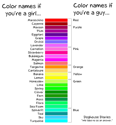
By a strange coincidence, the same night I first made the color survey public, the webcomic Doghouse Diaries put up this comic (which I altered slightly to fit in this blog, click for original):
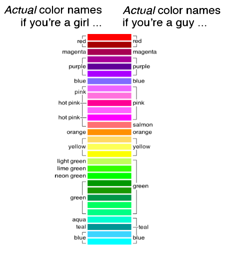
It was funny, but I realized I could test whether it was accurate (as far as chromosomal sex goes, anyway, which we asked about because it’s tied to colorblindness). After the survey closed, I generated a version of the Doghouse Diaries comic with actual data, using the most frequent color name for the handful of colors in the survey closest to the ones in the comic:
But if you ask a different question — not what were the commonest behaviors for each group, but rather what behaviors were most different between the groups — you get a different sort of answer. The color names "most disproportionately popular among women" were
1. Dusty Teal
2. Blush Pink
3. Dusty Lavender
4. Butter Yellow
5. Dusky Rose
Randall describes this as "Kind of an incense-bomb-set-off-in-a-Bed-Bath-&-Beyond vibe". The same list for male subjects:
1. Penis
2. Gay
3. WTF
4. Dunno
5. Baige
As Randall says, "I weep for my gender". (This result is Too Good To Check, but the whole dataset is available for download — in this respect the comics industry is way ahead of the scientific publishers, alas — so you can try different definitions of "most disproportionately popular", whether by sex or by geographical regions or whatever.)
The experiment's other major discovery is that no one knows how to spell fuchsia. Below is my own set of Google counts confirming this result:
| Spelling | Count | Did you mean __? |
| fuchsia | 8,470,000 | |
| fuschia | 1,960,000 | |
| fucsia | 1,400,000 | |
| fushia | 795,000 | fuschia |
| fuscia | 200,000 | fuschia |
| fucshia | 79,500 | fuchsia |
| fuchia | 103,000 | fuchsia |
The correct spelling wins — but the second-place-winner is suggested as a correction more often.
[Hat tip to Tiago Tresoldi.]
[Note, by the way, that Language Logger Paul Kay is an expert on the question of color naming and color perception, a topic that he posted about e.g. here. See also here and here. The techniques described in Paul's post on "Color vocabulary and pre-attentive color perception" would make it possible to determine whether the small sex differences that Randall found in naming varieties of green and blue are facts about perception or facts about response generation. Of course, Randall's experiment was not designed to address these questions, and didn't attempt to distinguish among color perception, knowledge of color names, and propensity to assign different names (if known) to different shades. ]
Aaron Toivo said,
May 5, 2010 @ 7:15 am
Wow! A spectacular demonstration that you do not necessarily need a neurosurgery degree to do proper and valuable science.
Also interesting: since I spent half an hour doing the survey myself, weeks ago now, I can reliably report that the comments do not do justice to the severity of cognitive impairment you get after spending half an hour naming two hundred microscopically different shades of green. The brain just turns to cottage cheese.
Alon Lischinsky said,
May 5, 2010 @ 7:50 am
@myl: I can't say whether this is relevant without more details on your Google search, but in case you didn't filter the results by language, it should be mentioned that ⟨fucsia⟩ is the standard spelling in Spanish and Italian for both the plant genus and the eponymous colour.
On a side note, I suppose that some evolutionary biologist will soon explain the greater likelihood of males identifying salmon as a different colour in terms of the fishing practices of our savannah ancestors.
Mark P said,
May 5, 2010 @ 8:59 am
If you ever accompany a woman to a cosmetics counter, or visit one yourself, you will find that there is a very large number of names for brown as well as green, blue and red. If there really was a tendency among women to distinguish among different shades of colors, I wonder if it could stem from the cosmetics counter. I can't think of any everyday thing that men use or wear that has the same level of color distinctions.
Ray Girvan said,
May 5, 2010 @ 9:04 am
My immediate impression was that the first graphic's LH column showed not female colour names, but rather the fanciful marketing names paint catalogues use to give distinct identities to virtually indistinguishable colours such as Dublin Bay and Paradise Green here.
Nicholas said,
May 5, 2010 @ 9:40 am
Tribute to the colour system of "Robert Ridgway, Curator of the Division of Birds, United States National Museum. His Color Standards and Nomenclature was privately published in 1912 in Washington D.C. It is clearly stated in the Preface that “The motive of this work is the Standardization of Colors and Color Names”. This work contains “Fifty-three Colored Plates and Eleven Hundred and Fifteen Named Colors”. Each colour was hand-printed."
This from a little piece about the colour names used in ornithology.
http://www.ibooknet.co.uk/archive/news_april04.htm#Feature
Anton said,
May 5, 2010 @ 9:41 am
Not being English, I would say that there is also a rather evident difference between countries in how they perceive colours. In Germany most people would use 'red' to describe various shades of the red spectrum, merely adding bright or dark in front of the colour description to make it more definite. In England however, most people would – even in casual speech – distinguish shades such as fuchsia, maroon or scarlet. Some people I knew even identified shades such as crimson and – most surprisingly I even heard people use vermilion (this was a man!) which I had no clue (up to that point) that it could even be the name of a colour.
marie-lucie said,
May 5, 2010 @ 9:49 am
If you go to a paint store looking for colour samples because you want to paint your walls, you will find hundreds of colour names there too. Each paint chip will have both a name (that the customer will remember) and a number and letter ID corresponding to a formula specifying the right mix of pigments to be blended for each shade. This is true for fabrics and cosmetics too: each colour name identifies a shade which is slightly different from the next one. If you shop for clothes through a catalogue, a plain word such as "red" or "green" would not be enough to distinguish between numerous shades of those colours, let alone allow the customer to make sure that different garments to be worn together will actually match (even "white" and "black" do not always refer to the same colours). Since women in general pay much more attention than men to which shades are most becoming to their own colouring, and the fashion industry makes sure that different colours become popular year by year, it is not surprising that they are more familiar with colour words than men are. But a woman is still more likely to say "my red sweater" than "my geranium sweater" unless she has several sweaters in slightly different shades of red.
Mr Fnortner said,
May 5, 2010 @ 9:55 am
A charming female acquaintance of mine of around age 5 named a certain color as "dark white." I couldn't fault her, but suggested that some other people also called it grey. She was pleased to learn a new word, and I was delighted to see the world through her eyes.
anon said,
May 5, 2010 @ 9:57 am
IIRC, "vermilion" shows up frequently in the Scott's postage stamp catalog; maybe the man who used it was a philatelist.
John said,
May 5, 2010 @ 9:59 am
Why is it "few-sha" anyway? As has already been pointed out it's "fucsia" in Italian, with the accent in the usual place. Our spelling is consistent with that: fuchsia.
So did English speakers learn the word through reading and mis-pronounce it (reading perhaps "fuschia") or is it an oral phenomenon.
Mr Fnortner said,
May 5, 2010 @ 10:05 am
And for those who are fans of interesting but generally useless scientific facts, magenta is the only color that does not occur on the visible spectrum (white excepted). It is an artifact produced in our visual processing mechanism when red and blue light combine.
Mark P said,
May 5, 2010 @ 10:06 am
I'm certainly not the first to note this, but there seems to be a set of color names that are not associated with particular things, like red, green, yellow, blue and so forth. And there seems to be a set of names that are associated with things, like plum, lemon and so on. There also seems to be a set of taste names that are not necessarily associated with things, like bitter, sweet, salty (which came first, the taste or the thing?), and a set of taste names that are associated with things, like apple, strawberry and so on. But as far as I can think, there are no names for odors that are not associated with a thing. (Or course most of the flavors as opposed to tastes are really odors since they are sensed in the nose.) And also, as far as I can tell, there are no real names of sounds, only descriptions like loud, piercing or soft.
Mark P said,
May 5, 2010 @ 10:11 am
@Mr Fnortner, in the strictest scientific sense, no color exists anywhere except in the visual processing centers of the brain anyway. We have names for combinations of wavelengths that the brain processes into what we call colors.
There was an article in a recent Scientific American about ways to allow humans to perceive colors that "can't exist."
[(myl) To a first approximation, all human color perception starts by projecting the spectrum of incident light into a three-dimensional subspace defined by the spectral sensitivities of the three cone photopigments:
Some (colorblind) people have only two or one types of photopigment; some women have four types. But everyone starts by throwing away most of the spectral information, so that very different spectra are perceptually indistinguishable ("metamers"). Here's one example oftwo spectra that are "metamers" for people with normal color vision, because these spectra engage the three photopigments in the same way (i.e. project to the same point in the three-dimensional subspace spanned by the photopigment sensitivities):
The brain does all sorts of interesting things with this input, including especially (trying) to sort out the effects of reflectance and illumination so as to see colors "as they are" rather than as the lighting makes them seem to be — see here for a review and model — which works pretty well overall, but can result in the spectacular sorts of mistakes that go into the many clever displays of color-perception illusions.]
Leonardo Boiko said,
May 5, 2010 @ 10:21 am
@Fnortner: there are lots of colors that are not spectral colors, including white, gray, and all light and dark “shades” (pink, dark green and so on) which are combinations of different wavelengths. See http://en.wikipedia.org/wiki/Spectral_color .
Ginger Yellow said,
May 5, 2010 @ 10:30 am
The most striking result for me was that (according to Munroe) "teal" was the most common alternative blue name. It's not a word I'd ever use outside of "Teal Lake", where my grandfather used to have a cabin. I wouldn't even know what shade it's supposed to describe. I'd be extremely strongly inclined to call pretty much any blue/green shade "turquoise".
Army1987 said,
May 5, 2010 @ 10:32 am
Lime and limpid green, a second scene, A fight between the blue you once knew…
Leonardo Boiko said,
May 5, 2010 @ 10:41 am
That paper about the different whorfianess of the left and right visual fields (Kay et al.) is fascinating. I wonder if this has any effect on people who lose one of their eyes.
[(myl) Each eye normally sends information both to the left and the right visual field.]
Mr Fnortner said,
May 5, 2010 @ 11:02 am
I unwaveringly concede the points made by Mark P, myl, and Leonardo Boiko. While trying to keep my post small (thereby not covering all aspects of color, light, and perception), I merely wanted to note that magenta, a color most of us perceive, and many of us love, does not have a home on the spectrum. If it did, it would have to be either to the far side of red or the far side of blue, a position only possible in such artificial devices as a color wheel, in which colors loop around (not an accurate model of the physical world). Magenta's existence as an artifact is an intriguing curiosity. Other colors as pink and dark green are best understood as pure colors whose saturation has been affected by the admixture of other colors or the reduction of the intensity of light. I would be happy and able to discuss this in greater depth, but this may not be the forum.
Leonardo Boiko said,
May 5, 2010 @ 11:09 am
Oh. Well, make that people with homonymous hemianopsia then – though a subtle change in color perception is probably the least of their worries…
(I have just seen this condition in the wpedia article for “visual field”, forgive my ignorance.)
cameron said,
May 5, 2010 @ 11:12 am
I think Teal was something of a fashionable colour in the 90s. If you'd done a survey like this in the 70s or 80s, I doubt many people would have used the word teal to describe any shade of blue.
Guitarists often use very specific color terms that correspond to the names used by Dupont for the paints that guitar manufacturers (especially Fender) used in the 50s and 60s. Many of those paints were originally associated with particular models of cars made by GM (Dupont and GM were the subject of federal anti-trust actions, because they were deeply in cahoots at the time). Hence it's quite common for guitarists to refer to antique Dupont paint names like Lake Placid Blue, or Seafoam Green, Dakota Red, etc.
Sravana said,
May 5, 2010 @ 11:13 am
I'm looking forward to the GeoIP data. Like Anton said, Americans seem to have a greater propensity to using fancy names of colors in everyday contexts. If enough internationals participated in the survey (which is unfortunately not likely), it would be interesting to check whether that's true.
Pekka K. said,
May 5, 2010 @ 11:20 am
Regarding the word teal, it may be well known to people involved with computers (that would be a not insignificant part of XKCD readers) because of its inclusion in certain standardized sets of color names often used in computing. It is one of the sixteen named HTML colors, for example, which are seemingly based on a common sixteen color palette from the time computers were still likely to display only sixteen colors at a time (so it says on Wikipedia).
Army1987 said,
May 5, 2010 @ 11:33 am
@Ginger Yellow: Indeed. I used it several times in the survey, but I expected it to me much rarer than that among the general population. But since I guess a disproportionate fraction of readers of xkcd — and hence of the people who answered the survey — are nerdish, and since teal is one of the 16 basic HTML colours…
Army1987 said,
May 5, 2010 @ 11:35 am
@Pekka K.: I swear I hadn't read your post yet, believe it or not!
...just don't call me late for dinner! said,
May 5, 2010 @ 11:37 am
"Hence it's quite common for guitarists to refer to antique Dupont paint names like Lake Placid Blue, or Seafoam Green, Dakota Red, "
I couldn't imagine referring to something as "Lake Placid Blue" unless it was an early 1960s Stratocaster painted Lake Placid Blue. Which is an interesting question itself — I see two items the exact same shade and call one "Lake Placid Blue" and one "light blue." So is there another dimension to color based on what is being colored?
Put in more prosaic terms, I'd imagine most people refer to violet flowers as being "violet." But if you take the same shade and put it on a pencil, would people be more likely to call the pencil "purple" instead?
Army1987 said,
May 5, 2010 @ 11:59 am
Indeed… Ask one hundred people what colour the moon is (except when it's low on the horizon, when it appears to be yellowish for the same reason the sun appears to be red) and see how many would answer that it's grey. Then repeat the same experiment with an Ethernet cable of the same colour.
(Also, as Liberman reminded a couple of times in the last months, people call copper metal and hair of that colour "red", but would call pretty much anything else with the same colour "orange".)
Rodger C said,
May 5, 2010 @ 12:11 pm
@cameron: If this experiment had been done in the 1970s, I'm sure it would have contained avocado.
And I'm gratified to note that no one mentioned puce, mauve or taupe, which I've never been able to keep straight. Perhaps I'm showing my age by even mentioning them.
[(myl) Even before downloading and examining the full dataset, I'd be prepared to bet a substantial sum that all of these colors were mentioned by quite a few of the participants in the experiment.]
Mr Fnortner said,
May 5, 2010 @ 12:40 pm
Some car paint colors worth noting from the sixties and seventies–Ford Maverick: Anti-Establish Mint, Hulla Blue, Original Cinnamon, Freudian Gilt, Thanks Vermillion; and Dodge Charger: Top Banana, Sublime, Go Mango and Plum Crazy. Ref: http://fourwheeldrift.wordpress.com/2006/09/30/color-me-crazy-%E2%80%93-the-best-and-worst-paint-color-names/
Tiago Tresoldi said,
May 5, 2010 @ 12:42 pm
Regarding the 'salmon' among males, some people (I do not remember if it was in Randall's blog or in Hacker News comments) were pointing to a well-known episode of Friends (well, at least among Friends' enthusiasts) in which Ross, one of the characters, keeps saying that a certain sweater he is wearing is 'salmon' and not 'pink' as everyone else describes it. The choice obviously relates to Ross' need to pose both as a "non-homosexual" (somewhat important in the character development) and as the "erudite" of the group (he is a professor) — and I can state that I have seen similar behaviors here in Brazil with "rosa" and "salmão".
Regarding the color names, I find it curious that "dark red" is not as common as "dark green" or "dark blue" (and even "dark purple") in English — the same applies to my native languages ("rosso scuro" in Italian and "vermelho escuro" in Portuguese sound well-formed, but somewhat odd) — while Anton seems to state above that it is quite natural in German. Does someone have a theory?
Ginger Yellow said,
May 5, 2010 @ 12:50 pm
That HTML explanation makes a lot of sense.
Rubrick said,
May 5, 2010 @ 1:13 pm
What's the correct web color hex for penis?
Rosie Redfield said,
May 5, 2010 @ 1:31 pm
Today's Salon Broadsheet blog (is it a blog? here) has an article about the absurd names given to nail polish colours.
Peter Taylor said,
May 5, 2010 @ 1:42 pm
I find the dislocation of magenta particularly interesting, as I agree with the Doghouse Diaries' view on what girls think magenta is, which disagrees considerably with both sexes in the xkcd data. Closer inspection shows that DD's value there is #ff40ff, and xkcd's is #ff00ff – which happens to be what Wikipedia lists for magenta, and is the value I would give without thinking about it.
James C. said,
May 5, 2010 @ 1:48 pm
@Rubrick: There’s more than one color, actually. One is #FFDEAD.
Jerry Friedman said,
May 5, 2010 @ 1:59 pm
"Teal" is a very well-known color in the United States, in my experience, and has mostly replaced "turquoise". As cameron said, I think this is much more because of fashion than HTML color names, and I'd guess the fashion led to the HTML color name rather than the other way around.
Is teal supposed to be the color on the Green-winged Teal's head? (Or wing, which is hard to find photos of?)
cameron said,
May 5, 2010 @ 2:02 pm
@Late for Dinner: The paint colour Lake Placid Blue was originally associated with the 1958 Cadillac – so it has wider associations than Stratocasters.
Incidentally, many colours which work really well on guitars would have been hideous on cars. Lake Placid Blue is a good example. It's a really classy looking colour for a guitar, but I think it'd look terrible on a car – especially as large a car as a 1958 Cadillac (which I have to assume was enormous). Sea-Foam Green is an even more extreme example. Cool guitar finish – but who would want a sea-foam green car?
Catanea said,
May 5, 2010 @ 2:11 pm
Girls may be more likely to read the labels on their Crayola® crayons, and arrange them in spectrum order. (And be bought sets with a greater variety of colours, poor boys were thought to need only the eight.)
Millions of people deal in actual pigments (rather than "hues") and know that vermilion and azurite and ochre are in fact things.
Those people, male or female, will skew your responses.
Re: "salmon" – men may fish (I fish, too) but women cook (so do men). Salmon isn't really very pink.
My dog is orange, too.
Leonardo Boiko said,
May 5, 2010 @ 2:22 pm
@Tiago: As a Brazilian, I have to say “vermelho escuro” sounds odd at all to my ear. I use it, and am pretty sure I have seen it often.
Here are google search results, restricted for pages in Portuguese:
* "vermelho escuro" 83.000
* "verde escuro" 178.000
* "azul escuro" 275.000
* "amarelo escuro" 64.400
* "roxo escuro" 62.100
* "marrom escuro" 56.500
Leonardo Boiko said,
May 5, 2010 @ 2:23 pm
Er, I meant it doesn’t sound odd (Freudian slip?)
cameron said,
May 5, 2010 @ 2:29 pm
More on teal.
I looked up the article from which I learned about the Fender Custom Colours. In there I find the following info about teal:
Teal Green (metallic)
Lacquer Source(s): DuPont 4297L, Ppg DDL12745.
Low VOC Source(s): DuPont 4297K.
Although this color was conceived in 1963 for the Ford Thunderbird, it wasn't called "Teal" until 1965 when it was used on the Lincoln Continental. Fender added "Green" to the name "Teal" to be more descriptive, thus creating "Teal Green". Used on 1963 Ford Thunderbird and 1964 Lincoln Continentals (Patrician Green), 1965 Lincoln Continental (Teal), 1964 Ford Thunderbirds (Riveria or Regal Turquoise), 1966 Mercury's (Turquoise Frost), and 1969 to 1970 Lincoln's (Medium Aqua).
The article in question is here: http://home.provide.net/~cfh/fenderc.html
m said,
May 5, 2010 @ 2:38 pm
At least for those who went to elementary school in the US, another source for learning a wide number of color names might be big boxes of Crayolas. For a list of all names ever used on a Crayola crayon:
http://www.crayola.com/colorcensus/history/chronology.cfm
Teal & Fuchsia appeared in the 1990s. Salmon appeared in 1949. "Flesh" became peach in 1962.
Carey said,
May 5, 2010 @ 2:45 pm
Teal was, for a time, the brand colour of Tasman Empire Airways Limited, and various shades of blue are still used by Air New Zealand, so I'd expect it to be better known in New Zealand. I wonder if the GeoIP data will back that up?
George Amis said,
May 5, 2010 @ 3:31 pm
One of the official team colors of the San Jose [CA] Sharks hockey team is Dark Pacific Teal, which doesn't seem particularly dark or Pacific to me. The team and its colors date to 1991.
Jongseong Park said,
May 5, 2010 @ 3:45 pm
Some of you may be interested in a study called "Color Naming and Color Categorization in Korean" by Rodney E. Tyson, which suggests a range of influences on colour naming and categorization by Korean speakers, including age, sex, education, occupation, and attitude toward the topic. Korean has extremely rich colour vocabulary, with words of native, Sino-Korean, Japanese, and English origin to choose from, so the sociological influences on colour word choices are easy to see. But I suspect the influences are there in most other languages, including English.
I have a feeling standardized education plays a big part.
Sili said,
May 5, 2010 @ 4:32 pm
Interesting.
I've noticed lately that the world appears redder in one eye than the other for me. I used to think it was due to the aberration of my glasses, but the last year or so my eyes have had then same dioptre, so it can't really be that anymore.
Matthew Kehrt said,
May 5, 2010 @ 4:47 pm
@Tiago Tresoldi I wouldn't actually trace that color name to Friends; Friends was mocking an actual phenomenon. At least in the late 90s and early 00s in the northeast US, a similar color was very common in men's shirts, and it was invariably referred to as "salmon". I suspect this is where this color being called "salmon" by men came from.
As for teal, I couldn't tell you where it came from, but I, an American, am much more likely to call something "teal" than "turquoise".
Aspen Swartz said,
May 5, 2010 @ 4:54 pm
Sili:
My husband had that start happening when he was a teenager. Probably related to subsequently diagnosed optic neuritis due to multiple sclerosis.
Mary Kuhner said,
May 5, 2010 @ 5:30 pm
Many domains have domain-specific color names, especially animal husbandry. I am currently teaching a section on cat coat color genetics in a college course, and we have to grapple with this:
what I see/what the cat fancier says
orange/red
pale orange/cream
gray/blue
brown/chocolate
pale brown/lavender or lilac (!)
Dogs, rabbits and horses also have complex color names, related to these but not the same. I gave up using rabbits as a model system after realizing I'd have to describe "sable" to my students.
Greg Morrow said,
May 5, 2010 @ 5:37 pm
Mark P. In (IIRC) Guy Deutscher's The Unfolding of Language, it is said that, if you go back far enough, all color words derive from things. E.g. all words for "red" trace back to a root for blood, or something else similarly colored.
I may be misremembering or misstating.
Tiago Tresoldi said,
May 5, 2010 @ 5:49 pm
@Leonardo: It might be a difference not only of language and perception, but also of what we mean by "odd": I was saying that "vermelho escuro" sounds a bit odd, in the sense that I instinctively look for a lexical alternative, such as "marrom", "sangue" or "vinho" (maroon, blood or wine), while I am perfectly happy with "verde escuro" (dark green) and "azul escuro" (dark blue) — something I found strange as the three are primary colors and seems to be mirrored in Randall's survey. Perhaps we are more used to trace analogies with red and green things in the natural world than in blue ones (even though Icelanders have dozens of words for green…)
While the number of Google occurrences is not a definitive answer, you certainly have a good point; I guess I was confusing "odd" with "common", and maybe I have some peculiar relation with the red color… (Well, I support Internacional whose uniform is red ;)
@Matthew Kehrt: Thank you!
marie-lucie said,
May 5, 2010 @ 6:12 pm
Sili: I've noticed lately that the world appears redder in one eye than the other for me.
Once, as a child lying face down in the grass on a summer day, I noticed that if I closed one eye, then the other, I saw different greens – one lighter, more greyish, the other one more brighly greem . I have since repeated the experiment many times (not always in the same context) and have come to the conclusion that my two eyes see colours slightly differently, though not differently enough to make a practical difference.
I think that many people whose taste tends to garish colours are not suffering from a lack of taste so much as from a lack of full colour perception, so that most colours look pale to them and only very bright, sharply differentiated colours satisfy their taste. Women who mix several shades of red, for instance, may not actually see that those reds are different and clashing with each other. And since men are more likely than women to have some kind of deficiency in colour perception, those men who need to take a woman along when they buy clothes, or who let their wives or girlfriends choose their clothes for them because they either don't care or keep making the "wrong" choices, perhaps do so because they cannot perceive and appreciate more subtle differences.
Sili said,
May 5, 2010 @ 7:21 pm
Thanks … now I'll worry about it, instead of thinking it's perfectly normal …
That's exactly what it's like. I just happen to notice it with red, since my tabby apparently has a tinge of it in the grey. And he's the only thing I'm likely to see up close in the morning before I put my glasses on.
Meredith said,
May 5, 2010 @ 7:46 pm
The Doghouse Diaries cartoon seems to be using the color names off the standard Apple "crayon picker"…
Mark P said,
May 5, 2010 @ 8:10 pm
@Matthew Kehrt, I'll bet that lots of Americans living in the Southwest would be more likely to call a particular pale bluish green "turquoise" than "teal." I don't live there, but I like the country and have some turquoise belt buckles and watch bands.
George Amis said,
May 5, 2010 @ 8:41 pm
@Sili and Marie-Lucie
I had the same effect (different perceptions of red and green in my left and right eyes). An ophthalmologist explained it as a consequence of the fact that I was farsighted in one eye and nearsighted in the other. I now have presbyopia (the farsightedness of aging eyes), and the effect has disappeared.
@Marie-Lucie
I think your observation about the preference for bright or garish colors is correct. As my mother developed cataracts, she also began picking more and more unsuitable and, given her earlier taste, uncharacteristic colors for her clothing and for upholstery fabrics. After an operation which corrected the cataracts, she was appalled. (Cataracts tint the world yellowish. Older women with perfectly white hair accordingly often have it dyed bluish, thinking that the end product is white.)
Dan M. said,
May 5, 2010 @ 8:56 pm
Marie-Lucie,
Re taste and clashing colors, I think that of at least as much importance as the strength of color perception is the way that way that the spectrum is mapped onto three photoreceptor signals.
Color blindness runs heavily in my family, and I've discovered that both my sister and I are "color sighted" in the sense that we don't see any gaps in a rainbow (our brother simply sees a blank where most of green is), but she and I perceive complex colors (such as a plaid shirt at a distance) as different colors.
I would explain this as use having the same vector space in our color gamuts, but using different triples of basis vectors.
marie-lucie said,
May 5, 2010 @ 9:11 pm
George, Dan, I am not familiar with the technical aspects of colour perception, but thank you for your comments. I think that there is literally "more to it than meets the eye" – not all eyes are exactly the same.
perceive complex colors (such as a plaid shirt at a distance) as different colors
At a distance, or in low light, or for a person whose vision is blurred without correction, some designs with a complex blend of individual colours (some tweeds, for instance, or even plaid) appear to be a uniform colour. Is that what you mean?
marie-lucie said,
May 5, 2010 @ 9:16 pm
Sili, thank you too for your comment. I should say that there is no history of multiple sclerosis in my family.
Joe Fineman said,
May 5, 2010 @ 10:23 pm
Mr Fnortner's report of a 5-year-old's calling gray "dark white" reminded me of the fact that, at about the same age, I was irritated by the name "navy blue". I thought it should be named as a bluish shade of black, because it was much closer to black than to blue. I did not like the idea that I would be judged wrong if I described a pair of navy blue pants as black pants.
Rosie Redfield said,
May 5, 2010 @ 11:47 pm
A teal is a kind of duck, with a blue-green head.
Dan M. said,
May 6, 2010 @ 2:41 am
marie-lucie
Actually, I was assuming we all knew that blends appear as one color when blurred.
My claim is that given a particular source (in this case a jacket woven with red and yellow threads, if I recall correctly) appeared at a distance to me as one particular single color (light pink) and to my sister as a different single color (medium brown).
Jo said,
May 6, 2010 @ 3:08 am
I think the rise in the popularity of certain color names in the US (teal is a good example, and BTW, I would use it for a shade much darker than turquoise) could be linked to a boom in clothing catalogs in the late '80s. J. Crew, for instance, was lying around everywhere at a certain point–airplanes, waiting rooms–and had such a fetish for pseudo-poetic color names that it was noticeable even to a young teenager: pink was never just pink, it was dusky rose, salmon, etc. Up to then, most clothes shopping was done in stores, where colors are only written on the label, if at all, and they're selling you on an actual garment rather on a catchy description of it. I think effective color naming played a major role in the success of more than one mail-order company and set a precedent for the online shops that came later.
Alon Lischinsky said,
May 6, 2010 @ 3:18 am
@Catanea: I did not add a smiley at the end of the comment about salmon because I believed its silliness was immediately apparent. The propensity of evolutionary psychologists to describe early hominids as having social mores very much like those of 1950 America is a running joke.
Cecily said,
May 6, 2010 @ 4:15 am
@Sravana: "If enough internationals participated in the survey (which is unfortunately not likely)…"
Whilst I expect the majority of respondents were Americans, xkcd is well-known in some circles outside the US. I participated and I know of many others loyal fans over here in England.
Regarding the results, I'm more surprised that the gender difference isn't wider, and as others have said, it would be interesting to compare results by age and nationality as well.
Kenny Easwaran said,
May 6, 2010 @ 4:22 am
I wonder if "teal" is more common than "turquoise" as a descriptor just because it spans a larger region of color space. I would think that turquoise is probably a more distinctive color, but something would have to be quite bright to be turquoise, while a range of darknesses would all be compatible with being teal (though none as light as anything compatible with being turquoise). And actually, after reading an old Berlin and Kay book about color names, and hearing that Russian has a term "goluboi" that relates to blue in the same way that pink relates to red, I thought that "turquoise" might almost play that role in English (I'd have a hard time describing it as clearly a shade of blue or green), apart from the fact that it borrowed its name from an object (like "orange").
Private Zydeco said,
May 6, 2010 @ 6:43 am
Some people just have so much trouble typing "straight" that they have to type "gay". Bra ? Bro.
LX said,
May 6, 2010 @ 7:18 am
I watched an undergrad study of this sort of thing done many years ago. The young woman conducting the study was expecting to find finer grain distinctions between colours observed by women than by men. Instead in the social group she was in she found the reverse. This was partly because of responses like 'World War Two, Africa Corp Desert Pink' and 'European Theatre Luftwaffe Helblau'. Suggesting that it is practice and application that may have as much to do with naming of colours, as gender.
J. Goard said,
May 6, 2010 @ 7:18 am
@Jongseong Park:
Sweet, thanks! This is of more than theoretical interest. Developing a consistent and reasonably accurate representation of Korean color terms has been rather difficult…
J. Goard said,
May 6, 2010 @ 7:32 am
I've long thought that the perceived guy/girl color term thing was really about how often those things for which many fine color distinctions are significant are employed by each gender as discourse topics. Clothes on people, for example. If women are more likely to build a discourse around the clothes, while men are more likely to use clothes either as reference points for talking about people or as backgrounded information, then naturally women would use a richer array of color terms. "Teal" or "salmon" make sense when you're talking about how wonderful an item of clothing is, but in a context like
Hey, dude, check out the chick in the ______ dress!
they are totally ridiculous. Not because guys don't have the words in their vocabularies (it would be just as infelicitous for women to use these colors in identifying a hot guy), but because it foregrounds information that ought not to be centrally relevant to guys' favorite topic (i.e., what's under the dress).
marie-lucie said,
May 6, 2010 @ 9:06 am
Dan M., sorry about the misunderstanding. But your and your sister's differing perceptions are quite unexpected (at least to me).
Jongseong Park said,
May 6, 2010 @ 9:37 am
@J. Goard:
Even with my intuition as a native speaker of Korean, I am at a loss to describe my own personal use of colour terms in Korean in a consistent and accurate manner, let alone that of Korean speakers as a whole.
I also happen to have colour vision deficiency (deuteranopia), so that interferes with my ability to draw sound general conclusions from my personal use of colour terms. All I can say that is that my own observations (e.g. my aunts frequently use certain colour words that people of my generation would almost never use) correspond to the broad conclusions of the paper I linked to.
Color coding « Arnold Zwicky's Blog said,
May 6, 2010 @ 11:09 am
[…] and gay men know and use color terms like mauve and taupe; see Mark Liberman's discussion, here, of xkcd's recent explorations into color vocabulary as used by women and […]
Dan M. said,
May 6, 2010 @ 11:35 am
marie-lucie,
It certainly was surprising to us an the time. ("Could you grab my brown jacket while you're over there?" "Uh, I brought your pink jacket because it's the only one I could find." "What??") At which point we both looked very intently and agreed about what threads it had.
On the other hand, it's not all that surprising result in light of myl's comment about spectral metamers, at least if you have a strong enough mathematical intuition to grok vector spaces.
Sili said,
May 6, 2010 @ 7:22 pm
Is 72 comments too little to make the Teal Deer joke?
Mr Fnortner said,
May 7, 2010 @ 11:24 am
Sili, I didn't get a chance to read your full post, but I agree that 72 comments is too little.
Antibubba said,
May 16, 2010 @ 12:04 am
The most relevant color madness has been left off–the Beige thing. Beige, taupe, ecrue, off-white, khaki, eggshell, nude, heather….
AAAAAAAAAHHHHHHHHHH!!!!!!!!!!!!!!!!!!!!!