Nuclear Proliferation 101
« previous post | next post »
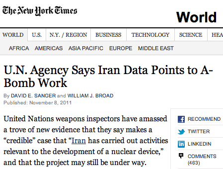
Gene Buckley was surprised to learn that the U.N. is projecting a grade of A- for Iran's bomb work:

This is not because the results of the stuxnet test had previously pointed to B+ work at best, but because the IAEA doesn't normally give letter grades.
The problem, of course, was caused partly by an unfortunately headline division in the Times Reader version of the article (David E. Sanger and William J. Broad, "U.N. Agency Says Iran Data Points to A-Bomb Work"), and partly by the naturalness to academics of collocations like "A- work".
The headline is divided the same way in regular html version of the online-article, at least in the browser that I used to look at it:
Dan Lufkin said,
November 10, 2011 @ 10:17 am
I wonder if the grading system can give an incomplete.
Seth Johnson said,
November 10, 2011 @ 10:25 am
Fortunately, typography gives a distinction between the "hyphen" character (-) and the longer "minus" character (−). What the article needed, though, was a non-breaking hyphen (Unicode U+2011).
Joseph said,
November 10, 2011 @ 11:17 am
@Seth: I'm used to seeing the +/- component of letter grades written in superscript. But I suppose that might be asking too much of a headline.
Garrett Wollman said,
November 10, 2011 @ 1:14 pm
While I accept Seth's point, and that is what I, too, practice in writing text for typesetting, is there any empirical evidence that the general literate public makes (or uses) any distinction among hyphens, minus signs, en- and em-dashes? Only one of those characters is on they typical keyboard, and I don't see much to suggest that people are going out of their way to pick the "right" one according to typesetting conventions. (I can't visually distinguish between minus and en-dash in any of the typefaces I typically use; can you?)
Brett said,
November 10, 2011 @ 3:07 pm
@Garrett Wollman: The term "en dash" (more properly, "N dash") only denotes the width of the character. In some typefaces, minus signs are N dashes in this sense. However, there is often a difference between the vertical placement of a minus sign and an N dash used to designate a numerical range; the latter one is lower, making the difference readily recognizable if the symbol has letters on one or both sides of it.
Tracy said,
November 10, 2011 @ 3:53 pm
This kind of grade inflation is just more evidence that standards for oppressive theocratic dictatorships are going downhill these days. And Iran has had extension after extension to complete this project, too! They must have very patient advisors.
Janice Byer said,
November 10, 2011 @ 4:03 pm
Garrett, even if I could distinguish them, I know from experience that I never would while reading. Unless someone draws our attention to them, seldom do I notice others' typos or word omissions. The old brain doesn't do windows, so to speak; it looks through them to the viewpoint.
Jerry Friedman said,
November 10, 2011 @ 4:53 pm
I'm pretty good at noticing typos (particularly other people's), including punctuation. I certainly notice the difference between hyphens, en dashes, and em dashes. But I've never noticed that some text used a minus sign instead of an en dash or vice-versa.
(About to hit the "Reveal Typos" button with great trepidation.)
Jon Weinberg said,
November 10, 2011 @ 6:52 pm
Tracy wins the comment thread.
Albatross said,
November 10, 2011 @ 11:58 pm
And Iran has had extension after extension to complete this project, too! They must have very patient advisors.
I heard Iran was upset they didn't get an A+. They cited their own perseverance throughout those extensions as proof they deserved a higher grade.
Garrett Wollman said,
November 11, 2011 @ 1:24 am
@Brett: Unicode does distinguish between all these forms of horizontal line segment and several more you're not likely ever to want to use.
Alex W. said,
November 11, 2011 @ 7:10 am
It must be said, though, that an A- is a pretty good choice of a grade for them. "A great effort, but you're not quite there yet…"
Brett said,
November 11, 2011 @ 9:59 am
@Alex W.: Apparently, the IAEA accepted their, "Stuxnet ate my homework," excuse.
Ken Brown said,
November 11, 2011 @ 4:03 pm
@Garrett Wollman "…is there any empirical evidence that the general literate public makes (or uses) any distinction among hyphens, minus signs, en- and em-dashes?"
Well, I don't :-)
And I am a bit of a typography fan. My guess is most people haven't the faintest.
UK Lawyer said,
November 12, 2011 @ 1:19 am
This member of the general literate public couldn't care less about en- and em- dashes, but has noticed that, when typing in Word, a short dash between words is automatically converted into a long one in some situations (assuming the default settings in Word have not been changed). So I do use the distinction, but not in any active sense. As far as I know, the practice of using two dashes (which Word converts into a long one) is not commonly encountered in the UK. Is there also a US practice of using three dashes? What does that signify?
Because they don't change anything I care about, dash prescriptions are less irritating than being told by Word that I must put a comma before "which", that my practice of putting two spaces between sentences is wrong (and can cause formatting difficulties if it straddles the end of a line), or that when I divide up a sentence into numbered paragraphs – (a), (b), (c), etc – I must start each paragraph with a capital letter.
Garrett Wollman said,
November 12, 2011 @ 5:03 pm
@UK Lawyer: the default input language of TeX automatically converts two hyphens into an en-dash and three into an em-dash. (It also converts one hyphen into a minus sign when in "math mode".) The traditional distinction is that an en-dash is used to separate numbers in a range, whereas an em-dash is used to set off parentheticals. These conventions have changed significantly over time; you will see books of a century or more ago using two-em dashes, colons followed by dashes, and other uses no longer common today. There is also considerable disagreement over the amount of space used around parenthetical-type em-dashes; TeX prefers none.
Ellen K. said,
November 12, 2011 @ 6:28 pm
I know I'm continuing an off topic conversation here. But I'll note it anyway.
Unless you can mindread, you will notice if em dashes and hyphens get mixed up. (en dashes perhaps not). The em dash and the hyphen have pretty much opposite uses. One sets something off parenthetically, the other ties two words together as a single word. They don't often get mixed up. But, I have seen one used in place of the other (I forget which way) and it much confused me. And I think many would be.
Not that hyphens don't get used in em dash spots, but if they are, there's either two of them, or a space before and after; either way making it clear the hyphen isn't functioning as a hyphen. If a single hyphen is used as an em dash (that is, to set something apart) without those spaces, I think a lot of people who claim that don't notice the difference would notice. And vice versa.