Hanzi Smatter circa 1700
« previous post | next post »
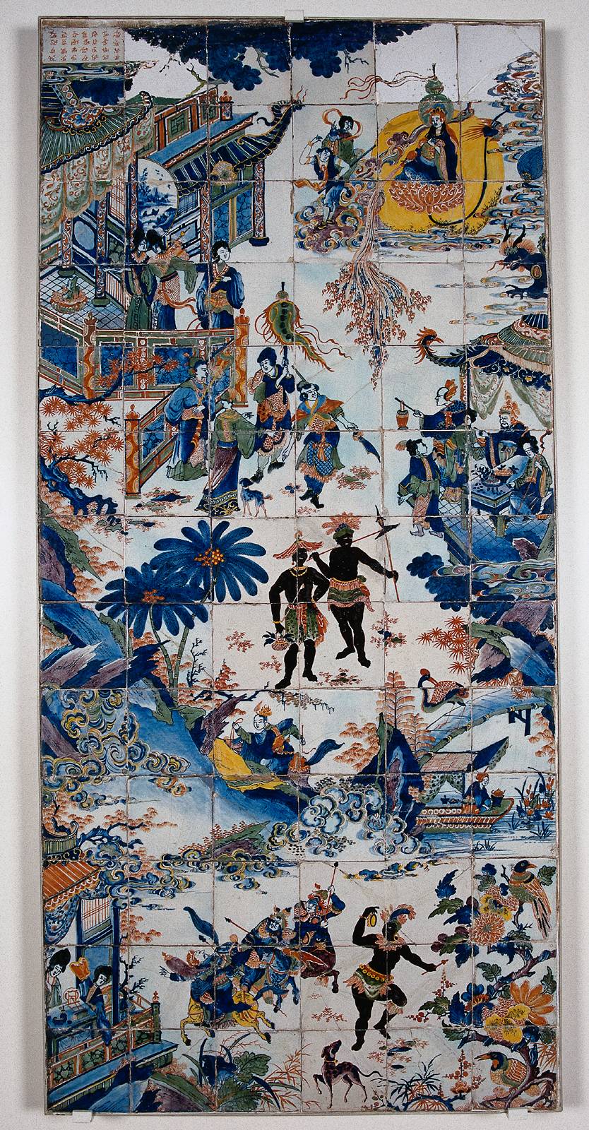
 A friend showed me a photograph of a Dutch chinoiserie tile panel from the late 17th-early 18th century, and asked me to help her identify some of the curious scenes represented on it. My eye, however, was immediately drawn to the cartouche in the upper left corner.
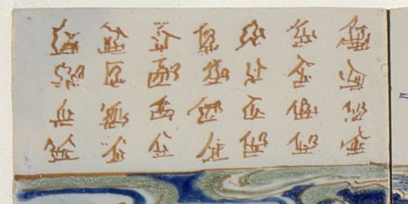
On first glance, the characters seem to be completely fake (made up). Even after straining my eyes and enlarging the panel, I couldn't recognize a single character.
Since I had gotten hooked on this inscription, I obtained a high resolution photograph showing only that part of the tile panel. Now the "characters" were clearer, and I thought to myself, "My, they look a bit like Jurchen script":
Upon reflection, however, I knew that couldn't be right, since the Dutch tile panel, which was made in Delft and is preserved in the Rijksmuseum in Amsterdam, most likely dates to 1690-1730, whereas Jurchen writing was current in the 12th century.
So, returning to the notion that the inscription was an attempt to write Chinese characters, I stubbornly stared at the squiggles, but still couldn't make any sense of them. Unwilling to believe that they were totally fabricated, I attempted to see whether I could spot any components of real characters or recurring elements indicating that the artist was at least modeling his work upon real characters.
After peering wearily and increasingly dejectedly at the scribbles, scratches, and scrawls for some minutes, I suddenly started to notice that all 28 were basically transformations and deformations (some rather extreme) on a vaguely identifiable pattern of strokes. It seems that the artist, with a certain amount of invention and even whimsy, no doubt, was playing a bit of theme and variations based on a single character. Although I am not certain, it is possible that all of these faux-Chinese characters might be "derived" from wú 無 ("nothing; nil; not"). If that were indeed the case, it would have been a most appropriate choice, considering what he was communicating.
Perhaps the artist's day job was at a tattoo parlor in the port!
[Thanks are due to Chi-ming Yang, who is doing intensive research on the entire tile panel.]
N.B.: Both photographs are embiggenable.

yeajung said,
May 25, 2011 @ 8:22 am
I would venture that some squigles in the bottom line look like variations on 金, 'gold', but I wonder how much sense that would make.
Emile de Bruijn said,
May 25, 2011 @ 10:03 am
What a fascinating example of the decorative use of Chinese characters in a European context. As you say, the tile painter either copied some real Chinese characters very loosely, or made them up himself based on a vague idea of what Chinese characters look like.
'Decorative' characters like this also occur on English chinoiserie silver of roughly the same period (late seventeenth century). Then they again seem to have been popular in the Regency period, when they were used, for instance, at the Royal Pavilion, Brighton, the Chinese Dairy at Woburn Abbey and the Chinese House at Wotton. There is also a Regency chinoiserie commode at the V&A painted with fantasy characters.
Vladimir Menkov said,
May 25, 2011 @ 10:20 am
金 was my first association too.
However, I think that in the 17th century Europe, the "Hanzi smatter" was associated more with learned churchmen than with tattoo artists. The founder of the tradition may have been the Spanish-Mexican Augustinian, Juan Gonzalez de Mendoza (1585): see here and the next page.
By the mid-17th century this became very prominent. On the one hand, there were Jesuits in China who were fluent in Chinese and capable of writing Christian tracts in the language; on the other hand, European publishers/publicists who were hungry for something interesting to publish. Athanasius Kircher's China illustrata (1667) is a glorious example of the latter: it begins with a scholarly reproduction, transcription and translation of the Nestorian Stele, provided by Michael Boym and two Chinese Christians visiting Rome; and it ends with "smatterish" illustrations like this.
For a more in-depth view, here I look at what Kircher's illustrators have done with Boym's 松鼠 ("squirrel").
Mr Fnortner said,
May 25, 2011 @ 11:40 am
Makes me wonder what a mimicry typeface for English/Roman letters might look like if devised by someone Chinese.
Victor Mair said,
May 25, 2011 @ 1:13 pm
Here are a couple of other references for those who might be interested in pursuing this topic further:
====
In his "Christian Art in China," Mitteilungen des Seminars für Orientalische Sprachen, 1, Abt. / 13 (1910), 100-118, Berthold Laufer (1874-1934) documents the miswriting of Chinese characters by Europeans who first encountered them. Sometimes the mistakes are minor, but at other times it is impossible to guess what characters they meant to write.
The great polymath, Athanasius Kircher (1601/1602-1680) had himself never been to China, but had a deep interest in Chinese characters, which are featured prominently in his China Illustrata (images readily available on the Web). Although his depictions of Chinese characters are painstaking, they are often so fantastically elaborated that it is impossible to determine which ones he was trying to represent.
Damon said,
May 25, 2011 @ 3:19 pm
Yeah, I thought of 金 when I saw the squiggle on the lower right. And I thought the rightmost, second row one looked a little bit like 母 or 每.
Nonetheless, it's definitely not Chinese writing, it has to be just a (poor) attempt to make something that resembles it. But he probably had seem some of these characters at some point.
bfwebster said,
May 25, 2011 @ 5:19 pm
It's the key to the Voynich Manuscript! ..bruce..
Terry Collmann said,
May 25, 2011 @ 5:39 pm
This T-shirt sums it all up.
JHH said,
May 26, 2011 @ 10:36 am
Created characters, variations upon characters. Reminds me of the Chinese artist Xu Bing :)
David Allen said,
May 29, 2011 @ 5:05 pm
and is it clear that the word embiggen (sic: embiggenable) is derived from an ancient episode of the Simpsons?
[(myl) Yes.]
MIss Hoover said,
May 30, 2011 @ 4:23 pm
David Allen, it's a perfectly cromulent word!
;-)
Yugan said,
June 7, 2011 @ 10:16 am
I’ve broken it! Here’s what your inscription says:
紅夷又來
求字於予
豈可與之
不厭其煩
夷狄越洋
工巧文陋
竟難敦化
Christy J said,
June 10, 2011 @ 1:28 am
When I was reading the story and bouncing back and forth from the text to the picture, I thought for sure the author would announce that he had discovered the characters were actually abstract depictions of kama sutra positions. Yes, I am female. And yes #mindingutter. That is all.
Jonathan said,
July 11, 2011 @ 2:45 am
I'm not sure you noticed, but on the fifth column you can see a man holding a stick; On the sixth it's a caravel; On the first it's a man carrying some sort of tool used in rice fields; second row and fourth column it looks like a horse… and so on
yum mee said,
November 30, 2011 @ 10:54 pm
My first impression when I saw the panel was that these looked more like Manchurian characters, as oppose to Chinese characters. They may be, and mostly likely be artist's rendition of the real thing, but he may be imitating a totally different language. At the time of its creation, China was under Manchurian rule.
This Week’s Language Blog Roundup | Wordnik said,
May 2, 2012 @ 12:55 pm
[…] Slate argued against the em dash, while the bloggers at Language Log wondered what “even” even means; explored the rejection of the power semantic; pondered the U.S. North Midland dialect (“You want punched out?”); and were boggled by faux Chinese characters. […]