Bus sign nerdview in Sydney
« previous post | next post »
It's good to find a prominently displayed list of local bus routes that you can 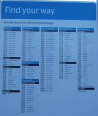 consult when you arrive at the train station in a big city that perhaps you do not know.
And Sydney Central station in New South Wales, Australia, has exactly that. There is a big board headed "Find your way" at the station. But let's take a closer look at it. See if you can spot the nerdview (pointed out to me by Language Log reader Geoff Dawson).
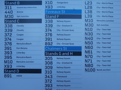
Do you see it? The list is organized as a list of the alphanumeric strings that are interpretable as bus route identifiers. Each is paired with a destination and a capital letter denoting a bus stand location, together with an indication of where the bus stand will be, so the information you need is all there. You can't complain about that. Yet still there is classic nerdview.
What the bus company technical team originally needed to work out was where each bus would pull up to take on passengers. The bus stop positions (called "stands") were assigned letters, and the letters were paired up with available positions in nearby streets. Then each stand letter was assigned a share of bus routes (hence paired with a set of bus route identifier strings), and each bus route identifier string was paired with a statement of the final destination for buses on that route. The list shown in the pictures was the result.
But what a traveler needs on arrival at the station, almost certainly knowing where they want to get to, is in effect a mapping from destinations to bus route identifiers, and then a mapping from bus route identifiers to stands, and then a mapping from stands to street locations. What the transport authorities in Sydney have provided is basically the reverse of this. If you know the street location, you can find a given stand; if you know the stand you want, it's easy to get from that to a list of bus route identifiers; and if you know the bus route you want, it's easy to scan down the alphanumerically sorted list of identifiers to find it. Then you will see the destination it is paired with, and you will know where that bus will take you.
They have in effect provided a sign that will tell you exactly what the question is provided you can already supply the answer.
What you will typically face is a series of questions like this: How do I get to Chatswood? (Answer: You need bus number 343.) How do I find bus number 343? (Answer: It'll pull up to either stand G or stand H.) And where are stands G and H? (Answer: They're on Chalmers Street.) That's how you want it to go.
But the sign as it stands doesn't take this perspective. It would be ideal for a forgetful bus company manager needing to answer a question like: "In what street did we put stands G and H?" or "Where did we decide that the 343 should stop?". But no traveler will have questions of this sort. The sign clearly takes the perspective of the traffic-flow engineers and bus company planners.
The sign should have been organized by destinations, laid out in alphabetical order: Bondi Beach, Bondi Junction, Chatswood, Circular Quay, Clovelly, Coogee, Eastgardens… They might even have included notable sights and important institutions: Harbour Bridge, Macquarie University, Opera House, University of Sydney, etc. (Incidentally, all the destinations like "City – Gresham Street", "City – Martin Place", "City – Town Hall", etc., should have the redundant "City" removed — I think we all know that Sydney City Hall will be in the heart of the city — and replaced by "Gresham Street", "Martin Place", "Town Hall", etc.) Then after each destination there should be a list of suitable bus routes linked to stand letters and locations:
Chatswood: 343 from stands G & H in Chalmers Street Coogee: 372 or 374 from stand C in Eddy Avenue …
It shouldn't be necessary for Language Log to explain to the public transport authorities of Sydney how to design their signs. But we have to, because local transport authorities just do not get it about nerdview.
Design signs for the public so that they make sense from the perspective of the intended user, not from the perspective of the engineer or planning authority creating the sign.
Is that too hard to understand?
Finn said,
December 18, 2016 @ 9:02 am
Disagree. If someone new to the city (who has never heard of "Gresham Street" or "Martin Place" before) wants to go downtown but isn't too fussed about where, exactly, it's more convenient for them to be able to find all the downtown stops on the list easily and pick from among them at their leisure.
That's probably quite common among tourists. They want to head into the city (from the airport, say) in order to wander around and see what they see, but one downtown stop is as good as another.
[Then I'll accept it as a friendly amendment that "City center" should be added to the list of destinations. (Actually "City centre", just in case there are any spelling nitpickers out there.)—GKP ]
Norman Smith said,
December 18, 2016 @ 9:17 am
One of the things about designing information systems is that different system users have different needs. Organizing the board by destination works for those who are going to a destination, but not everyone does; some go to places along the route. Many users will already know their route number, but won't know where to find the stop in a location they've not been to previously. Their question might be, "where do I catch the number 18?" It is also a sign of nerdview to insist that information users ALL want the same thing. This is not to say that this is a good sign – of all the ordering choices, this seems the oddest – but a firm insistence on a single alternative isn't going to meet everyone's needs either.
Ellen Kozisek said,
December 18, 2016 @ 9:37 am
Speaking as a bus rider (though not in Australia) I would say a list by route number is needed. Buses don't have a single destination, but a route. And some bus riders may know what bus route number they need, but not the name of the route.
Dan said,
December 18, 2016 @ 10:16 am
Did the coiner of "nerdview" intend it to be an example of nerdview itself?
Kim said,
December 18, 2016 @ 10:20 am
You nailed it in one, and this kind of transit operator-centric semi-communication is routine.
Finn's "I just want to go downtown" thesis is interesting but assumes the routes at one stand go in the same general direction, and assumes visitors would know that.
Norman's "I may want to get off along the way" thesis correctly notes how much rider knowledge is assumed even if the signage were reorganized around destinations.
Given this kind of signage alone, visitors conclude that the bus system is optimized for local commuting and hail their favorite ride share; their time is too limited to squander it unwinding signage like this. Whether that's okay depends on the intent of the transit system: are visitors even the intended audience?
If they are, accompanying such signage with well-designed maps might tilt the balance if the routes are not terribly complex, but a dense urban bus network may always leave newcomers in the dark compared with a simpler rail system, if available, offering a shorter learning curve.
Here in Washington DC most bus routes are impenetrable to visitors, but a few visitor-friendly "Circulator" routes are a notable exception. Circulator buses are distinctively marked, stop at their own stops, and most importantly connect among places of greatest visitor interest. No timetable is needed because they run every 10 minutes.
Peter said,
December 18, 2016 @ 11:53 am
Norman is correct – this board is precisely for the person who knows they need the 123 bus. As a resident of Sydney the route number is the currency for informed bus transport. I agree this board is useless for anyone who doesn't know the bus route number they need but it's placed at Central Railway so you're already in the system by then and there is an information centre staffed by generally helpful humans http://www.sydneytrains.info/contact_us
They've genuinely come a long way in communicating with travellers.
K said,
December 18, 2016 @ 12:10 pm
I would think the most useful thing for the sign to have would be a map with the bus routes and important destinations clearly displayed. From there I would think a listing of where to catch each bus organized by route number would be best (bonus if busses going in the same general direction are all caught in the same place since in a decent sized city you may well have more than one route choice to many destinations). This should be flexible for many usage cases.
j2h said,
December 18, 2016 @ 12:26 pm
London has a pretty good approach to this – such signage tends to categorise bus routes by destination, including areas the bus passes through.
So, for example, if I'm in Harrow and I want to get to Northolt, I can look under Northolt and be directed to the 140 bus, even though that bus's final destination is Heathrow Airport. If I knew I wanted the 140 I would hopefully also know where I was going, so I could still look it up by location.
If you need even finer-grained information e.g. which bus might serve a particular street, building or landmark then you would probably check online first (although signs at bus stops do also provide simplified route maps).
(That said, the areas of London popular with tourists tend to be well-served by the Underground, so it's likely many visitors to the city never set foot on a bus in the first place)
Mara K said,
December 18, 2016 @ 1:25 pm
I didn't see a problem with the sign, but that's probably because I'm the kind of person who obsessively Googles her destination beforehand to make absolutely sure which bus(es) will get me there, where I can catch them, and where I can get off. That sign would absolutely be helpful to me.
David Morris said,
December 18, 2016 @ 2:40 pm
After working in or otherwise travelling in/through Sydney CBD for most of the last 20 years, I don't know where Gresham St is. Even if I did, I would more need to know which street(s) the bus goes along to get there.
peterv said,
December 18, 2016 @ 3:39 pm
I am reminded that old definition of a computer manual as a document written by someone who knows all the answers but none of the questions.
David Morris said,
December 18, 2016 @ 4:43 pm
Some Sydney bus stops now have a sign which says:
'Caution, this bus stop might have moved'
It's about temporary route and stop changes for New Year's Eve. Whatever stops might move for New Year's Eve haven't happened yet, so the stop hasn't moved. Meanwhile, there's no information anywhere that I can find about the buses which run along the main street, several blocks of which are currently closed for extensive development works.
cM said,
December 18, 2016 @ 4:45 pm
Another environment where "wrong-way information mapping" is depressingly standard:
Multi-storey shops. They all put signs at the escalators listing "floor -> things on that floor", where pretty much everyone would want to see "Looking for thing? Go to that floor."
Giles Martin said,
December 18, 2016 @ 4:52 pm
As a person who has lived in Sydney, and has used public transport in Sydney, I have a few comments.
First, I agree that it would be more useful to the visitor arranged by destination.
Second, if you just have the bus routes' ultimate destinations, you miss out on important intermediate places on their routes, such as the main campuses of Sydney University and the University of New South Wales.
Third, a visitor finding places like Bondi Junction and Chatswood listed here might think that those bus routes are the best ways to get there. They aren't, because there are trains going there from Central Station which are much faster than the buses.
And lastly, a list by destination might include some compounded routes. For example, to get to Bondi Beach (a popular destination), you should catch a train to Bondi Junction then a bus to the beach.
Geoff said,
December 18, 2016 @ 5:49 pm
Norman, Ellen: yes, some people would have done their research and know already that they want bus 338. Others might have just landed in the big smoke and know only that their B&B is two doors down from Clovelly post office. Something useful for both types of rider would be best.
B.Ma said,
December 18, 2016 @ 6:40 pm
@Pullum / Finn, comment 1
In Sydney (and possibly the rest of Australia), "City" is the way to say city centre / downtown / CBD, so the wording is correct in that respect.
But it now occurs to me that people unfamiliar with this turn of phrase (e.g. GKP) may find it odd.
In fact this distinction seems to be made in Cantonese too. In Sydney I would say 出城 "go out to the City" whereas in Toronto I would say 落去市中心 "go down to downtown"
Theophylact said,
December 18, 2016 @ 6:52 pm
Whereas in Manhattan, "downtown" has a specific north/south meaning. If you're on Wall Street and you want to go to Grand Central Terminal, you go uptown; but if you're at Columbia University, you go downtown. (Grand Central is usually considered to be in Midtown Manhattan.)
Vilinthril said,
December 19, 2016 @ 3:47 am
I'm in the “that's not really nerdview” group here.
Sid Smith said,
December 19, 2016 @ 5:45 am
For any city from London to New York to Sydney you need only install the Citymapper app to solve all your transport queries.
And if you then install Maps.me (for walking in cities) and BackCountry Navigator (for walking in the countryside) you'll never be lost again.
dainichi said,
December 19, 2016 @ 6:59 am
> It would be ideal for a forgetful bus company manager needing to answer a question like: "In what street did we put stands G and H?"
The other way around, no? What stands are in Chalmers St?
The problem with indexing one-to-many relationships by the "many" is that the "one"s have to be written many times each. "Stand F, Foveaux St" would have to be written as many times as there are lines departing from stand F. Sure, the stand-to-location mapping could be in a separate table, but still, it's a tradeoff with conciseness. I'm not sure people would find more text/more tables clearer, even if it makes sense from a search algorithm perspective.
As for indexing by the destination, I doubt that is a good idea. If this is anything like the public transport I am used to, bus routes can have the same name going in both directions, and the destination (all the way to which most people don't go) is mostly just an indicator of the direction. It probably could have been "northbound" or something like that as well, but then that probably has it's own problems, since the bearing might change during the route, and not all people are comfortable with… what do you call them? Compass bearings?
As others have mentioned, I believe the bus route names are the most common thing people want to search by. If the table were much larger, it might make sense to index by the route, but as it is now, I think it's a fairly good compromise.
mollymooly said,
December 19, 2016 @ 8:26 am
Further to B.Ma's comment, "City of Sydney" [etc] designate local government areas covering only the CBD of "Sydney" [etc]. In the UK this may be true only for the "City of London". So this issue is Nerdview's cousin, Localview: the meaning of "City" on the station boards is understandable for Aussies but not foreigners; many reading the boards will be the latter.
Hans Adler said,
December 19, 2016 @ 9:57 am
I often prefer this particular kind of 'nerd view' presentations of information to different formats. Often it is quite easy to extract general principles from it such as this: "All north-bound buses depart from stand 1 or 2. Most east-bound buses depart from stand 3. All south-bound buses and a few east-bound ones depart from stand 4." When organised this way, everything makes sense and is easy to remember.
Even for a one-time traveler, the organising principle may still be important. E.g., if I just want to go a few stops eastward on the next available service, it's important to know which stands I need to monitor for that purpose.
Similarly for cM's example of multi-storey shops. Normally there is a guiding principle that causes certain departments to be grouped on certain floors. Once I have understood that, I can navigate through the shop without consulting the sign more than once. A mapping from departments to floors may be adequate for planning my journey through the shop in advance, but spontaneous changes may require another look at the sign.
What both examples have in common: This isn't really nerd view because the organising principle is the *actual* layout of physical objects in space. We are all quite good at grasping this. And so long as the information displayed has been chosen judiciously, it should be easy to scan for a specific item of interest.
AntC said,
December 19, 2016 @ 10:46 am
So arriving at a London (overground) major terminus and wishing to continue by underground, what would GKP have me see?
IIRC, I'm presented with a choice of lines (Circle, Piccadilly, District, …); and as I descend to the depths a choice Northbound/Westbound/etc. Is this any less nerdview? It works well because the vast majority of travellers are regulars, and know which line they want.
Tourists/occasional visitors need only refer to the iconic 'Tube map' (handily printed on tea towels and trays available from any pavement hawker) to identify their line. (Also available inside every tube train running from Heathrow, where it can be studied at length on that crushing journey.)
Did LL reader Geoff Dawson (as presumably such an occasional visitor) look around for such a map? Perhaps it said: Eastbound? Go to Foveaux Street, etc.
BZ said,
December 19, 2016 @ 2:53 pm
Some people claim this about how US highway signs are designed (Exit 10, I-287 North, Metuchen). Apparently, in some European countries, destination comes first, route number second, and direction not at all (I think they have exit numbers, though). Personally, I like the US system. Unless I'm going to blindly rely on GPS, I would know which routes I want to take in which direction ahead of time.
This is true to an extent with public transportation too. I wouldn't just arrive somewhere and blindly pick a bus by where I want to go. I would already know which routes go there. And now, with smartphones ubiquitous, you don't even need to do it ahead of time.
James Wimberley said,
December 20, 2016 @ 9:35 am
Is it nerdview for bus managers to assume that bus passengers have Google Maps, which will tell them the bus route number but not the stand?
I like AntC's vision of lost tourists in London anxiously consulting their souvenir tin trays with the famous Tube map. This design masterpiece worked by deciding that users needed the topology of the system, not its accurate mapping on to surface geography.
Rodger C said,
December 20, 2016 @ 12:38 pm
Then there are the maps of the campus you're visiting, in which each building is indicated by a number, and the key is an alphabetic list of buildings with the numbers out of order.
Rob Young said,
December 20, 2016 @ 6:32 pm
Some time ago I worked for a software company that produced inventory management software for retail firms. On one iteration of the software, the product database was only searchable by bar code.
Wonks Anonymous said,
December 21, 2016 @ 3:52 pm
BZ, not too long ago I went the wrong way on a US highway and didn't realize it for some time. I wanted to go north, the routes were labeled east & west (at least in the area I was driving). Without such directions there would be even more opportunity for such mistakes.
Chas Belov said,
December 22, 2016 @ 3:23 am
Alas, this response is going to be somewhat disorganized and discursive, as I don't have time to write a shorter response.
I've been in the industry 20 years (but speaking solely for myself here) and a lifelong public transit fanatic before that (and still), so I can't claim to be either totally in nerdview or customer view. I do feel this sign is in the nerdview realm, and I also feel there is no one ideal solution.
The sign is in organized poorly, IMO. The way the sign is now, I have to look in potentially 12 different places on the sign in an attempt to find my route number.
I believe your point (organization by destination) is most valid for a downtown sign in a place which is solely a radial system. It is useless for a grid system (such as Toronto). And you may be asking more of the sign than is reasonable to ask of it.
A destination-organized sign would need to have all destinations, not just terminal destinations. (For instance, in the San Francisco system, the J, K, M, and 8 all travel between downtown and the same general area in the southwest of the city, but take wildly different routes from one another.) This would make the sign much larger, perhaps 3-10 times longer depending on the area covered by the system (and readability/print size is important as well). It belongs in a timetable book where it can occupy as many pages as needed, but perhaps not on a space-restricted sign.
On the other hand, a sign would hopefully be customized for the location, while in a booklet you would need to look up both your destination and where you are leaving from to find the route that serves both, if there is one. You might need to transfer. (This is especially true in Toronto, which is almost totally a grid system. San Francisco is a mix of radial, cross-town, and grid.)
I think a customer needs to consult a trip planner or transit map or an information line first to find the route number they need, then approach this sign equipped with their route number and it's endpoint. (Although trip planners tend to give you the best plan for that minute, not the best general path to take, while maps may lead you to less frequent but more direct routes. The new (San Francisco) Muni map attempts to deal with the latter problem using line thickness – thicker = more frequent – and LA Metro provides a frequent-service map, as do some other cities.
For a sign, I believe that route number is the most important sequencing here. And most routes will be there twice, once for each direction, so each route number needs to be paired with an endpoint and a stop. Then there needs to be a map showing where the stops are in relation to "you are here" and, if you're in a subway station, which exit to use to get to that stop.
So for this sign, I'd expect to see something like (with S-E for southeast)
391 S-E Port Botany Stand C
391 in Railway Square Stands G/H
393 S-E Little Bay Stand C
393 in Railway Square Stands G/H
395 S-E Maraubra Beach Stand C
395 in Railway Square Stands G/H
The map I found shows the 391 leaving the area via a different routing than the 393 and 395, although at some point they join up again.
Of course, "in" works only for radial routes. East/West/North/South/Clockwise/Counterclockwise/etc. are needed for cross-town and circular routes.
As I said, I'm a lifelong transit fanatic and this is probably more than you want to know unless you are one as well.