Massachusetts is red(-faced)
« previous post | next post »
Or rather,

Reading the New Yorker on the train this morning, I was struck by the full-page ad following p. 17:

My eye was first caught by the Chinese character 財 (CAI2, "wealth, riches") on a lantern (which I initially mistook for a hot air balloon). The CAI2 is undoubtedly part of the expression FA1CAI2 ("get rich"); I think that I can even see part of the 發 FA1 to the left, which would mean that the writing on the lantern goes from left to right. If the whole New Year's greeting were written on the lantern, it would read GONG1XI3 FA1CAI2 in Modern Standard Mandarin, Cantonese GONGHAI/HEI FAT CHOI 恭喜发财 ("Congratulations and May You Get Rich!"). We've discussed this ubiquitous saying at length before here at Language Log.
But then when my eye drifted down the page a little, I had a bit of a shock. I could immediately read the four Chinese characters on the arch over the entrance to Boston's Chinatown: TIAN1XIA4 WEI2 GONG1 天下為公 ("All-under-Heaven Is a Commonwealth"), reading left to right. What left me disoriented is that each of the characters in the inscription was reversed. But then I realized that the entire inscription was a mirror image of what it should be. In other words, all four characters should be flipped over as a group and read from right to left.
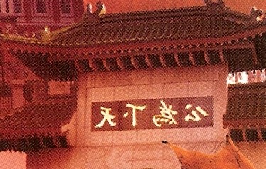 |
 |
| As shown in the ad | As flipped left/right (correct) |
Parenthetically, without being partial to the City of Brotherly Love, I think that Philadelphia's PAI2FANG1 or PAI2LOU ("memorial arch / gateway") is far more magnificent. The wording on it runs from right to left and says, rather elegantly, FEI4CHENG2 HUA2BU4 ("Philadelphia Chinaport").

My wife served as a translator for the Tianjin artisans who constructed the arch, so I feel a personal attachment to this beautiful piece of monumental architecture.
While not as embarrassing as the MaxPlanckForschung Cover Fiasco, I think that the Massachusetts Office of Travel and Tourism might consider asking the advertising agency responsible for the New Yorker slip-up to give them a partial refund.
Oh, I almost forgot to add that this advertisement was apparently brought on by an earlier one, also in the New Yorker, entitled "Massachusetts is Blue." Perhaps some conservative red folks took umbrage at the idea of the Bay State as being exclusively liberal blue, hence this new "Massachusetts is Red" ad to mollify them. Then again, perhaps this is a covert appeal to those aging radicals who remain nostalgic for the anthem of the Cultural Revolution — political colors can be confusing these days. (Well, actually, it's a rainbow-themed Massachusetts Office of Travel and Tourism campaign, with yellow and green in between red and blue, and then violet besides.)
But whatever the semiotics of color, the sign is backwards, and Massachusetts really ought to be red(-faced).
Mark P said,
June 5, 2009 @ 8:40 am
I know that photos are sometimes flipped for design purposes. Even newspapers sometimes do it in feature photos, but usually for objects where it doesn't matter much, like a tree. You can see here that the arch image as used turns more inwards, facing the center of the page, where if it had been oriented correctly it would have faced away from the center. I assume whoever is responsible considered the Chinese symbols to be meaningless decoration. Maybe someone at the ad agency should learn to use Photoshop.
Grep Agni said,
June 5, 2009 @ 9:21 am
Mark P — I think graphic designers typically consider ALL text to be meaningless decoration. If you look at ads carefully, you will often see bizarre phrasing or essentially meaningless words added to improve symmetry.
Thomas Westgard said,
June 5, 2009 @ 9:54 am
That lantern looks a little like Cthulhu.
http://www.toyvault.com/cthulhu/Cthulhu%20Medium%20-%20Large.jpg
Nigel Greenwood said,
June 5, 2009 @ 11:01 am
I've come across this sort of flipping in newspapers & books on numerous occasions, particularly when there's an inscription in Arabic or Persian. I bet there are examples on the Web, but I can't think of an efficient way to search for them: any ingenious suggestions?
Dan T. said,
June 5, 2009 @ 11:16 am
The graphical designers are generally in the employ of Marketing Types, who consider text of use only for the purpose of conveying the desired impression in the minds of the readers; any resemblance to actual truthful facts is coincidental.
Ray Girvan said,
June 5, 2009 @ 11:17 am
Or this year's Kingston Coombes crop formation.
Cecily said,
June 5, 2009 @ 11:25 am
It's also interesting that they have two Chinese illustrations for a red theme. Isn't that potentially politically controversial for a tourism advert?
ArthurDent said,
June 5, 2009 @ 12:00 pm
In the interest of fairness I submit the lettering I observed on a van we used in a recent trip to Yunnan Province.
The English reads:
dtL oC elciheV oclevarT saeS ruoF gnimnuK
Unlike the Mass ad, this is not a mirror image. Each letter is oriented properly, but the entire message is reversed and must be read right to left.
Picture here.
John Cowan said,
June 5, 2009 @ 12:18 pm
So is there a semantic difference between tian1xia4 wei2 gong1 and the presumptively correct reading gong1 wei2 xia4tian1?
Gerard said,
June 5, 2009 @ 1:33 pm
@John – I believe tianxia wei gong is the correct reading? Right to left reading is common in traditional Chinese inscriptions.
Anne H. said,
June 5, 2009 @ 3:01 pm
I'm afraid this is not merely a case of aesthetics, but also one of ignorance. In a literature class, we recently watched some scenes from the Chen Shizheng production of Peony Pavilion (1998). The scene titles which appear on the screen before cutting to the taped production have a Chinese scroll background, on which the characters are also reversed. I just pray no one has made this mistake on a tattoo.
Spectre-7 said,
June 5, 2009 @ 4:19 pm
I wouldn't worry too much about it. Most of the folks with said tattoos obviously aren't too worried about the mark's accuracy, or else they wouldn't trust the translation skills of a tattoo artist. And besides, it'll look just smashing in the mirror.
Alice said,
June 5, 2009 @ 8:28 pm
@ John, the correct reading is tian1xia4 wei2 gong1. gong1 wei2 xia4tian1 would mean something like "The Commonwealth is All-under-Heaven". My Chinese isn't great, but I'd say there is a semantic difference between the 2. And of course it's syntactically incorrect. gong1 and wei2 stand alone, but the 2 characters tian1xia4 make one word that can't be arbitrarily swapped round in the same way that "wealthcommon" doesn't mean the same as "commonwealth".
That's my understanding anyway.
montgomery said,
June 6, 2009 @ 1:02 am
@Arthur Dent
That reminds me of what I once saw written on an ambulance in Asia. It was exactly like this:
ECNALUBMA
(I swear it's true, but unfortunately, I didn't have my camera with me.) Clearly, someone had been instructed to write the word "ambulance" backwards so it could be read in the rearview mirror, and misunderstood the instruction.
Peter Austin said,
June 6, 2009 @ 4:49 am
At the Registry Office in Canberra, the capital city of Australia, where I attended a marriage over 30 years ago, the waiting room walls were festooned with framed marriage certificates from various foreign countries — one in Chinese was hanging upside down. I pointed this out to the person in charge but haven't been back to see if it has been righted.
A celebratory book published by SOAS last year contains one page that is a photograph of a Japanese poetry manuscript held by the library — it is printed back to front, because it seems designers rather than academics put the book together. And this from the "School of Oriental and African Studies" :-(
Randy Alexander said,
June 6, 2009 @ 10:45 am
@ArthurDent: That kind of writing seems to be very popular in China. I'm not in Kunming (Southwest), but rather all the way in the other direction (Northeast), and see this a lot. It seems that they believe that writing on a bus should be from front to back, which isn't too much of a problem in Chinese (traditional Chinese is written in columns starting on the left and moving to the right, but when the columns are only one letter long, it basically reads from right to left horizontally). Of course they write the letters in mirror images, so perhaps in their minds, writing English "characters" on a bus, they just reverse the order for the same effect.
Stephen Politzer-Ahles said,
June 6, 2009 @ 11:25 am
@ Anne H.:
Actually, I would wager lots of people have made these mistakes on tattoos. Take a look at http://www.hanzismatter.com/.
Aaron Davies said,
June 8, 2009 @ 1:50 am
I read somewhere once of a Japanese ship named "Kaba". It's apparently normal in Japan to write the name of a ship bow-to-stern on both sides, thus making it necessary to read the starboard side right to left. In this case, failure to do so would yield "Baka", universally known to anime fans to mean "idiot".
ChuckB said,
June 8, 2009 @ 12:55 pm
Aaron Davies said
"…In this case, failure to do so would yield "Baka", universally known to anime fans to mean "idiot"."
But wouldn't
"Kaba" printed backwards yield "Akab" rather than "Baka"? Or do they also print words inside out on ships?
ChuckB said,
June 8, 2009 @ 12:57 pm
Let me try this again.
"Kaba" backwards would yield "Abak", wouldn't it? Not "Baka".
tian (www.hanzismatter.com) said,
June 8, 2009 @ 2:10 pm
Besides http://www.hanzismatter.com, I have created a public photo group in Flickr.com for everyone to share their photos:
http://www.flickr.com/groups/hanzismatter/
Mel said,
June 8, 2009 @ 8:33 pm
Could anyone tell me in which issue of the New Yorker this ad appears? I've looked near p.17 in all my recent issues and can't seem to find it…
Thanks!
Alan said,
June 9, 2009 @ 7:32 am
Chuck, I think the point is that in Japanese Kaba would be two characters, Ka and Ba. Backwards it would still be two characters, Ba and Ka.
Nathan V. said,
June 9, 2009 @ 1:43 pm
The characters on the arch bring to mind fan3xie3shu1fa3, in which the calligrapher paints mirror images of the characters. I'm not too informed about calligraphy techniques, but I did find a couple links with pictures of this art form. In this link http://blog.sina.com.cn/s/indexlist_1399704237_2.html , under the entry for 2008-08-09, the last picture (following the words 26 hao4zuo4pin3) shows the same form of tian1xia4 (second line from right, third and fourth characters) as seen in the advertisement (there are other examples of this calligraphy in the rest of the pictures). Another calligrapher's rendition of these two characters using this technique is seen here http://hi.shuhua.cc/?1587/action_viewspace_itemid_35722.shtml . (Some other links with pictures of this type of calligraphy include http://www.zgjcsh.cn/Article/mingjia/dangdai/200901/401.html and http://www.hj.cn/html/Culture/ArtStar/SXTS/2009-2/25/0922508422555536.html)
Somehow I don't imagine the Massachusetts Office of Tourism and Travel had this in mind when they published this advertisement (not to mention the issue of word order).
Aaron Davies said,
June 10, 2009 @ 2:59 am
yes, it would be in hiragana, which is (very roughly) a syllabary, not an alphabet. (at least, nowadays, i think it would. the story may be old enough that the usage balance between hiragana and katakana was different.) In hiragana, kaba is かば, and baka is ばか.
jidanni said,
July 20, 2009 @ 2:48 pm
See also:
Taiwan's 1999 $1000 bill globe reversed
1999年版台幣千元鈔地球儀印相反
http://jidanni.org/geo/nt1000
Victor Mair said,
August 12, 2009 @ 12:07 pm
Anonymous sent the following note to Tian (HanziSmatter), and Tian forwarded it to me:
====
Anonymous has left a new comment on your post "Massachusetts is red(-faced)":
This snafu is brought to you by Connelly Partners in Boston, MA.
http://www.connellypartners.com/
Go to "our work", print, MOTT, it's the third one. Thank you, thank you.
dave jones said,
January 24, 2013 @ 11:19 am
華埠 means Chinatown, not china port. 埠 only means port in a different context. 華埠 is a cantonese term, and it's pronounced wa4fau6. when 埠 means port in cantonese, it is pronounced bou6. Get your facts right before you post