Orthography of prosodic focus: The history
« previous post | next post »
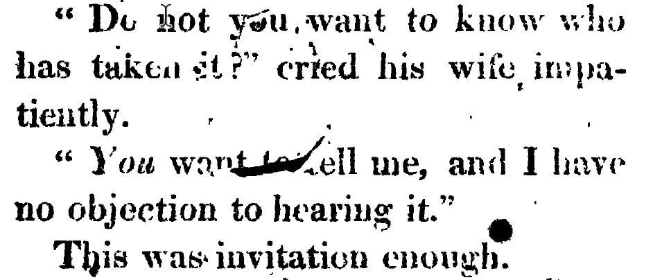
It's well known that Jane Austen's novels made extensive use of italics to mark prosodic focus. Here's the first example from Pride and Prejudice, which occurs in the eighth sentence of the work, on p. 2 of the 1813 first edition:
"Do not you want to know who has taken it?" cried his wife impatiently.
"You want to tell me, and I have no objection to hearing it."
This was invitation enough.
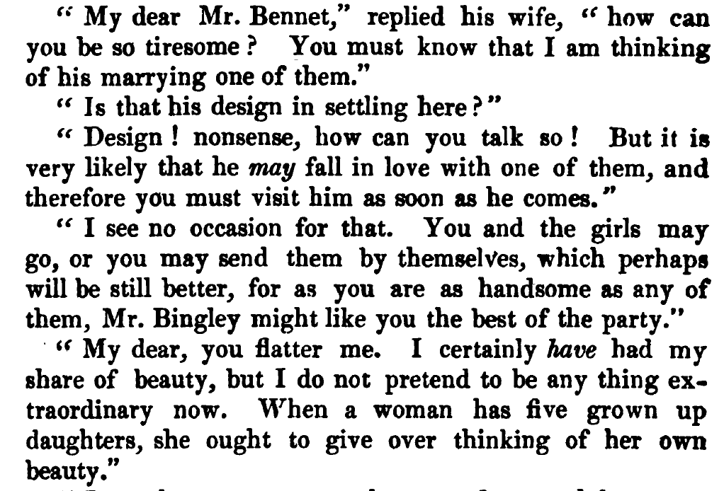
And there are two more examples just a few sentences later, in the same opening conversation. Here's an image from the 1853 edition, for which the scan is better quality:
"My dear Mr. Bennet," replied his wife, "how can you be so tiresome? You must know that I am thinking of his marrying one of them.
"Is that his design in settling here?"
"Design! nonsense, how can you talk so! But it is very likely that he may fall in love with one of them, and therefore you must visit him as soon as he comes."
"I see no occasion for that. You and the girls may go, or you may send them by themselves, which perhaps will be still better, for as you are as handsome as any of them, Mr. Bingley might like you the best of the party."
"My dear, you flatter me. I certainly have had my share of beauty, but I do not pretend to be any thing extraordinary now. When a woman has five grown up daughters, she ought to give over thinking of her own beauty."
A quick check of the Project Gutenberg plain text version suggests that there are 414 such uses of italics in the book as a whole. (Though that text derives from a later edition, so the first-edition numbers might be different…)
Austen's use of italics has certainly been noticed before — and interpreted in (sometimes fantastical) detail, e.g. in R.A. Harris, "Social Definition in Pride and Prejudice: An exercise in Extensional Semantics", English Studies in Canada, 1991:
One very immediate function of italics is to support character personality: Mrs. Bennet stresses petulantly, her husband with ironic placation; Darcy stresses earnestly, Elizabeth playfully; Lady Catherine stresses to reinforce a majestic bearing that her blustering stresses belie.
Harris goes on to suggest that Austen's italics are an orthographic innovation:
Austen primarily reserves stress for function words, or high frequency, low information adverbs and adjectives (words like now, more, and most), items with little or no intensional capacity. This marks the more specific application of a typographical device widespread in eighteenth-century fiction. Fielding, for instance, and Fanny Burney, use italics for general emphasis, or to highlight place names and abstract properties, or for no apparent reason at all; Austen presents a limited set of very specific contrasts.
I've read somewhere that Austen's manuscripts use underlining in the places corresponding to italics in the printed versions. This makes sense — and suggests that the orthographic innovation was the response of editors and printers to a typographical difficulty, since I imagine that it was harder to typeset underlining than italics.
Anyhow, I have a question: Was Austen the first published writer to indicate prosodic focus in a systematic way, by whatever orthographical or typographical means? Are there earlier hand-written (English) documents, like letters, that indicate prosodic focus in some systematic way?
[h/t Martin Ho Kwan Ip]
Philip Taylor said,
February 18, 2022 @ 7:16 am
Wikipedia (which I appreciate is not definitive) says "The evolution of use of italic to show emphasis happened in the sixteenth century and was a clear norm by the seventeenth". Since Jane Austen starting writing books in (I believe) the 18th century, there must presumably be earlier examples of what you refer to as the indication of "prosodic focus, by whatever orthographical or typographical means".
bks said,
February 18, 2022 @ 9:09 am
See page 29 for an example of italics for emphasis in Robinson Crusoe (1719):
http://users.clas.ufl.edu/burt/Bibliomania!/PicturesofPronunciation.pdf
Philip Taylor said,
February 18, 2022 @ 10:00 am
I could not easily find a facsimile of that particular page, but the British Library does have a number of facsimiles of that edition on offer, including https://www.bl.uk/britishlibrary/~/media/bl/global/dl%20restoration%20and%2018th%20century/collection%20items/first-edition-of-daniel-c_30_f_6_p77.jpg, where can be seen "but there was ſomething Negativ or ſomething Poſitiv to be thankful for in it".
[(myl) The first paragraph of the 1722 edition of Robinson Crusoe uses italics in a way that echoes Harris's description (quoted above) about the earlier use of italics —
(Harris:) "This marks the more specific application of a typographical device widespread in eighteenth-century fiction. Fielding, for instance, and Fanny Burney, use italics for general emphasis, or to highlight place names and abstract properties, or for no apparent reason at all; Austen presents a limited set of very specific contrasts."
]
bks said,
February 18, 2022 @ 10:12 am
P.Taylor: Sorry, p. 29 of the linked article, not p. 29 of R. Crusoe.
Philip Taylor said,
February 18, 2022 @ 10:20 am
Yes, that I realised, but what is on p.~29 of the linked article is almost certainly re-typeset, whereas the BL facsimile is of the text as printed in 1719.
Rodger C said,
February 18, 2022 @ 10:50 am
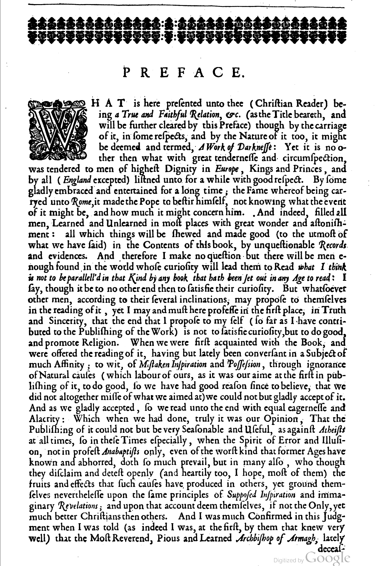
Use of italics to transcribe underlining is at least as old as Meric Casaubon's True and Faithful Relation, 1659, his transcript of some of John Dee's magical diaries.
[(myl) A scan of the 1659 edition is available here. A quick look at the preface suggests that here as well, italics are used "for general emphasis, or to highlight place names and abstract properties, or for no apparent reason at all". And a quick look at the transcribed diaries suggests that italics are also used there to mark quotations (e.g. from spirit voices). I see few if any cases where the italics are plausibly used to make prosodic focus.]
Philip Taylor said,
February 18, 2022 @ 11:11 am
The question that arises in my mind is "how would a reader, in 1722, have read the opening pages of The life and adventures of Robinſon Cruſoe, &c ?". Would he have read it as we would today, with every italicised word carefully enunciated and stressed, or would he have read it as if the italics did not exist ? In other words, were the italicisations intended to convey sound, or to convey meaning, or both ?
George said,
February 18, 2022 @ 11:14 am
Austen may not have been the first but there is nonetheless something different about the use of italics in her work compared to anything earlier I've ever come across. I'll never forget the sheer elation of first reading Persuasion as a young teenager. And the use of italics in exactly the same way that I would have used them myself was a huge part of what made her seem so utterly modern.
Mark Dow said,
February 18, 2022 @ 12:15 pm
And *please* don't forget the SMS version of asterisks for italics for emphasis. (Already almost obsolete?)
Stephen Hart said,
February 18, 2022 @ 12:22 pm
"This makes sense — and suggests that the orthographic innovation was the response of editors and printers to a typographical difficulty, since I imagine that it was harder to typeset underlining than italics.
Rather the other way around. Typewriters can't do italics, so underlining was a substitute.
[(myl) Typewriters were not exactly relevant for Jane Austen. And I see italics all over the place in printed works in Jane Austen's time and before then, and hardly any underlining — if underlining was easier, why isn't there more of it?
Here's the first page of the Preface to the 1659 edition of John Dee's journal:
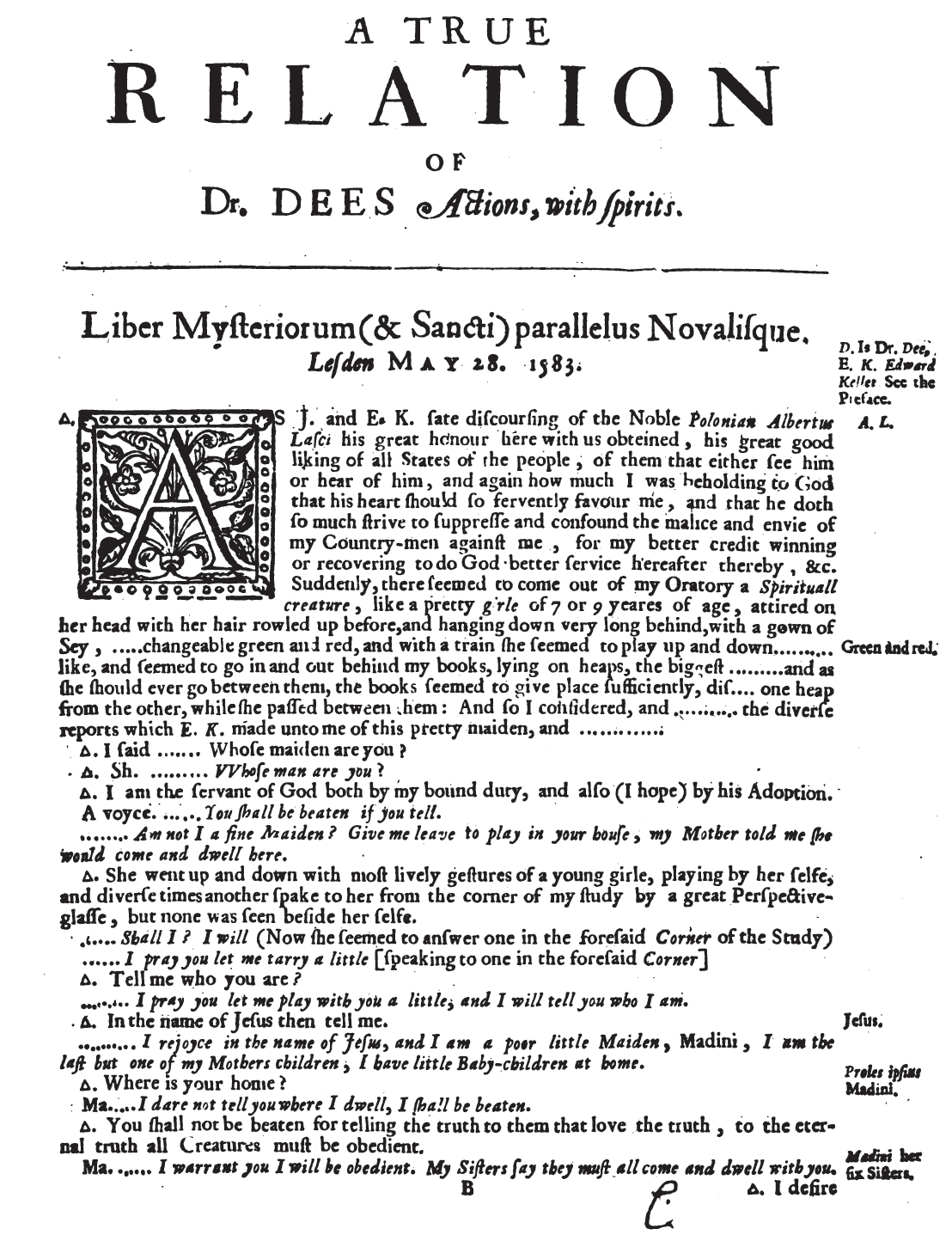
And the first page of the transcribed journal itself:
Italics all over the place, but no typeset underlining. Can you point to any printed texts of the 17th or 18th century where typeset underlining is more common than italics — or even can be found at all?]
SusanC said,
February 18, 2022 @ 12:52 pm
I'm old enough to remember the times before we sent machine-readable camera-ready copy to publishers … and the convention in handwritten manuscripts was to underline words that you want the printer to put in italics.(*)
No idea how 9ld this is, but wouldn't be surprised if it was in use in Jane Austen's time.
Note: it is not the printer using italics as an approximate substitute for underline, but the underline being in manuscript an approximate substitute for what they want the printer to do,
(*) one of my early published papers was word processed but printed out and glued onto paper sheets marked up with the publishers preference for margins etc. I had to explain, some years later, when a grad student looked at the machine readable version of the paper and wondered why it didn't have the same margin width as the print version.
For young people: yes, academic publishers really used to do page layout with scissors and glue,
Doctor Science said,
February 18, 2022 @ 1:18 pm
In Pride and Prejudice, when Lydia is away
–which suggests to me that underlining was the established way to convey emotional emphasis (=prosodic focus) in handwriting by 1800 at latest.
DMcCunney said,
February 18, 2022 @ 1:37 pm
#Mark Dow: "And *please* don't forget the SMS version of asterisks for italics for emphasis. (Already almost obsolete?)"
That convention had been in use well before SMS. I'm not certain where it originated, but I saw it all over Usenet Newsgroups,BBS message forums, and email beginning in the 80s (when I first got online access. It likely predated my arrival. The underlying factor was that all of these were plain text forums, where things like italics and boldface for emphasis weren't possible.
The asterisk wasn't the only character used in that manner. I saw examples like /text/ and _text_ used as well. But regardless of what characters were used, the notion that the text they delimited was being given special emphasis was clear to all.
I'd not call the practice obsolete, as plain text only forums do still exist,and *very* popular online services like Facebook don't support markup in posts. If you want to indicate emphasis, you do *this*. Places like Reddit support emphasis, but use is problematic. Reddit's FancyPants editor,that tries to be WYSIWYG, is quirky, but the alternative is composing in Markdown which most posters don't know.
What we increasingly see now in places like Facebook are fancy emoji (which are even being added to the Unicode specification. I suppose I'm officially an Old Fart these days, as I do *not* consider that in improvement.
_______
Dennis
Doctor Science said,
February 18, 2022 @ 1:38 pm
Further research shows that Austen was DEFINITELY not the first to use italics for emphasis. If you look at the first edition of Richardson's Clarissa (1748), for instance, you'll see lots of italics for conversational emphasis in the letters.
[(myl) Indeed. A scan of the 1748 edition is here. And on p. 3 we find
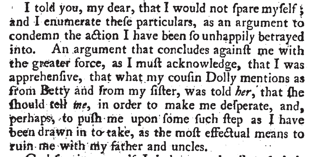
I told you, my dear, that I would not spare myself; and I enumerate these particulars, as an argument to condemn the action I have been so unhappily betrayed into. An argument that concludes against me with the greater force, as I must acknowledge, that I was apprehensive, that what my cousin Dolly mentions a from Betty and from my sister, was told her, that she should tell me, in order to make me desperate, and, perhaps, to push me upon some such step as I have been drawn in to take, as the most effectual means to ruin me with my father and uncles.
And immediately following on p. 4:

And doubly may they triumph, if they can triumph, in the ruin of a sister, who never wished or intended hurt to them!
]
David Marjanović said,
February 18, 2022 @ 2:09 pm
That's for emphasis, not specifically for italics. The same holds for _faux-underlining_. There are numerous websites and apps – Skype for instance – that automatically change asterisks to *boldface* and faux-underlining to _italics_.
/Slashes/ were, however, a common way to indicate italics on typewriters. I've seen this online, but very rarely.
Philip Taylor said,
February 18, 2022 @ 2:48 pm
Oddly enough, I do use slashes in plain ASCII text to indicate emphasis, but never asterisks. No idea why, except (perhaps) that bold can be interpreted as "shouting" while italics are less "in one's face".
Philip Anderson said,
February 18, 2022 @ 3:10 pm
@Philip Taylor
For me, *this* is emphasis, THIS is shouting..
Rick Rubenstein said,
February 18, 2022 @ 4:21 pm
Personally I'd like to know who originated the convention of, when a whole passage is italicized, de-italicizing a word for emphasis, so I can go back in time and rough them up a bit. It just doesn't work in my brain at all. It needs to be even more italic. Or something.
AntC said,
February 18, 2022 @ 5:05 pm
I have similar questions about the capitalisation of Nouns in the scans myl is showing. The Robinson Crusoe capitalises every noun. Dr. Dees Journal only some — with no apparent reason as to which, Jane Austen only Proper Names.
Presumably a Habit adopted from German. But why? And why did it die out?
Monscampus said,
February 18, 2022 @ 5:36 pm
@AntC
This may be helpful https://english.stackexchange.com/questions/10522/what-were-the-rules-for-capitalising-nouns-in-the-17th-and-18th-centuries
Bob Ladd said,
February 18, 2022 @ 5:42 pm
@AntC – I don't think capitalising nouns was specifically German – it was quite widespread. Danish had it until the post-WW2 spelling reform, for example, and I think there were other languages as well. It's just that German never got rid of it (and in fact, Großschreibung has been a hot issue in German for well over a century). English still retains capitals on a lot of words (days of the week, month names, nationality adjectives…) that begin with lower-case in many European (see?) languages.
AntC said,
February 18, 2022 @ 6:20 pm
Thanks @Monscampus. From those answers, capitalisation was not always a thing in English, it appeared mid-Shakespeare's time.
So I blame the introduction of printing. And I'm going to continue to attribute it to German/Gutenberg.
Stephen Hart said,
February 18, 2022 @ 6:55 pm
Mark Liberman said:
"Italics all over the place, but no typeset underlining."
That was my point. Outside of typesetting, italics were difficult, underline easy.
Italics were the intent, underline was the substitute for italics.
The principle was the same typewriting and handwriting.
In typesetting, both italics and underline would presumably be similar, requiring a whole font (with underlines cast in to each character) in a type case.
Of course, the advent of optical typesetting (eg. Lumitype) functioned more like modern computers.
The substituting of underline for italics lasted well into the computer age, hence the seminal *The Mac is not a Typewriter*, by Robin Williams. (Also double spacing between sentences.)
Jenny Chu said,
February 18, 2022 @ 8:44 pm
In Emily Climbs, the second book in the Emily series by L.M. Montgomery (of Anne of Green Gables fame), Emily is a budding author and has dared to show her work to a respected and beloved teacher. The teacher shows her a lot of tough love, and one of the things he criticizes is the overuse of italics.
I have always wondered: she was very clearly showing him handwritten work (that's a whole thing in the book, how her kind cousin Jimmy buys her blank books to write in, despite the stinginess of her severe Aunt Elizabeth). And I guess an early 20th century rural Canadian would be writing in longhand, slanted cursive. So how was she italicizing? It's not just a one time comment – in the following book, Mr. Carpenter's last words are literally, "Beware of italics" as Emily weeps at his deathbed.
Mark F. said,
February 18, 2022 @ 10:16 pm
First let me just reinforce Stephen Hart. In grade school, I was taught that it is a long-established convention that you use underlining in handwriting for what would be italicized in print. So I assume she underlined expressions fully expecting them to be italicized in print, and that the typesetter used italics where she underlined without giving it a second thought. So, in the case of Jenny Chu's comment, I would guess that Emily is italicizing by underlining. But maybe I'm wrong.
Mark F. said,
February 18, 2022 @ 10:39 pm
Second, I think Mark's question wasn't just whether others had used italics for emphasis, it's whether they had used textual emphasis (in the form of italics) to indicate speech prosody. Following Dr. Science, I looked at Clarissa, and indeed, on p. 7, I find "He was but too handsome a man for her!" – just the kind of application that R. A. Harris describes as being characteristic of Austen.
But it's not so important that she be the first to do it. Harris makes no such claim in the quote above, only that she was different from some other prominent writers, and that's an observation worth making.
Barbara Phillips Long said,
February 19, 2022 @ 1:53 am
When I first saw this post, I went looking in the Paston letters to see if there was underlining for emphasis. I did not see any in the images of letters that I accessed, but this blog post had a book inventory from John Paston II (1442-1479) that includes underlining related to book titles:
https://blogs.bl.uk/digitisedmanuscripts/2015/04/the-paston-letters-go-live.html
A transcript of the list is here — note that the original ms. Is damaged and the transcript reflects the incomplete information:
https://quod.lib.umich.edu/c/cme/Paston/1:9.86?rgn=div2;view=fulltext
Using underlining to differentiate some handwritten text goes back a long way in English letters, apparently, but if the Paston letters are representative, the kind of emphasis that Austen used had yet to come.
Philip Anderson said,
February 19, 2022 @ 4:20 am
Regarding typeset italics and handwritten underlining, which are agreed to correspond and reflect the difference in ease of production, the question is surely which came first?
Handwriting is older than printing, and italics were invented as a style of handwriting, but did anyone ever write in a mixture of italics and non-italics? Was underlining used before italics or printing? Or did printers invent written emphasis as Stephen Hart appears to think? That seems unlikely to me.
It also doesn’t seem likely that non-authors would adopt underlining if that technique had only been invented for the convenience of printers.
Tom Dawkes said,
February 19, 2022 @ 7:20 am
For an example of Italics and Secretary hand (16th c.) see https://www.nationalarchives.gov.uk/palaeography/doc3/default.htm. "The document is mainly written in secretary hand. This style of writing was used for business purposes, and was the main hand used in Britain in the Tudor and Jacobean periods. The italic hand, which we saw in document 1 (the letter from Princess Elizabeth), existed alongside secretary hand, and writers of secretary hand would sometimes write certain words in italic hand to make them stand out. An example of this can be seen in this document, which has the names of the Spaniards written in italic.
Tom Dawkes said,
February 19, 2022 @ 7:21 am
PS. See lines 11 'Don Alonso' and 13 'Don Thomaso'
Amanda Adams said,
February 19, 2022 @ 9:28 am
As in many manuscript books, words may be heavily abbreviated which is often shown by long horizontal lines above &/or below the word – usually passing through one or more ascending or descending letters adjacent to the missed-out letter or letters, underlining for emphasis is seldom found, although in having a quick look through my images, I have found red underlining used to set off the title of some Parables of Solomon, even though the title is already in a larger script (a Bâtarde, in this case). What I am looking for, are examples I know exist (but I don't like them. Will I find any that I have saved?) where what we would call a strike-through – seemingly crossing out as though for deletion – is actually used for emphasis. These are not rare, historically; but I can't fine them fast.
Rodger C said,
February 19, 2022 @ 10:30 am
writers of secretary hand would sometimes write certain words in italic hand to make them stand out
Dr. Dee did this in his MS Of Famous and Rich Discoveries, which I've eyeballed. I don't know of any transcription of passages from it that reflects this. Also notable in that MS is that he distinguishes v from u in transcribing Russian placenames, but not elsewhere.
Philip Taylor said,
February 19, 2022 @ 11:21 am
I have to hand a handwritten letter dated 09-Feb-2022. It is written using a Biro in a cursive but not elegant hand, and makes use neither of underlining nor italicisation. What it does make use of are caps and small caps. The contents of the letter are confidential, so I echo here only those parts set in caps and small caps, which I estimate as being less than 5% of the whole. I have had to use full caps, so please assume title case unless stated otherwise. Dotted "i" is used even in the caps and small caps parts.
<Sender's address (four lines)>
TRELiSKE HOSP … OCT … JAN … STOMA … STOMA … MARCH … MARCH … TRust …. COVID FREE … TRELiSKE … OCTOBER … TRELiSKE …
OK …
Philip Anderson said,
February 19, 2022 @ 3:02 pm
@Tom Dawkes
Thank you. That does suggest that printers did take italic use from handwriting.
Joyce Melton said,
February 20, 2022 @ 2:29 am
Speaking as someone old enough to have dealt with hand-typesetting (mostly in scchool) neither italics nor underline are particularly hard. They are just different cases, and in machine typesetting you set the case quite easily rather like doing so on a computer today.
But…to do underlining, you had to plan from the beginning to leave enough room for underlines between lines: the case with underline letters was often taller than the other cases. Done wrong this really looks awful.
And if you had one line in a block of text that had enough room for underlining, but other lines did not leave that room, you had a bad situation. You could fix this with spacers in hand typesetting and an equivalent operation in machine typesetting.
There was another way to do underlining but adding lined spacers did not work with all font families.
Switching to italics in midline was easier in that sense because it took no preplanning and no going backward to fix poor appearances.
Andrew Usher said,
February 21, 2022 @ 8:33 am
Although italic use was probably taken from handwriting, the result looks very different: in handwriting all letters tend to be slanted. The direct descendant of the secretary hand/italic hand dichotomy would be using print words in otherwise cursive writing, which would definitely stand out despite being nearly opposite to the typesetting practice.
The old German habit of emphasis by placing space between each letter of a word may be related to something like that.
Despite the above testimony it does seem that underlining was pretty strictly avoided in manual typesetting: I have never seen it, professional typesetting has always shunned it, and most likely it just never looked good.with traditional type.
The last paragraph quoted from Austen is noteworthy: not just because I can't imagine a real woman saying it, but because the italics are on 'has'. Stressing the 'have' of a perfect is not ordinarily done today, is it? I'd expect there 'have had'.
k_over_hbarc at yahoo dot com
Mark Young said,
February 21, 2022 @ 9:22 am
I'd say that "/have/ had" and "have /had/" differ slightly in meaning. The former says "definitely did have" while the latter says "definitely no longer have".
Philip Taylor said,
February 21, 2022 @ 10:13 am
"I certainly have had my share of beauty" feels perfectly natural to me — whilst I could never utter that sentence in its entirety, I can certainly hear myself saying "I certainly have had my share of bad luck".
Philip Anderson said,
February 21, 2022 @ 5:35 pm
@Mark Young
I think that’s a valid difference in meaning, and Mrs Bennet is undoubtedly saying the former!