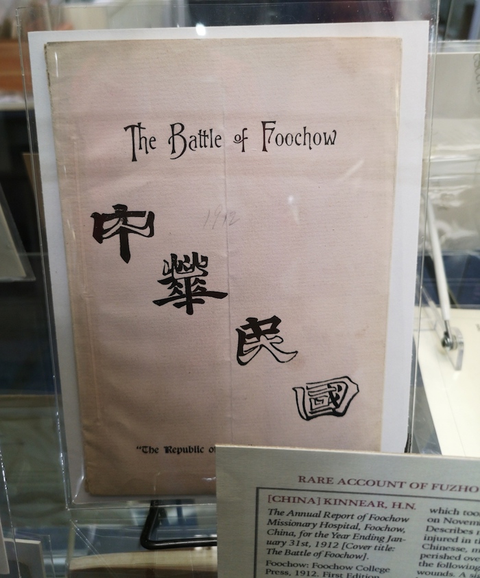
Nested calligraphy
« previous post | next post »
Clément Pit-Claudel writes:
I was recently at the Boston antiquarian book fair, where I spotted a book titled The Battle of Foochow about the Fuzhou Uprising of November 8, 1911, in which revolutionaries defeated the Qing (Manchu) army, a significant step on the way to the fall of the last dynasty in traditional Chinese history, when the six-year-old Last Emperor, Puyi, abdicated on February 12, 1912. Here's a photograph of the cover:
This is the first edition of the book, published by the Foochow College Press in 1912.
It's a little bit tricky to read the Chinese. If you get the knack, though, you can see that it says:
Zhōnghuá mínguó rénxīn dàtóng
中華民國 人心大同
"Republic of China Great Unity of the People's Hearts"
You first read the characters written in black, then you read the characters in white superimposed upon them. Neat, eh?
I don't think I've ever seen exactly this sort of playful writing before. Clément styles it "nested" or "superimposed".

Philip Taylor said,
February 11, 2020 @ 6:26 am
Now that is clever. When I first read "nested", I assumed that there would be several small hanzi bundled together to form another larger one, but did not for one minute expect a simple white-on-black superimposition. I do, though, have great difficulty in identifying all the component strokes of "心"
JS said,
February 15, 2020 @ 10:21 am
@Philip Taylor It took me a second to see them. For one thing I had to notice that the grass radical 艹 at the top of the black character appears in its full form: 艸. From there, the first dot of 心 is on the leftmost branch of the left compontent, and the second and third dots are superimposed on the branches of the right component. Hope that helps!