Watch out for those cone dispensers
« previous post | next post »
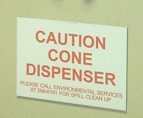
Peter Meilstrup sends in this picture from his local hospital:

He notes that he had several moments of wondering whether the whole world had gone mad, before realizing that this sign did not warn passers-by to beware of a cone dispenser, but instead labelled the dispenser as a source of "caution cones".
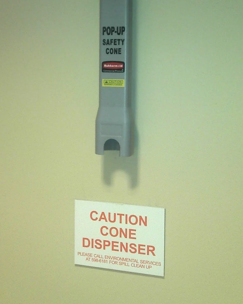
A picture showing the dispenser as well as the sign:
Observe, however, that the dispenser does have a little yellow sign reading "CAUTION: SPRING LOADED". So maybe the world is mad, after all, and the sign that caught Peter's eye really should be parsed "CAUTION: CONE DISPENSER".

Oliver Taylor said,
June 5, 2012 @ 6:55 am
Could it be that the misinterpretation of such signs stems from an expectation that punctuation necessary for disambiguation will be removed for the sake of brevity or layout reasons?
I would imagine that the only unambiguous form would be, "Caution-cone dispenser", which is certainly not ideal.
Martin J Ball said,
June 5, 2012 @ 8:05 am
What on earth is a 'caution cone'?
[(myl) This. The specific brand involved is apparently this.]
Brett said,
June 5, 2012 @ 8:23 am
@Martin J Ball: It's a cone you place on the floor that usually says "CAUTION" on it. It's there to keep people from stepping into something (generally a spill) that could be hazardous (or at least unpleasant). These collapsible cone dispensers seem to be located in all the supermarkets around where I live, and in some other businesses as well.
Brett said,
June 5, 2012 @ 8:44 am
@Oliver Taylor: I find it pretty much unambiguous if there's no line break between the first two words. The way it appears on the sign, the correct reading is not automatic for me, but when such signs start with "CAUTION CONE" on a single line, I never have any problem parsing them correctly. I think that part of this relates to precisely how I expect punctuation to be omitted on signs like this; if the "caution" appears on the same line with another word, I expect it to be followed by a colon if it's marking the beginning of a warning.
Jerry Friedman said,
June 5, 2012 @ 8:47 am
@Oliver Taylor: "Caution-cone dispenser" looks ideal to me. ("Ideal" here includes the sense of "not real". If I actually saw it, I'd think I'd died and gone to the Empyrean.)
Amy Reynaldo said,
June 5, 2012 @ 8:49 am
"Get your caution cones here" is also unambiguous. Sure, you'll need a bigger sign, but…
Speaking of signs, the other day I was briefly perplexed by a crash-blossom road sign reading:
BUS SHOULDER
RIDING ENDS
"Ends" was the verb, not "riding."
Jukka said,
June 5, 2012 @ 8:53 am
"I would imagine that the only unambiguous form would be, 'Caution-cone dispenser'"
Dispenser of caution cones.
This has the extra benefit of not beginning with the word "Caution", since messages beginning with "Caution" _are_ usually cautions.
Mona Williams said,
June 5, 2012 @ 8:57 am
Why call it a caution cone at all? The term "safety cone" on the dispenser is perfectly clear. Using it on the sign would eliminate both the "caution" ambiguity and any possible puzzlement over why two terms are being used for the same thing.
David L said,
June 5, 2012 @ 9:05 am
@Mona Williams. Maybe it's an excess of caution, due to our friends the lawyers. A caution cone warns you to be cautious. But if you see a safety cone, then inhale some noxious substance and suffer harm, you could sue on the grounds that the marked area wasn't in fact safe at all…
Anthony McAuley said,
June 5, 2012 @ 9:08 am
My favourite safety message is "Do not use elevator in case of fire", which suggests to me that the elevator could burst into flames. Why can't the people who make these signs agree on "In case of fire, do not use elevator"?
Kate Y. said,
June 5, 2012 @ 9:35 am
Signage at a storage business near us proclaims it to be, among other things, "FIRE SPRINKLED", a charming image as long as cherished possessions are not involved!
Best alternative we came up with was FIRE SPRINKLERED. Obviously "best" need not imply "good".
By the way, the comment form I'm filling out has a field for "URI" instead of "URL" (eye vs. ell). Perhaps this is old news and beyond LL's control.
[(myl) The choice of URI over URL was made by WordPress; but it's not necessarily wrong. As Wikipedia explains, Uniform Resource Identifiers "can be classified as locators (URLs), as names (URNs), or as both".]
Vic said,
June 5, 2012 @ 9:51 am
@David L,
But the name of the cone (as indicated on the dispenser, and at the link in myl's comment to Martin J Ball) IS "Safety Cone".
Dan T. said,
June 5, 2012 @ 10:21 am
Whenever I encounter a sign on an emergency exit that says "DOOR ALARMED", I wonder just how the door manages to have an emotional state.
C Thornett said,
June 5, 2012 @ 10:38 am
Does anyone else feel uneasy about using a disabled toilet?
OrenWithAnE said,
June 5, 2012 @ 10:55 am
Awesome.
PS. For those of us that want to send in items of linguistic interest, to where should they be sent?
"Woman Beats Man with Prosthetic Leg during Argument over Groceries"
OrenWithAnE said,
June 5, 2012 @ 11:00 am
As a tangent, does anyone else routinely read these as being an automatic-caution door?
Mark F. said,
June 5, 2012 @ 11:38 am
OrenWithAnE — Absolutely. Didn't even have to look at your link to know what you were talking about.
Mark F. said,
June 5, 2012 @ 11:48 am
If the horizontal line in "Caution-cone dispenser" is recognized as a hyphen, then it's unambiguous in the desired way. If it's treated as a dash, then it's unambiguous in the undesired way. The two are distinguishable, but I did get it wrong on a first reading.
===Dan said,
June 5, 2012 @ 12:17 pm
If the sign were handwritten there could have been a set of those famous gratuitous quotes, eliminating any ambiguity.
John said,
June 5, 2012 @ 12:26 pm
There's a Dilbert somewhere about the tendency of highway-sign makers (hyphen!) to eliminate small words for no good reason. The classic example is of course "End Construction" on a giant diamond-shaped sign (hyphen!), where there is plenty of room for an "of" (or, I suppose, an exclamation point when the imperative is desired).
John said,
June 5, 2012 @ 12:27 pm
And here it is with a nice URI: http://www.dilbert.com/strips/comic/1989-05-06/
Agustin said,
June 5, 2012 @ 1:26 pm
The pessimist says the glass is half-empty; the optimist says the glass is half-full. The engineer says the glass is too big.
The sign-maker says "caution cone dispenser"; the linguist says "caution-cone dispenser". The engineer says you don't need that sign: the dispenser is already labeled "pop-up safety cone".
Ellen K. said,
June 5, 2012 @ 1:44 pm
I think the hyphen is unnecessary.
As Brett notes, once you put "cone dispenser" on one line, it's unambiguous. I don't see that adding a hyphen further helps. And, as noted, if mistaken for a dash, it could have the opposite effect desired.
CAUTION CONE
DISPENSER
CAUTION-CONE
DISPENSER
Martin J Ball said,
June 5, 2012 @ 3:18 pm
Many years ago, the Radcliffe Hospital in Oxford really did have a sign "Caution – Thieves operate in this hospital" shades of Larry Niven's organ leggers …. :)
Peter Taylor said,
June 5, 2012 @ 3:40 pm
@Agustin, perhaps the real purpose of the sign is to remind people to call environmental services for clean-up (which really needs a hyphen!).
Ben Zimmer said,
June 5, 2012 @ 4:03 pm
Perhaps we expect "CAUTION CONE DISPENSER" to have an implicit colon after seeing so many signs of the "SLOW CHILDREN AT PLAY" variety.
Agustin said,
June 5, 2012 @ 9:42 pm
@Peter, yes – that's true. I guess the engineer should have said "you don't need that part of the sign."
djbcjk said,
June 6, 2012 @ 3:24 am
In Australia the one-piece caution-cones are universally known as "witches' hats". A WITCHES HAT DISPENSER would be equally alarming.
Dan T. said,
June 6, 2012 @ 11:14 am
@djbcjk: Perhaps one might find those along the corridors of Hogwarts.
Lisa said,
June 6, 2012 @ 4:27 pm
This reminds me of going to the farmers' market with an ESL friend. She asked me "What are range eggs?" and I was momentarily stumped until she pointed to the sign saying "free range eggs"!
Angiportus said,
June 6, 2012 @ 7:39 pm
What am I supposed to caution that cone dispenser about?
Ben Hemmens said,
June 7, 2012 @ 7:38 am
I notice one of the products on the page linked to by myl ( http://www.rubbermaidforless.com/safety-safety-cones-category-14_24.html ) has the legend "slippery trip hazard". Funny, I would have thought that slipping and tripping were two separate activities. I guess if one combines a spillage with a judiciously placed caution cone, one can enjoy both at the same time ;-)
Ice said,
June 9, 2012 @ 8:37 pm
I would also have to say that the CAUTION: SPRING LOADED could equally, and validly be read: CAUTION SPRING: LOADED. Since it is.
der said,
June 13, 2012 @ 5:04 am
That is so incredibly British. It always amused me when I lived there how in buildings open to the public they would always be very quick to put up warning signs or (what I now know to be called) caution cones — instead of just mopping up the spillage or fixing whatever is broken. ("Warning! Unsecured high-voltage cables sticking out of the wall. Do not touch.")
Joe1959 said,
June 15, 2012 @ 11:18 am
@der
Except that it's in the US, if I'm not mistaken.
If it were in the UK the sign would normally say "CALL ENVIRONMENTAL SERVICES ON 596 6181" rather than "CALL ENVIRONMENTAL SERVICES AT 596-6181", and though "596 6181" is theoretically a valid UK (within-city) phone number it would normally be prefixed by a further four digits, formatted as "nnnn nnn nnnn" or "nnnnn nnnnnn".
airolg said,
January 4, 2013 @ 5:21 pm
"Caution cone" – is _that_ what they're called! We always referred to them as "Elves' hats"
Karen said,
March 14, 2014 @ 3:09 am
"Bump ahead" on a road sign