Burial Man: new hero?
« previous post | next post »
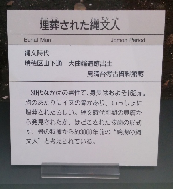
Label on a display at the Nagoya City Museum:
The label on this display case says at the top:
maisō sareta Jōmonjin 埋葬された縄文人 ("Jomon burial")
Jomon (the name, given by the American scholar Edward S. Morse in 1877, means "cord-marked" or "cord-patterned") is the earliest archeological period in Japanese prehistory, which dates from about 14,500/12,000-300 BC. The occupant of the burial is a 30 year old male who has dog bones around his chest.
Conspicuous is the furigana (ruby phonetic annotation) on the label and on the additional explanation to the left of the label for even fairly simple terms. I suppose this has something to do with trying to reach audiences of all ages, which would be part of the mission of a public museum. The museum is free to junior high school students and under, so they clearly are an important target.
[Thanks to Nathan Hopson]

Jim Breen said,
August 16, 2014 @ 5:28 pm
Yes, you see furigana all over the place on things children are likely or expected to read. (We don't talk about it helping adults too, because it's an article of faith in Japanese officialdom that all adults can read all the jôyô kanji.)
leoboiko said,
August 16, 2014 @ 8:25 pm
A team-mate for Florida Man, perhaps.
Jo Lumley said,
August 17, 2014 @ 12:09 pm
It's interesting that only the (fairly straightforward) title of the item gets accompanying furigana. And yet the place name underneath — 瑞穂区 mihuzo-ku 'Mizuho Ward' (a Ward in Nagoya, understandably enough) –, which is genuinely quite tricky to pronounce, does not. Though I suppose that Nagoya schoolchildren or other residents would know how to read it.
What is the "additional explanation to the left of the label" that you are talking about? I suppose that 縄文時代 jōmon jidai 'Jōmon Period' is arguably redundant explanation given the main title.
Elonkareon said,
August 17, 2014 @ 12:59 pm
The lower middle section is written entirely in Kanji, and I suspect the contents would not be particularly meaningful to children even if they did have furigana (seems to consist mostly of places names and technical terms). The real question is why the bottom section doesn't have furigana.
Matt said,
August 17, 2014 @ 6:36 pm
Because furigana ain't furii, basically. Someone has to type them in, someone has to format them (the museum/print shop may well be using software that makes this much more difficult than it needs to be), someone needs to proof them, etc. The decision process probably went like this:
Q) Is it worth it to furiganafy the title?
A) Yeah, it's not that much effort, and it's extremely useful in terms of telling people what they're looking at/helping them find their way through the exhibit
Q) Is it worth it to furiganafy the place of discovery?
A) Probably not; the place of discovery is usually only relevant to someone to the extent that they can read it
Q) Is it worth it to furiganafy the explanation?
A) Nah, we'd have to reformat that part of the placard, and the vast majority of people visiting the museum will either be able to read it well enough (even if they wouldn't bet their life on a pronunciation of 貝層, they'll've heard of 貝塚 and they'll be able to guess what it means) or will be with a parent/teacher who'll explain it to them anyway. Plus, we're keeping it pretty simple in the first place, not using kanji for "hodokosu" (施す), leaving "issho ni" in kana because it's used as a grammatical word, etc.
Similar line of thinking for translation, really, with the stronger case for the affirmative in (3) outweighed by the greater cost of translation. (Including the risk of getting it wrong; at this point museums are well aware that any mistake they make in translation will instantly become an object of online entertainment — as it has here!)
If I were in the meeting, I'd probably have argued for at least transliterating the place name, personally; that's something that would be of direct interest to tourists (people deciding which place to visit next) in particular, and also happens to be the hardest part to read of the whole sign.
Victor Mair said,
August 17, 2014 @ 7:46 pm
@Jo Lumley
The additional explanation on a placard to the left of the label got cropped out during posting. The original photograph didn't show much at all of the placard, but included enough so that I could see furigana for ita 痛 ("hurt") and hone 骨 ("bone"), which hardly seem necessary even for grade school kids. On the other hand, following along with Matt's thinking about the "not-furii" cost of typesetting with furigana, the format on the placard was much more open and expansive than that on the label, so it would have been much easier to insert the furigana there.