How a 40% decrease in X can be a 6% increase in non-X
« previous post | next post »
And also, how 35% of the population can be above the 95th percentile…. Razib Khan, "The Obesity Rate for Children Has Not Plummeted (Despite what the New York Times tells you)", Slate 2/28/2014:
Common sense tells you that if you run enough trials, by chance, you will occasionally get an unexpected outcome. When scientists deem a result “statistically significant,” they're just saying that given their default expectations (e.g. around 50/50 for a coin toss), the outcomes obtained are unlikely to have occurred by random chance. A fair coin is unlikely to land on heads nine out of 10 tosses, so such an outcome suggests the coin is probably not fair. Unlikely is not the same as impossible, and if you look long and hard you will inevitably stumble upon random events that seem novel but are just the outcome of chance.
I bring this up because earlier this week the New York Times trumpeted: “Obesity Rate for Young Children Plummets 43% in a Decade.” A surprising discovery, and a pretty big deal, right? The article spread like wildfire on Twitter and Facebook. For once, some heartening news about the health of this nation! My immediate reaction, however, was that there must be something we don’t know about obesity to get such a massive change in such a short period of time. Then I started reading.
Razib is concerned about stories like these: Sabrina Tavernise, "Obesity Rate for Young Children Plummets 43% in a Decade", NYT 2/25/2014; Lena Sun, "New CDC data shows 43 percent drop in obesity rates among children 2 to 5", Washington Post 225/2014; Betsy McKay, "U.S. Childhood Obesity Rates Fall 40% in Decade", WSJ 2/25/2014. And he's justifiably concerned that those headlines are instances of "data dredging" or "cherry picking":
… if you do enough comparisons and interpretations across various age cohorts, you're bound to turn up an exciting statistically significant result eventually. If you do 10 flips of enough coins, you will at some point flip one to land on heads 10 times. This isn’t fate—it’s probability, and it’s inevitable in the long run. In order to separate out the noise from the real significant results, the authors should have held themselves to a higher standard.
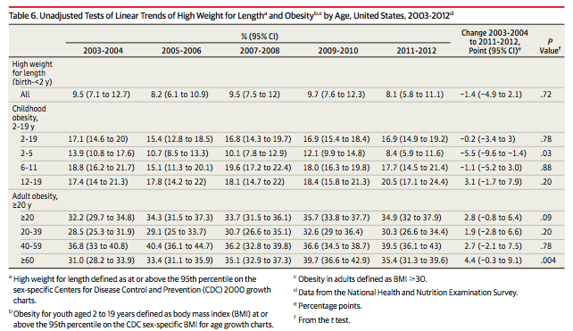
The trigger was the publication of C.L. Ogden et al., "Prevalence of Childhood and Adult Obesity in the United States, 2011-2012", JAMA 2014, which contains this table:
Out of nine age groups in the table, two have "statistically significant" changes — the 2-5-year-olds are down from 13.9% to 8.4%, while the ≥60-year-olds are up from 31.0% to 35.4%. Overall, across all age groups, there is no significant trend.
I agree with Razib's concerns about cherry-picking; but I'd like to point out that everyone seems to have missed the real story.
To see what that story is, we need to look into what the Ogden et al. paper means by "obesity". They refer us to C.L. Ogden & K.M. Flegal, "Changes in terminology for childhood overweight and obesity", National Health Statistics Reports 2010, where "obesity" is defined as being at or above the 95th percentile in BMI for your age:
A variety of different terms, metrics, and cut-off values have been used to describe and assess overweight and obesity in children. Body mass index (BMI) calculated as weight in kilograms divided by height in meters squared can be used to express weight adjusted for height. In order to account for variability by sex and age, BMI in children is compared to sex- and age-specific reference values. In the United States, the Centers for Disease Control and Prevention (CDC) 2000 growth charts serve as reference values. The terminology used for high BMI-for-age in children in the United States to date has been based on the recommendation of an expert committee convened by federal agencies. This committee recommended the use of BMI and defined overweight as a BMI-for age at or above the 95th percentile of a specified reference population and the designation of ‘‘at risk for overweight’’ for BMI values between the 85th and the 95th percentiles of BMI for age. More recently, although the cut-off values and the interpretation have not changed, changes in terminology were proposed. An American Medical Association expert committee report retained the two cut-off values of the 85th and 95th percentiles of BMI-for-age but used different terminology, referring to BMI-for-age from the 85th up to the 95th percentile as ‘‘overweight’’ and to BMI-for-age at or above the 95th percentile as ‘‘obesity.’’ The National Center for Health Statistics (NCHS) and other CDC publications will continue to include prevalence estimates at the 85th and 95th percentiles as before but will change the terminology to use the term ‘‘overweight’’ for a BMI-for-age between the 85th and 95th percentile (formerly called ‘‘at risk for overweight’’) and the term ‘‘obesity’’ for a BMI-for-age at or above the 95th percentile (formerly called ‘‘overweight’’).
If "BMI-for-age at or above the 95th percentile" were the whole story, of course, the table of changes in obesity percentages would make no sense at all. The percentage of individuals whose BMI is at or above the 95th percentile for their age is exactly 5%, by definition.
But the reference distribution is (for now) fixed: It's the CDC's 2000 growth charts. (At least for ages 2-20; the norms for older groups apparently result from a similar process.)
Where do the CDC 2000 growth charts come from? Basically from earlier versions of the same survey whose results from 2003-2004 to 2011-2012 are discussed in the JAMA paper that started all this off. Specifically, according to R.J. Kuczmarski et al.. "2000 CDC Growth Charts for the United States: Methods and Development", Vital and health statistics. Series 11 (246), Data from the national health survey, 2002.
The growth charts were developed with data from five national health examination surveys and limited supplemental data. Smoothed percentile curves were developed in two stages. In the first stage, selected empirical percentiles were smoothed with a variety of parametric and nonparametric procedures. In the second stage, parameters were created to obtain the final curves, additional percentiles and z-scores.
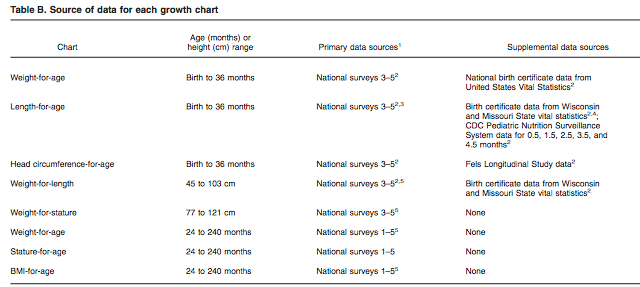
That publication's table of growth chart sources indicates that the BMI-for-age data came from "National Surveys 1-5", which are further identified as NHES II (1963-65), NHES (1966-1970), NHANES I (1971-1974), NHANES II (1976-1980), and NHANES III (1988-94):
The particular methods used:
For 2 to 20 years, LWR model was based on a 5-point smoothing at midpoints of age intervals for ages 2 to 12.5 years, and a 25-point smoothing for boys and a 27-point smoothing for girls for ages 13 to 20 years. The curves were further smoothed with a 4-parameter polynomial regression model fit to smoothed percentile points for BMI at midpoints of age intervals.
This means that the BMI-by-age percentile values are smoothed not only by combining data from five surveys spanning 30 years (1963 to 1994), but also by smoothing across ages. Still, for the reference population it should remain true that the percentage of individuals with BMI-for-age above the 95h percentile should be roughly 5%.
So this leads us to the real story: Whatever the changes by age group from 2001 to 2012, the high-BMI end of the whole population across that whole period is MUCH larger, in percentage terms, than it was in the reference period from 1963 to 1994.
How much larger?
Well, this gets us into the tangled area of percentage changes (which are often problematic), and percentage changes in percentages (which are worse).
Let's illustrate the problems by looking at those recent headlines again. The NYT and WaPo stories focus on the 13.9% to 8.4% change in the 2-5 age group between 2001 and 2012, and call it a 43% drop. They apparently got this by rounding the numbers to 14% and 8%, yielding 8/14 = 0.571, 100*(1-8/14) = 42.857, rounded to 43%.
The WSJ story — more honestly — gets a 40% drop in 2-5-year-old obesity from the same numbers: round(100*(1-8.4/13.9)) = 40%.
But if we had applied exactly the same logic to the change in the non-obesity percentage, we'd get (1-.084)/(1-.139) = 1.064, or a 6% increase in non-obesity.
All this is perfectly logical and correct, but it's obvious how to use calculations of this kind to spin the importance of a change as larger or smaller.
In the area of machine-learning research, where changes in error rates and/or success rates a central concern, people seem to have have evolved a set of norms for keeping things more-or-less straight. First, it's normal to talk about error rates and not about percent correct; and second, changes in the error rate are always flagged as "absolute" (additive) or "relative" (proportional).
This is the practice even for error rates near 50%, where the difference between absolute and relative changes is only about a factor of 2. Thus J.G. Fiscus, "A post-processing system to yield reduced word error rates: Recognizer Output Voting Error Reduction (ROVER)", IEEE ICASSP 1997:
On the development test set, the Nist1 system yields a word error rate of 43.5%, which is a 1.0% absolute reduction in word error, or 2.2% percent relative reduction.
But in the world at large, it's prudent to assume that news stories will pick the calculation that maximally magnifies or diminishes the effect that they've chosen to magnify or diminish.


D.O. said,
March 3, 2014 @ 3:56 pm
Few quickies. For adult obesity they use absolute rather than percentile scale. The CDC handout explains
The childhood data should have a strong cohort effect. In fact, just as statistically significant findings may turn out to be not that significant, statistically insignificant findings can provide a wealth of information if there are lots of them (oh well, elsewhere Prof. Liberman actually wrote about it in terms of Turing log-odds assessment of evidence). Someone should come up with a model which takes to account the cohort effect and reanalyze the whole sample.
Stephen said,
March 4, 2014 @ 1:00 pm
"If you do 10 flips of enough coins, you will at some point flip one to land on heads 10 times."
Derren Brown actually did this for a TV programme, see
https://en.wikipedia.org/wiki/List_of_works_by_Derren_Brown#Derren_Brown:_The_System_.282008.29
for details.
BobW said,
March 4, 2014 @ 2:58 pm
One thing I sometimes do is ask people the chances of a coin flip coming up heads after it has come up heads 99 times in a row. Of course it is 50%, but few people say so.
Mark Dowson said,
March 4, 2014 @ 7:19 pm
Read or watch the opening scene of Tom Stoppard's RosenKratnz and Guildenstern for an entertaining (and intelligent) discussion of what to conclude if a tossed coin repeatedly lands showing "heads".
Nanani said,
March 4, 2014 @ 10:01 pm
@BobW
Ah but you didn't specify a FAIR coin. I think people are justified in saying the coin is likely to come up heads for a hundredth time since the observation of 99 heads in a row is strong evidence that we are not dealing with a fair coin, after all.
Jenny said,
March 6, 2014 @ 3:18 pm
Please, never stop writing about statistics, journalism, and spin. I'm trained in error analysis, but not spin, and I am so glad you remind me regularly to check journalistic claims. Reading Language Log has made me a lot more careful (and skeptical) as a reader. Thanks!
Andrew (not the same one) said,
March 6, 2014 @ 4:41 pm
But do people say that the coin is more likely to come up heads a hundredth time, for which, as Nanani says, there is a reasonable justification, or that it is more likely to come up tails?