Just press Pay
« previous post | next post »
This is a screen shot I snapped during a recent attempt to purchase something (can't remember what) on the web:
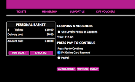
Notice that in order to continue, it tells me (twice) that I have to press "Pay". Can you see any button labeled "Pay" on the screen?
If you are itching to tell me what I should have done, you are missing my point.
I'm not asking you to tell me what I should do. I am well aware that the business about clicking on "PAY" is just a mistake, and they probably want me to click on either "CHECK OUT" or "SUBMIT" (it actually isn't clear which; and by the way, I always think "Submit" is a very poor choice of verb, with its ambiguity between "hand it over to us" and "yield to our domination", as in "We will continue tightening these screws on your thumbs until you submit").
My point is not about how to complete the purchase. It is to draw attention to this question: How much attention can they possibly be paying to the user experience when they tell me to "Press Pay" and put nothing on the screen that says "Pay"?
It's a further illustration of something about the quality of machine-to-human interface programming that I have often mentioned here on Language Log and twice written about on Lingua Franca (here and here).
The simplest way to describe the attitude of software engineers and companies to linguistic interfacing with their customers would be to say that they do not give a monkey's fart about such matters. Not only do they never have a linguist check the use of language in the programs they expect us to use (that'll be the day), they don't have anybody at all checking it.
If they program interfaces this carelessly, just how likely is it that robots are going to respect the Three Laws of Robotics?