Killer Pope
« previous post | next post »
Giacomo Sillari sent in this snapshot of a news-stand display:
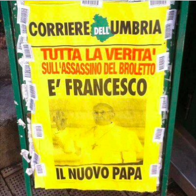
The sign juxtaposes teasers for two different stories, one the election of Pope Francis, and the other a multiple murder and suicide in Umbria.
If we ignore the color-coding and run everything together with the implied punctuation, we get:
Tutto la verità sull'assassino del Broletto: È Francesco, il nuovo Papa.
which means something like
"All the truth about the Broletto killer: It's Francis, the new Pope."
Giacomo submitted this under the heading of "Crash Blossom", but it's really a new form of journalistic misinterpretation. Following the pattern of naming such phenomena after the index case, we could call this a "Killer Pope".
Dw said,
March 15, 2013 @ 3:48 am
Reminds me of this (scroll down a bit).
Adriano said,
March 15, 2013 @ 4:18 am
Well… Yes, it could be interpreted this way. But as a mother tongue speaker, I can say that thas was not the first meaning which comes to my mind.
The second sentence is written that way so as to emphasize the name of the Pope, by putting it at the beginning and putting the verb before it (something similar should happen in English too, I presume…)
I am not a linguist and my studies in this field were some time ago. Therefore I know there is a name for this, but can't remember it. The standard sentence should be
Il nuovo Papa è Francesco.
or
Francesco è il nuovo Papa.
which sounds like
Francesco is the new Pope.
That way, no misunderstanding.
One side comment: in Italian a low case is used after a semicolumn.
Pete said,
March 15, 2013 @ 4:26 am
The free newspaper Metro (in the UK) does this sort of thing all the time: it has a front-page headline but then a big photo from a different story, sometimes with shocking results.
For example, when the dancer Bez won Celebrity Big Brother, the Metro front page was a picture of him emerging from the BB house with the headline (including quotation marks) "I'll turn Iraq into a bloodbath". At the bottom of the page was a few column-inches about the radical Shia cleric who'd said that about Iraq; the Celebrity Big Brother story was on page 2.
Carl said,
March 15, 2013 @ 4:50 am
I recall a "Killer Pope" from Columbia, SC's The State back in 1998. Pakistan had just openly tested a nuclear bomb for the first time, and a headline saying something to the effect of "Pakistan Tests A-Bomb" was positioned directly over a picture of the local carnival grounds, which had just opened for the year.
zythophile said,
March 15, 2013 @ 5:07 am
Surely there must already be a rock band called the Killer Popes?
Jarkko Hietaniemi said,
March 15, 2013 @ 6:00 am
In … 1981 a Finnish tabloid Iltasanomat did the same trick, amusingly enough, with papal news:
THE POPE HAS BEEN SHOT
…
J. R. CANNOT MAKE IT TO THE FUNERAL
Or, in original FInnish
PAAVIA AMMUTTU
…
J. R. EI PÄÄSE HAUTAJAISIIN
The Pope being the Pope back then, and J.R. being in the mean guy from the Dallas TV series, being unable to attend some storyline rites, probably due to meanness.
richardelguru said,
March 15, 2013 @ 7:20 am
Now there's a case where a b/w photo would be much better than colour!!
Bill W said,
March 15, 2013 @ 7:25 am
Isn't the colon added in the English translation cheating a bit?
Jarek Weckwerth said,
March 15, 2013 @ 8:55 am
Is it customary in Italian to use apostrophes instead of accented letters in this way?
Cameron said,
March 15, 2013 @ 9:49 am
I don't know of a band called The Killer Popes, but there have been a couple of bands called The Bad Popes. That name comes from the book of that title by E.R. Chamberlin.
Beniamino said,
March 15, 2013 @ 9:49 am
Jack: It is for capital letters, especially in newsprint.
Ellen K. said,
March 15, 2013 @ 10:07 am
Bill W, note that the colon is also added to the Italian, not just the translation, and the text of the post notes "with the implied punctuation".
Adriano said,
March 15, 2013 @ 10:35 am
Jarek Weckwert,
I confirm what Beniamino has said. It was the only way to write the accent on old typewriters, where capital accented letters were absent. As far as I know, nowadays the only reason to do this is whenever the capital accented letter is absent in the font used (or there is a risk of mis-interpretation during the conversion from a doc type to another one).
Errata: I wrote " in Italian a low case is used after a semicolumn". I meant colon (i.e. ":"). In the Italian version "with the implied punctuation" therefore there is this little mistake.
Narmitaj said,
March 15, 2013 @ 11:36 am
Here's one that works when written out (with implied colon) but doesn't look so convincing on the original newspaper:
CLUBLAND MURDER CHARGES: THE KILLERS TO PLAY ECHO ARENA
(Being the band The Killers; almost but not quite The Pope Killers).
Private Eye often prints inappropriate headline-photo or ad-photo juxtapositions, though I can't find any online. However this site has some good ones, such as a photo (in The Daily Telegraph) of UK female royal power trio the Queen, Camilla and Kate above a headline reading "Witchcraft Threat To Children".
One more texty one there is POLICE SEARCH FOR TEEN'S RAPIST: DON'T YOU WISH YOU WERE A KID AGAIN? (The second part being above a photo of a bunch of kids joyfully splashing about in some water in a heat wave)
Brett said,
March 15, 2013 @ 12:39 pm
Chamberlin's The Bad Popes, is a really excellent book, by the way.
Gyslain said,
March 15, 2013 @ 1:21 pm
All-time winning headline here…
Fabio Montermini said,
March 15, 2013 @ 1:40 pm
I would say that "E' Francesco il nuovo papa" is simply a case of right dislocation. What is interesting, I guess, is that the newspaper in question is printed in Umbria, the region Saint Francis of Assisi came from. St. Francis is still very popular all over Italy, by the way. I suspect that the use of this particular construction is intended to emphasize the similarity between the new Pope and "their" saint, and the possible ambiguity went unnoticed. I must say that when I first saw this picture on Facebook I thought it was a fake, before understanding that there was a second (the right) interpretation.
Gene Callahan said,
March 15, 2013 @ 2:47 pm
Jack, also on non-Italian keyboards you can use an apostrophe instead.
Chris Henrich said,
March 15, 2013 @ 9:24 pm
For me, the difference in colors makes it natural to read the two headlines as separate.
But a really good crash-blossom should never be left to blush unseen.
Matt McIrvin said,
March 16, 2013 @ 8:51 am
Dynamite with the rope-a-dope, guaranteed to blow your mind… anytiiiiime…
mgh said,
March 16, 2013 @ 2:57 pm
It seems like a special case of what I was taught to call "tombstoning headlines", which happens when headlines belong to stories in adjacent columns are set in a way that the reader might interpret them as a single long headline, sometimes to amusing effect.
I am having trouble finding good examples unfortunately! but here are a couple in the same general area:
"Bin Laden is dead" http://anglofiles.com/2011/05/10/royal-kiss-bin-laden-dead-best-front-page-ever/
"Free bikes for freshman" http://www.intuitive.com/blog/hilarious_tombstoning_gaffe_in_local_newspaper.html
Chris Travers said,
March 18, 2013 @ 4:30 am
I am not sure this is new. I remember reading in "Red Tape Holds Up New Bridge And Other Flubs of the Nation's Press" a bunch of other similar cases. It seems that there is a common issue space cues, particular where floats and tables are involved, of juxtiposing pictures with headlines in ways that lead to bizarre connections.
The one that comes to my mind was a headline of something like "Backlash against Gays as Parents" displayed right under a picture of Prince Charles, Princess Di, and their children.
The problem I think, now that i have done some work with typography, is that floats (typically with newspapers, larger images, etc), well, float and so there is a lot of opportunity for things to combine in unintended ways. Since this gets done typically in the design phase (well after proofreading, etc), there is little attempt to double check how everything fits together in that way, particularly when double meanings are involved.
So there is a significant structural difference between this and a crash blossom. A crash blossom is a pretty purely linguistic phenomenon. It is self-contained. This, on the other hand, is a collision of floating elements and thus exists on one side as a design problem and on the other (the reader's side) a linguistic one.