Stylized characters
« previous post | next post »
Dean Barrett sent in these two photographs of signs from, respectively, the Taiwan Literary Museum and a sex shop in Tainan that is well known for its wide selection of condoms:

When the Chinese writing system originated more than three millennia ago, back at the stage of oracle bone inscriptions, the characters were much more pictographic and ideographic than they are now, though even then they were already conventionalized and many of them conveyed information through phonetic, rather than directly semantic, means. By the time of the bronze inscriptions and seal script during the first millennium BC, the vast majority of characters relied more on phonophoric hints than on semantophoric indicators to convey lexical information. Nonetheless, the popular belief persists that characters somehow depict meaning through their shapes without relying on the intermediary of sound. Although that is a linguistic fallacy, it encourages graphic designers and others to emphasize the pictorial quality of the characters, often in complete disregard of their actual derivation, as with the notorious Chineasy method of teaching students how to write:
- "Chineasy? Not" (3/19/14)
- "Chineasy2" (8/14/14)
Still and all, it's fun to see how modern graphic designers play with the characters to enhance their pictorial elements, or, I should say, to add pictorial elements to them. The above two signs are good examples of this playfulness.
The first one (under a logo of the Taipei City Government) reads:
bǔjírǔshì 哺集乳室
("breastfeeding and breastmilk-pumping room")
Here the designer has replaced the square mouth of the first character with a round one, making it look like an "O". In this case, the minor modification to a more pictorial rendition of a child's mouth is historically accurate.
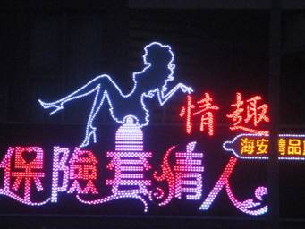
The second second sign says:
bǎoxiǎntào qíngrén 保險套情人
("condom lover")
I won't comment on the modifications the designer has applied to the characters, other than to say that none of them has a basis in historical derivation.
[Thanks to Melvin Lee and Fangyi Cheng]
David Morris said,
July 25, 2016 @ 7:49 am
I'm very worried about the placement of the female figure on the stylised condom exactly like that.
Victor Mair said,
July 25, 2016 @ 11:01 am
@David Morris
Precarious!
Rodger C said,
July 25, 2016 @ 11:42 am
And is it sheer coincidence that the picture in the sign on the left echoes the structure of the character 母?